侘寂民艺美学麻布中国发展史设计
来源: @xiaoxiaodong01模型: ChatGPT
📸 示例图片
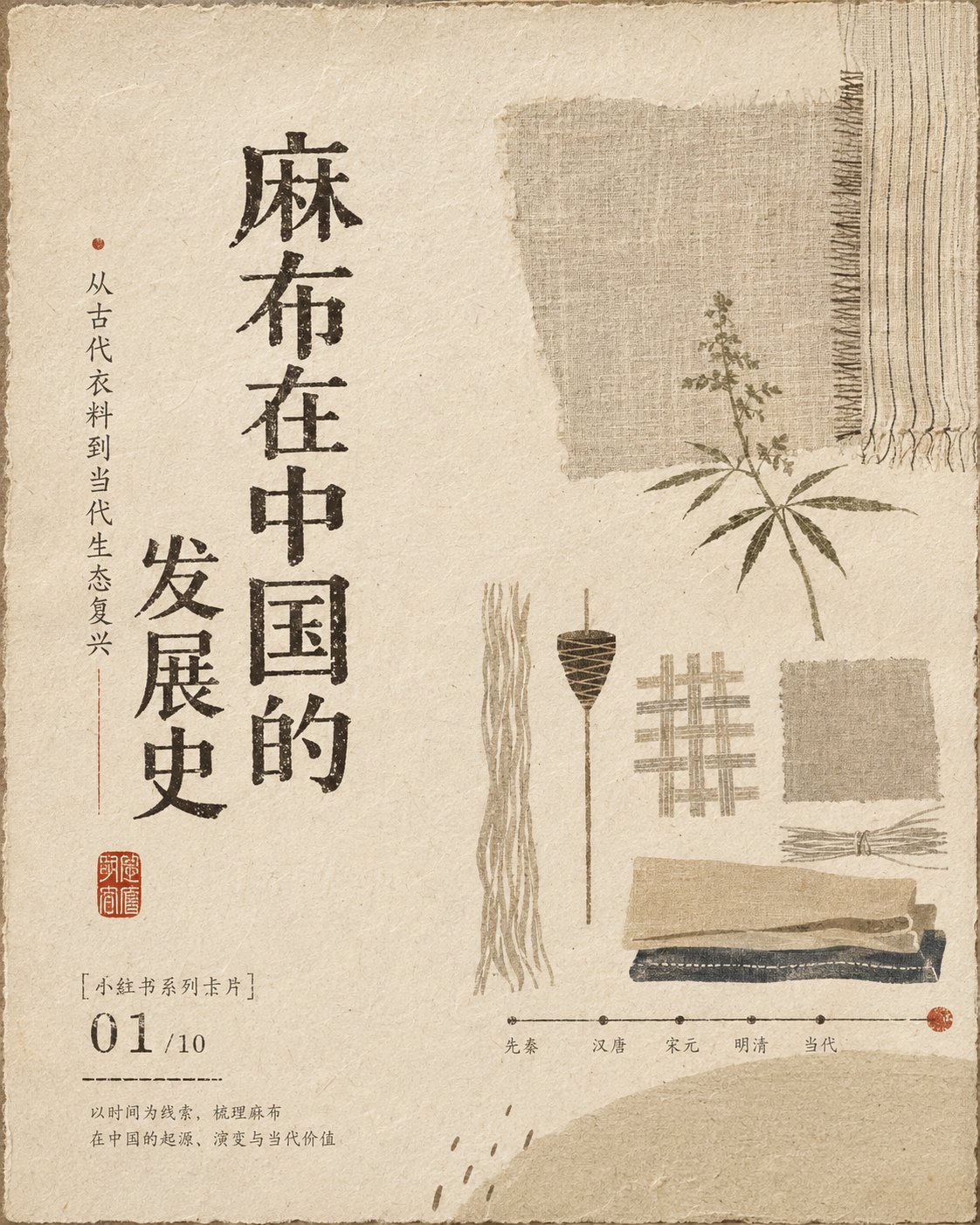
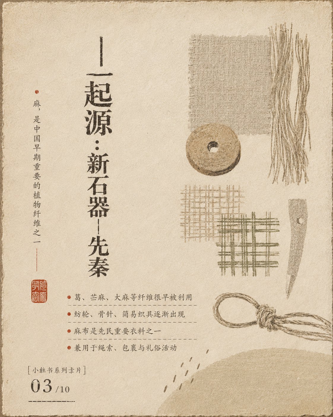
提示词
English
With wabi-sabi aesthetics, Ma aesthetics, folk art theory, mono no aware consciousness, Eastern Zen white space, ancient book layout and modernist visual order as the core, integrated with Yanagi Soetsu's simple folk art view, Serizawa Keisuke's stencil dyeing structure, Taniuchi Rokuro's naive narrative, Tanaka Ikko's geometric refinement, Jin Nong's archaic writing, and Wu Changshuo's seal carving charm to assist the design; the overall adoption of handmade fabrics, old paper fibers and natural media textures like plant dyes, preserving wrinkles, raw edges, color bleeding, wear, slight overprinting misalignment and uneven ink absorption, but controlling the density of dirt to make the picture more restrained, exquisite, and breathable. The color matching follows principles such as low-saturation tone, analogous color progression, value layering, hidden cold and warm contrast, area proportion control, material composite colors, a small amount of high-brightness visual brightening, and small-area anchoring of dark colors, carried by a large area of soft base tones, establishing layers with medium-brightness blocks, stabilizing the center of gravity with a small amount of deep values, and forming a gentle focus with local light and brightness, presenting the color relationship of old objects warmed by time. The composition adopts asymmetrical balance, Eastern white space, visual triangle, diagonal movement, rhythm of density, Gestalt proximity and closure laws, one-sided text anchoring, edge tension, and scale contrast; the main symbols are distributed in a loose but orderly rhythm, avoiding standard centering and average arrangement, allowing the white space to become the main visual content, forming a quiet, slow, and light reading path. The font system adopts vertical arrangement of ancient books, block-printed characters, clerical script handwriting, seal marks and modern information hierarchy mixed arrangement; the glyphs are de-mechanized, the center of gravity is slightly low, the horizontal and vertical proportions are not completely uniform, the stroke ends retain woodcut knife marks and dry brush flying white, and local parts are slightly elongated, flattened, damaged, or ink-bleeding; the main text forms a spiritual axis with a vertical rhythm, the auxiliary text uses a small-size annotation-style layout, the character spacing is loose, the line spacing is restrained, and seal-style graphics serve as visual signatures; through screen printing, woodblock rubbing, stencil dyeing, dry brushing, rubbing, overprinting and slight misregistration to create a sense of true handmade quality. Illustrations use Serizawa Keisuke's flat stencil generalization, Taniuchi Rokuro's childlike naivety, Samiro Yunoki's folk fabric rhythm, Tanaka Ikko's geometric induction, rough edges of woodblock prints and child-like imprecise proportions; the content is only suggested by abstract life symbols, simple blocks, silhouette outlines and a small amount of hand-drawn strokes, not depicting specific categories, not pursuing realistic perspective, preserving contingency, a sense of pause and handmade temperature. Overall atmosphere: warm, quiet, nostalgic, rustic, soft, restrained, intimate, healing, implicit, relaxed, everyday poetry, old time sense, handmade temperature, slightly sweet, low-voice narrative, Eastern life ritual sense, high-end but not over-exquisite.

——————
Subject: The development history of linen in China
Usage: Serialized pictures Xiaohongshu cards.
Multi-picture logic similar to PPT
A total of 10 pictures
中文
以**侘寂美学、间之美学、民艺理论、物哀意识、东方禅宗留白、古籍版式与现代主义视觉秩序**为核心,融合**柳宗悦的朴素民艺观、芹泽銈介的型染结构、谷内六郎的稚拙叙事、田中一光的几何提炼、金农的古拙书写、吴昌硕的篆刻气韵**辅助设计;整体采用手工织物、旧纸纤维与植物染般的天然媒介质感,保留褶皱、毛边、渗色、磨损、轻微套印错位与不均匀吸墨,但控制脏污密度,使画面更克制、精致、有呼吸感。  配色遵循**低饱和统调、近似色渐进、明度分层、冷暖隐性对比、面积比例控制、材质综合色、少量高明度视觉提亮、深色小面积锚定**等原理,以大面积柔和底调承载,中等明度块面建立层次,少量深沉色值稳定重心,局部轻亮形成温柔焦点,呈现旧物被时间温润后的色彩关系。  构图采用**非对称平衡、东方留白、视觉三角、斜向动线、疏密节奏、格式塔接近律与闭合律、单侧文字锚定、边缘张力、大小尺度对比**;主体符号以松散却有秩序的节奏分布,避免标准居中与平均排列,让空白成为主要视觉内容,形成安静、缓慢、轻盈的阅读路径。  字体系统采用**古籍竖排、刻本字、隶意手写字、篆刻印记与现代信息层级混排**;字形去机械化处理,重心略低,横竖比例不完全统一,笔画端点保留木刻刀痕与干笔飞白,局部轻微拉长、压扁、缺损、渗墨;主文字以竖向节奏形成精神轴线,辅助文字使用小字号注疏式编排,字距疏朗、行距克制,印章式图形作为视觉落款;通过**丝网印刷、木版拓印、型染镂版、干刷、擦印、叠印与轻微错版**制造真实手作感。  插画使用**芹泽銈介的平面型染概括、谷内六郎的童真稚拙、柚木沙弥郎的民间织物节奏、田中一光的几何归纳、木版画的粗粝边缘与儿童画般的不精确比例**;内容仅以抽象生活符号、朴素块面、剪影轮廓和少量手绘笔触暗示,不描摹具体品类,不追求写实透视,保留偶然性、停顿感与手工温度。  整体氛围:**温润、安静、怀旧、朴拙、柔软、克制、亲密、治愈、含蓄、松弛、日常诗意、旧时光感、手作温度、微甜、低声叙事、东方生活仪式感、高级而不精致过度。**

——————
主题:麻布在中国的发展史
用途:系列化图片 小红书卡片。
类似ppt的多张图片逻辑
一共10张图片