高级茶饮品牌三栏式详情页视觉海报
来源: @ou_zhen599模型: ChatGPT
📸 示例图片
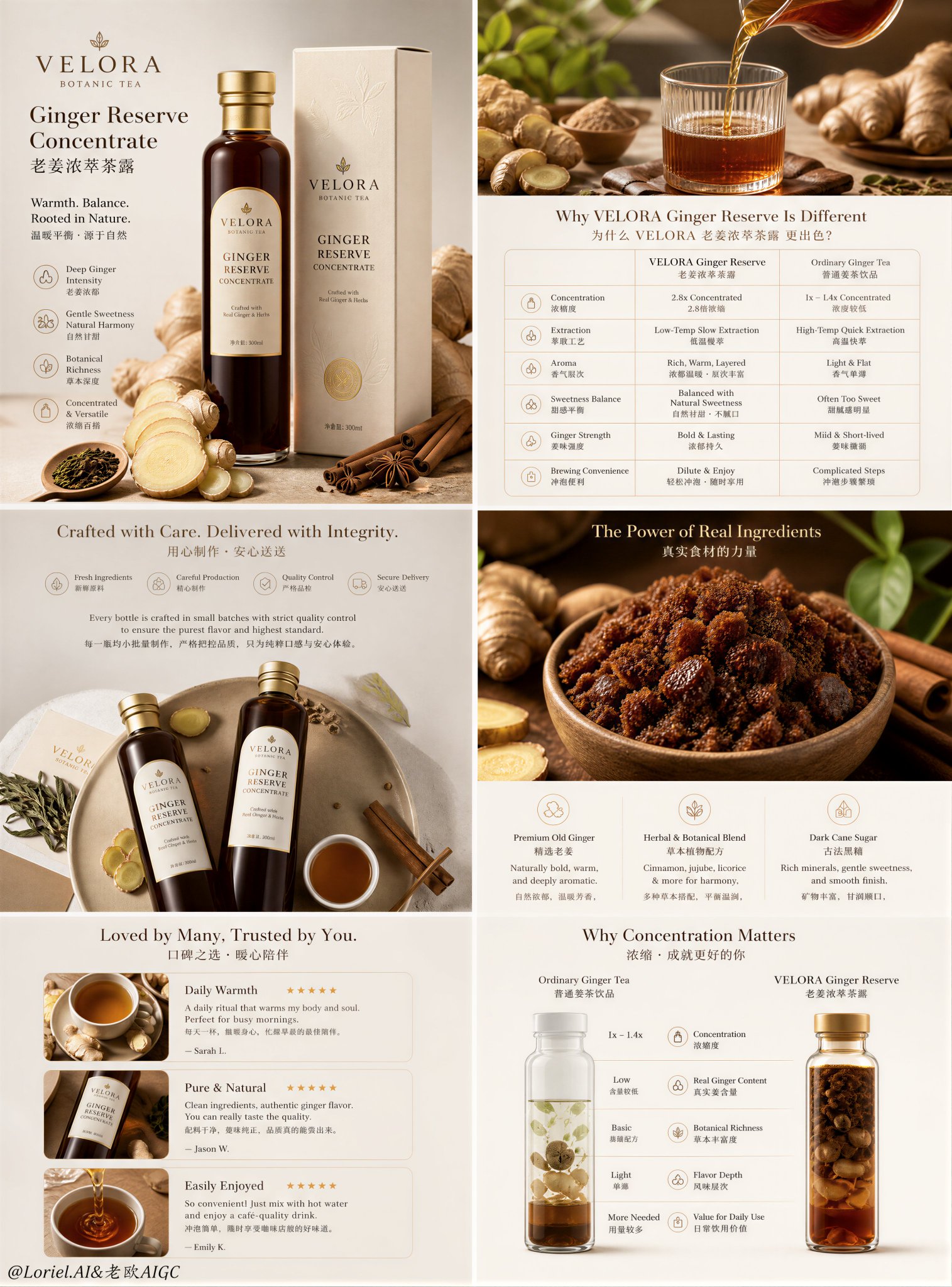
提示词
English
Create an ultra-premium e-commerce detail-page sales poster for a self-invented tea beverage brand, strictly preserving the exact original three-column long-form vertical layout logic, while merging Cream Halo Transit luxury brand precision with Milk Cloud Orbit tactile realism to make the entire detail page feel rarer, more expensive, and more flagship-level. Do not change the original structural composition. Keep the same three tall narrow columns side by side, the same top-to-bottom modular reading rhythm, the same infographic-detail-page hierarchy, and the same product-explanation sequence. The final artwork must feel like a design-award-level premium tea brand detail page: hyper-real, clean, elegant, materially rich, highly unified, and visually expensive, with minimal English main titles and smaller Chinese subtitle support.

Brand and product:
Create a self-invented premium tea beverage company such as “AUREL TEA LAB”, “VELORA TEA WELL”, or “EMBER TEA RESERVE”. The hero product should remain a premium powdered tea latte or grain-tea shake style tea drink, perfectly suited to the original page logic. The packaging must feel luxury-grade, modern, healthy, and giftable, with refined cylindrical canister design, elegant label hierarchy, premium matte paper texture, subtle embossing, and precise print clarity.

Strict original page structure:
Preserve the original logic exactly:
Left column:
- top brand / badge / intro block
- middle hero product with one standing canister and one finished creamy tea drink
- lower nutrition or key-value strip
- bottom icon-based feature section

Center column:
- top quote-style brand statement block
- middle powder / tea blend macro block with percentage logic
- lower nutrient or function-circle cluster
- bottom product spill / powder reveal image

Right column:
- top ingredient-value / spoon-comparison block
- middle flavor and taste explanation block with finished drink visual
- bottom raw ingredient ratio / source comparison section

Do not change this structure into a homepage, collage, or different module order. It must remain a strict three-column product detail page.

Make the detail page feel more expensive:
This is critical. Upgrade the entire page into a higher luxury tier through:
- more refined negative space inside each module
- thinner, more elegant typography hierarchy
- more premium material rendering on product, powder, spoons, packaging, and ingredients
- calmer and more controlled section rhythm
- more precise alignment of numbers, icons, headings, and explanatory blocks
- less cheap “health product” feeling, more flagship brand editorial-commerce feeling
The page should feel like a collector-grade commercial detail page, not a generic marketplace layout.

Left column hero:
Show one premium tea-latte powder canister standing next to a prepared creamy tea beverage in a transparent mug or elegant glass. The drink should show realistic foam, milk-tea density, powder suspension, and soft creamy meniscus. Around it, place restrained supporting ingredients such as tea powder, grain flakes, oat fragments, hojicha powder, matcha dust, or one premium spoon with powder. The hero must feel calm, expensive, and materially rich. The nutrition strip below must feel precise and luxurious, not crowded.

Center column explanation:
At the top, place a minimal English headline with a smaller Chinese subtitle in a quote-like refined composition. In the middle, show a large macro bowl or circular composition of premium tea powder blend with beautifully scattered fine powder around it. Use elegant numerical logic such as tea concentration, grain ratio, botanical content, or low-sugar structure. In the lower middle, create a refined cluster of circular nutrient or functional icons with better spacing and more premium finishes. At the bottom, show the canister slightly opened or tipped with powder spilling out in a controlled, tactile, luxurious way.

Right column explanation:
At the top, show two premium spoons or measuring tools holding different powder textures or tea concentrate references to communicate ingredient richness. In the middle, create a flavor block with one finished tea drink in a glass or cup showing creamy texture, foam body, and warm depth, paired with a short elegant explanation of taste, aroma, and mouthfeel. At the bottom, create an ingredient-ratio comparison area using circular bowls or neat ingredient clusters such as roasted grains, tea leaves, oats, sesame, beans, or herbs, with one elegant percentage badge. The whole right column must feel highly aligned and premium.

Cream Halo Transit brand precision:
Unify the entire page into one disciplined flagship brand system. All English titles, Chinese subtitle lines, percentages, icons, badges, nutrition stats, functional circles, ratio sections, and label areas must share one highly controlled visual language. Typography spacing, image-to-text proportions, module padding, and alignment must feel internationally premium and art-directed.

Milk Cloud Orbit tactile realism:
Push tactile realism to the highest level:
- tea powder micro-grain texture
- creamy liquid density and surface tension
- foam micro-bubbles
- powder spill softness and edge breakup
- canister matte paper grain and emboss detail
- label print sharpness and subtle ink contrast
- spoon metal or ceramic realism
- raw grains, oats, tea leaves, sesame, herbs, and beans with rich tactile definition
- glass reflections and cup wall thickness
Everything must feel touchable, de-AI, and materially expensive.

Color direction:
Use a premium palette of warm ivory, oat beige, milk-tea cream, toasted grain gold, hojicha brown, muted sage or matcha green accents, and soft taupe. Keep the three columns clearly differentiated enough to preserve the original page rhythm, but unify them into one elegant brand family.

Lighting:
Use soft premium commercial lighting with clean daylight-like highlights, elegant shadow falloff, refined reflections on packaging and cups, and delicate powder realism. The page must feel bright, healthy, premium, and visually expensive without looking loud.

Rendering style:
ultra-premium tea beverage e-commerce detail page, strict original three-column long-page structure, Cream Halo Transit luxury brand precision, Milk Cloud Orbit tactile realism, materially expensive flagship design, premium powdered tea latte product, hyper-real tea powder and creamy drink realism, elegant English main titles with smaller Chinese subtitles, award-winning commercial design, 8k, masterpiece quality

Negative prompt:
changed page structure, homepage layout, collage composition, cheap health-drink ad, plastic liquid, fake powder texture, cluttered page, messy typography, generic template, low-end packaging, cartoon infographic, oversaturated colors, harsh flash lighting, noisy props
中文
为一个自创的茶饮品牌创建一个超高端的电商详情页销售海报,严格保留原有的三栏长幅垂直布局逻辑,同时融合 Cream Halo Transit 的奢华品牌精准度与 Milk Cloud Orbit 的触感写实主义,使整个详情页感觉更稀有、更昂贵且更具旗舰级水准。不要改变原始的结构组合。保持相同并排的三个高窄栏,相同的从上到下的模块化阅读节奏,相同的信息图表详情页层级,以及相同的产品解释顺序。最终的艺术作品必须感觉像设计奖级别的优质茶品牌详情页:超写实、干净、优雅、材质丰富、高度统一且视觉上很昂贵,配有极简的英文主标题和较小的中文副标题支持。

品牌与产品:
创建一个自创的高级茶饮公司,例如“AUREL TEA LAB”、“VELORA TEA WELL”或“EMBER TEA RESERVE”。核心产品应保持为高级茶粉拿铁或谷物奶昔风格的茶饮,完美契合原始页面逻辑。包装必须感觉是奢侈品级、现代、健康且适合作为礼品的,具有精致的圆柱罐设计、优雅的标签层级、优质的磨砂纸张质感、微妙的压花和精确的印刷清晰度。

严格的原始页面结构:
完全保留原始逻辑:
左栏:
- 顶部品牌/徽章/介绍区块
- 中间核心产品,包含一个立式罐体和一个冲调好的奶油茶饮
- 下部营养或关键价值条
- 底部基于图标的特性部分

中栏:
- 顶部引用风格的品牌宣言区块
- 中间带有百分比逻辑的茶粉/混合茶宏观区块
- 下部营养素或功能圆圈集群
- 底部产品溢出/粉末展示图像

右栏:
- 顶部成分价值/勺子对比区块
- 中间带有成品饮料视觉效果的口味和口感解释区块
- 底部原料比例/来源对比部分

不要将此结构更改为主页、拼贴画或不同的模块顺序。它必须保持严格的三栏产品详情页。

让详情页感觉更昂贵:
这是至关重要的。通过以下方式将整个页面提升到更高的奢华档次:
- 每个模块内更精细的负空间
- 更纤细、更优雅的排版层级
- 产品、粉末、勺子、包装和成分上更优质的材质渲染
- 更平静、更受控的分段节奏
- 数字、图标、标题和解释区块更精确的对齐
- 减少廉价的“保健品”感,增加更多旗舰品牌编辑商业感
页面应该感觉像收藏级别的商业详情页,而不是普通的市场布局。

左栏核心图:
展示一个高级茶拿铁粉末罐,旁边放在透明马克杯或优雅玻璃杯中冲调好的奶油茶饮。饮料应显示真实的泡沫、奶茶密度、粉末悬浮和柔软的奶油半月板。在它周围,放置克制的辅助成分,如茶粉、谷物片、燕麦碎片、焙茶粉、抹茶粉或一把盛有粉末的高级勺子。核心图必须感觉冷静、昂贵且材质丰富。下方的营养条必须感觉精确且奢华,不拥挤。

中栏说明:
在顶部,放置一个极简的英文标题,并以类似引用的精制构图配上较小的中文副标题。在中间,展示一个大型宏观碗或圆形构图的优质混合茶粉,周围精美地散布着细粉。使用优雅的数字逻辑,如茶叶浓度、谷物比例、植物含量或低糖结构。在中下部,创建一个间距更好、表面处理更优质的圆形营养素或功能图标精制集群。在底部,显示罐子微微打开或倾斜,粉末以受控、触感、奢华的方式溢出。

右栏说明:
在顶部,显示两个装有不同粉末质感或浓缩茶参考的高级勺子或测量工具,以传达成分的丰富性。在中间,创建一个口味区块,展示玻璃杯或杯子中冲调好的茶饮,呈现奶油质地、泡沫体和温暖的深度,并配以简短优雅的口味、香气和口感解释。在底部,使用圆碗或整齐的成分簇(如烘焙谷物、茶叶、燕麦、芝麻、豆类或草药)创建一个成分比例对比区域,并带有一个优雅的百分比徽章。整个右栏必须感觉高度对齐且高端。

Cream Halo Transit 品牌精准度:
将整个页面统一为一个受控的旗舰品牌系统。所有英文标题、中文副标题行、百分比、图标、徽章、营养统计数据、功能圆圈、比例部分和标签区域必须共享一种高度受控的视觉语言。排版间距、图文比例、模块填充和对齐必须感觉具有国际水准的优质感和艺术指导感。

Milk Cloud Orbit 触感写实主义:
将触感写实推向最高水平:
- 茶粉微粒质感
- 奶油液体的密度和表面张力
- 泡沫微气泡
- 粉末溢出的柔软度和边缘破碎感
- 罐子的磨砂纸纹理和压花细节
- 标签印刷的锐度和微妙的油墨对比
- 勺子的金属或陶瓷写实感
- 原始谷物、燕麦、茶叶、芝麻、草药和豆类具有丰富的触感定义
- 玻璃反射和杯壁厚度
Everything must feel touchable, de-AI, and materially expensive.

色彩方向:
使用由暖象牙色、燕麦米色、奶茶奶油色、烤谷物金、焙茶棕、柔和的鼠尾草绿或抹茶绿点缀以及软灰褐色组成的高级调色板。保持三栏清晰区分以保留原始页面节奏,但将它们统一为一个优雅的品牌系列。

光照:
使用柔和的高级商业照明,带有干净的类日光高光、优雅的阴影衰减、包装和杯子上的精致反射以及细腻的粉末真实感。页面必须感觉明亮、健康、高端且视觉上昂贵,而不显得嘈杂。

渲染风格:
超高端茶饮电商详情页,严格原始三栏长页结构,Cream Halo Transit 奢华品牌精准度,Milk Cloud Orbit 触感写实主义,材质昂贵的旗舰设计,优质茶粉拿铁产品,超写实茶粉和奶油饮品真实感,优雅的英文主标题配较小的中文副标题,获奖商业设计,8k,杰作质量

负面提示词:
改变的页面结构,主页布局,拼贴构图,廉价健康饮料广告,塑料感液体,假粉末质感,拥挤的页面,凌乱的排版,通用模板,低端包装,卡通信息图表,过饱和的颜色,刺眼的闪光灯照明,嘈杂的道具