街头文化社论海报物理交互排版
来源: @MrLarus模型: ChatGPT
📸 示例图片
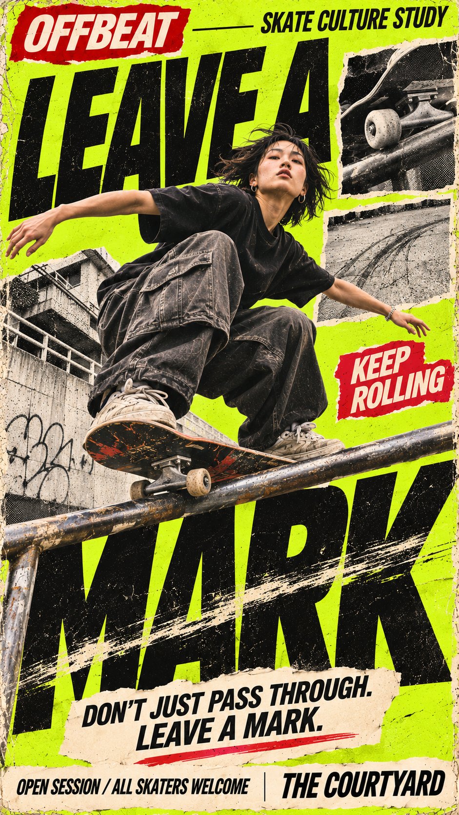
提示词
English
Create a high-impact 9:16 vertical street culture editorial poster.

Customize:
- Brand / Series: [BRAND NAME]
- Main Headline: [MAIN TITLE]
- Subject: [PERSON / OUTFIT / OBJECT]
- Physical Interaction: [FABRIC FOLDS / SLIDING DOORS / WATER REFRACTION / SKATE FRICTION / OTHER]
- Main Colors: [COLOR PALETTE]
- Supporting Copy: [TAGLINE / EVENT INFO]

Visual Style

Blend authentic streetwear photography with oversized experimental typography, 90s–2000s punk zine aesthetics, grunge editorial design, screen printing, torn-paper collage, halftone textures, and analog print imperfections.

Physical Typography

The key idea is that the typography should physically interact with the real-world subject.

Let fabric folds bend printed letters, doors split a headline, rain or transparent surfaces refract type, rails and motion leave friction marks across letters, or another believable physical phenomenon directly change the typography.

The interaction must feel intentional and physically believable—not like a random digital effect. Keep the main headline large, bold, condensed, and clearly readable.

Composition

Use dramatic perspectives, asymmetrical layouts, strong foreground/background overlaps, and one dominant visual relationship.

Make the subject large enough to work at thumbnail size. Let photography, typography, and physical materials overlap through realistic occlusion and depth instead of simply placing text behind the subject.

Editorial Details

Add meaningful supporting copy, small editorial labels, monochrome photo inserts, thin divider lines, torn-paper elements, and compact information sections.

Keep the layout dense but organized, with a clear hierarchy from main visual → headline → supporting information.

Texture & Finish

Use bold contrasting colors, distressed ink, subtle print misregistration, photocopy grain, halftone dots, rough paper fibers, and tactile cutout edges.

Keep people, clothing, objects, and physical materials photorealistic with natural skin, realistic fabric, accurate anatomy, and believable lighting.

Final result: a polished, stop-scroll street culture poster where real materials and physical phenomena become part of the typography itself.

Avoid generic fashion layouts, glossy CGI, 3D text, meaningless filler text, excessive clutter, plastic skin, anatomy errors, fake QR codes, decorative numbering, and watermarks.
中文
创建一个具有冲击力的 9:16 垂直街头文化社论海报。

自定义:
- 品牌 / 系列:[品牌名称]
- 主标题:[主标题]
- 主体:[人物 / 服装 / 物体]
- 物理交互:[织物褶皱 / 推拉门 / 水折射 / 滑板摩擦 / 其他]
- 主色调:[调色板]
- 辅助文案:[标语 / 活动信息]

视觉风格

将真实的街头摄影与超大实验排版、90年代至2000年代的朋克杂志美学、垃圾摇滚社论设计、丝网印刷、撕裂纸张拼贴、半色调纹理以及模拟印刷缺陷相结合。

物理排版

核心理念是排版应与现实世界的主体产生物理交互。

让织物褶皱弯曲印刷字母,门拆分标题,雨水或透明表面折射文字,栏杆和运动在字母上留下摩擦痕迹,或者另一种可信的物理现象直接改变排版。

交互必须感觉是刻意的且在物理上可信——而不是随机的数字效果。保持主标题大、粗、紧凑且清晰可读。

构图

使用戏剧性的视角、不对称的布局、强烈的背景/前景重叠以及一个主导的视觉关系。

使主体足够大,以便在缩略图尺寸下也能发挥作用。让摄影、排版和物理材料通过真实的遮挡和深度重叠,而不是简单地将文字放在主体后面。

社论细节

添加有意义的辅助文案、小型社论标签、单色照片插图、细分割线、撕纸元素和紧凑的信息部分。

保持布局密集但有组织,具有从主视觉 → 标题 → 辅助信息的清晰层级。

纹理与饰面

使用大胆的对比色、做旧墨水、细微的印刷对位不准、复印颗粒、半色调点、粗糙的纸张纤维和触感十足的裁剪边缘。

保持人物、服装、物体和物理材料的写实感,具有自然的皮肤、真实的织物、准确的解剖结构和可信的光影。

最终结果:一张精致的、令人停止滚动的街头文化海报,在这里真实材料和物理现象成为排版本身的一部分。

避免通用的时尚布局、光滑的 CGI、3D 文本、无意义的填充文本、过度混乱、塑料皮肤、解剖错误、伪造的二维码、装饰性编号和水印。