📸 示例图片
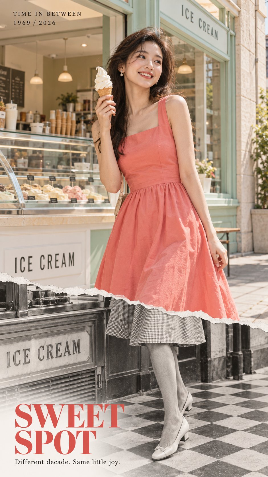
提示词
English
【SUBJECT】: {成年女性 / 男性 / 情侣}
【MODERN OUTFIT】: {现代服饰}
【PAST OUTFIT】: {符合时代的服饰}
【LOCATION】: {唱片店 / 酒店 / 冰淇淋店 / 加油站 / 自助洗衣店 / 等}
【PAST YEAR】: {例如 1969}
【PRESENT YEAR】: {例如 2026}
【MODERN SCENE】: {该地点今天的样子}
【PAST SCENE】: {同一地点在过去的样子}
【KEY PROP】: {可选物品}
【ACCENT COLOR】: {主色调}
【TITLE】: {英文简短标题}
【TAGLINE】: {短句}
【ASPECT RATIO】: 9:16

创建一个高端的 9:16 时尚编辑海报,围绕单一的撕纸时间过渡效果构建。图像的上部 65–70% 是一张完整的现代彩色照片。只有下部被撕开,露出【PAST YEAR】中同一地点的黑白历史照片。不要在顶部添加第二次撕裂。

让【SUBJECT】成为绝对的视觉焦点,占据画面约 70–80%。使用真实的皮肤纹理、自然的头发、可信的解剖结构、自然的肢体语言和哑光织物。避免油性皮肤、塑料感的 AI 面孔、过度修图、CGI 纹理和僵硬的模型姿势。为人物穿上【MODERN OUTFIT】,并使用【ACCENT COLOR】作为主要的视觉色彩锚点。

使用【MODERN SCENE】展示【PRESENT YEAR】的【LOCATION】。保持环境真实、当代、整洁且在视觉上有所克制。在单一的撕裂边缘下方,露出黑白的【PAST SCENE】,保持相同的摄像机角度、建筑结构、门口位置、地板线条、地平线和透视,使两个时代清晰地感觉像是在同一个地方。

让撕裂的边缘在人物的大腿或膝盖附近穿过。在其下方,将同一个人过渡到【PAST OUTFIT】,同时保持完全相同的身体位置、比例、腿部方向和重量分布。如果有用,让【KEY PROP】也变为其历史对应的形式,同时保持其位置和透视一致。

撕裂的边缘看起来应该具有真实的物理感,带有精细的白色纸张纤维、不规则的手工撕裂感、轻微的厚度和柔和的接触阴影。保持历史部分整洁且具有摄影感,带有微妙的黑白胶片颗粒和自然的灰度。避免沉重的划痕、污渍、变黄、陈旧的纸张、发光的裂缝、传送门、漂浮的碎片或奇幻效果。

使用自然日光或可信的室内光线。现代部分应感觉整洁、具有触感和编辑风格,而不是过度的电影感或商业感。保持人物比背景更清晰,具有真实的皮肤、织物、物体材料和景深。

添加克制的编辑排版:顶部附近有“TIME IN BETWEEN”和“【PAST YEAR】 / 【PRESENT YEAR】”,然后在下方的历史区域有“【TITLE】”和“【TAGLINE】”。保持排版次于人物。不要添加随机文本、徽标、水印、二维码或装饰符号。

最终的视觉层级应该是:首先是人物和服装,然后是单一的撕裂边缘,最后是发现同一个人、物体和地点在下方延续到了早期的时代。生成一张完整的独立 9:16 海报,而不是分屏、网格或前后对比布局。
中文
【SUBJECT】: {adult woman / man / couple}
【MODERN OUTFIT】: {present-day outfit}
【PAST OUTFIT】: {era-appropriate outfit}
【LOCATION】: {record store / hotel / ice cream shop / gas station / laundromat / etc.}
【PAST YEAR】: {e.g. 1969}
【PRESENT YEAR】: {e.g. 2026}
【MODERN SCENE】: {how the place looks today}
【PAST SCENE】: {how the same place looked in the past}
【KEY PROP】: {optional object}
【ACCENT COLOR】: {main color}
【TITLE】: {short English title}
【TAGLINE】: {short sentence}
【ASPECT RATIO】: 9:16

Create a high-end 9:16 fashion editorial poster built around a single torn-paper time transition. The upper 65–70% of the image is one complete modern color photograph. Only the lower part is torn open, revealing the exact same location in 【PAST YEAR】 as a black-and-white historical photograph. Do not add a second tear at the top.

Make 【SUBJECT】 the absolute visual focus, occupying roughly 70–80% of the frame. Use realistic skin texture, natural hair, believable anatomy, candid body language, and matte fabrics. Avoid oily skin, plastic AI faces, excessive retouching, CGI textures, and stiff model poses. Dress the subject in 【MODERN OUTFIT】 and use 【ACCENT COLOR】 as the main visual color anchor.

Show 【LOCATION】 in 【PRESENT YEAR】 using 【MODERN SCENE】. Keep the environment realistic, contemporary, clean, and visually restrained. Below the single torn edge, reveal 【PAST SCENE】 in black-and-white, preserving the same camera angle, architecture, doorway positions, floor lines, horizon, and perspective so both eras clearly feel like the same place.

Let the torn edge cross the subject around the thigh or knee. Below it, transition the same person into 【PAST OUTFIT】 while keeping exactly the same body position, proportions, leg direction, and weight distribution. If useful, let 【KEY PROP】 also change into its historical equivalent while keeping its position and perspective aligned.

The torn edge should look physically real, with fine white paper fibers, irregular handmade tearing, slight thickness, and a soft contact shadow. Keep the historical section clean and photographic, with subtle black-and-white film grain and natural grayscale. Avoid heavy scratches, stains, yellowing, distressed paper, glowing cracks, portals, floating fragments, or fantasy effects.

Use natural daylight or believable indoor light. The modern section should feel clean, tactile, and editorial rather than overly cinematic or commercial. Keep the person sharper than the background, with realistic skin, fabric, object materials, and depth of field.

Add restrained editorial typography: “TIME IN BETWEEN” with “【PAST YEAR】 / 【PRESENT YEAR】” near the top, then “【TITLE】” and “【TAGLINE】” in the lower historical area. Keep typography secondary to the person. Do not add random text, logos, watermarks, QR codes, or decorative symbols.

The final visual hierarchy should be: first the person and outfit, then the single torn edge, then the discovery that the same person, object, and location continue into an earlier era underneath. Generate one complete standalone 9:16 poster, not a split-screen, grid, or before/after layout.