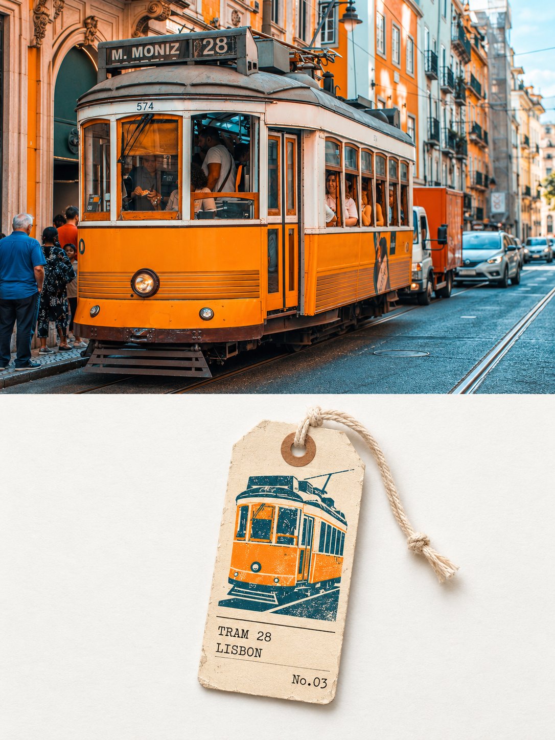
真实摄影旅行行李牌排版海报
来源: @Hamburgerai模型: ChatGPT
📸 示例图片
提示词
English
Please turn each photo I upload into an independent high-end design poster, no multi-photo stitching, each photo output separately. The overall composition uses a 3:4 vertical layout, with the upper and lower regions strictly 1:1 in height, each occupying 50% of the frame. The upper part preserves the original photo, maintaining the subject's identity, structure, posture, real texture, natural light and shadow, and the original color atmosphere, with only slight high-end color grading to give it the texture of an art magazine, independent publication, or exhibition image. To adapt to the aspect ratio, the environmental background can be naturally extended, but the subject must not be stretched, distorted, or changed. The upper part contains only the uploaded photo itself, following the original framing, without adding any text, borders, or graphics. The lower part extracts the most recognizable subject, silhouette, posture, and narrative relationship from the photo, reconstructing them as a travel luggage tag: a paper luggage tag with a cotton rope, placed vertically on a very light paper surface. Do not copy the photo; only retain the front silhouette and the most recognizable color block relationships of the subject, summarizing them into a small, highly recognizable partial graphic using flat color blocks and a few lines. No text, numbers, labels, or logos should appear in the graphic; any text from the photo should be omitted. The composition follows 'one small luggage tag, a large area of white space': the luggage tag occupies about three-fifths of the height and one-fifth of the width of the lower part, slightly tilted and leaning to one side; the top of the tag has two corners cut off, a reinforced circular ring at the punching hole, and a knotted cotton rope threaded through, with the rope falling naturally. The upper part of the tag surface is the small graphic, the lower part is a neatly arranged information area, separated by a thin line in the middle. The color scheme extracts three colors from the photo above: the three most eye-catching colors in the subject or scene, purified into bright spot color inks. The tag surface is a very light off-white cardstock color, bright and clean, not yellowish or grayish. The background paper is extremely light, with a brightness significantly higher than the luggage tag. The material is cardboard and printing: the edges of the tag are slightly worn and cornered, the reinforced ring of the punching hole has a bit of indentation, the printed color blocks have slight overprint misalignment and grain, and the rope has a real cotton thread texture. Wear and misalignment only exist on the edges of the tag and inside the graphics; the layout of the information area remains neat. Text appears only on the tag surface as follows: the first line of the information area (name of the subject, all caps English, no more than ten letters), the second line (name of the city or location where the photo was taken, all caps English; if unrecognizable, write the scene category of the subject), and the last line right-aligned (number in the form of 'No.03'). The font is a small typewriter font, arranged along a unified left margin and baseline, with a small font size and clear hierarchy. Other than this, no text, letters, numbers, or logos appear in the frame. The overall presentation is a visual relationship of real photography × travel luggage tag × field records, bright, clean, restrained, and with a sense of collectability. Avoid gray and dirty distressed effects, full-page textures, realistic illustrations, complex decorations, multiple luggage tags, commercial advertising copy, and template feels.
中文
请将我上传的每一张照片分别制作成一张独立的高级设计海报,不多图拼接,每张照片单独输出。整体采用3:4竖版构图,上下两个区域高度严格1:1,各占画面50%。

上半部分保留原始照片,保持主体身份、结构、姿态、真实质感、自然光影和原有色彩氛围,仅进行轻微高级调色,使其具有艺术杂志、独立出版物与展览图像质感。为适配画幅,可自然扩展环境背景,但不得拉伸、扭曲或改变主体。上半部分只放上传的照片本身,沿用原有取景,不添加任何文字、边框或图形。

下半部分提取照片中最具识别性的主体、轮廓、姿态与叙事关系,重构为一枚旅行行李牌:一张挂着棉绳的纸质行李牌,竖着放在极浅的纸面上。不要复制照片,只保留主体的正面轮廓与最有辨识度的色块关系,用扁平色块和少量线条概括成一枚小小的最有辨识度的部分图形,图形里不出现任何文字、编号、标牌或标志,照片中的字样一律省略。

构图遵循“一枚小行李牌、一大片留白”:行李牌约占下半部分高度的五分之三、宽度的五分之一,略微倾斜,偏向一侧;牌的上端是被剪去两角的形状,打孔处有一圈加固的圆环,穿着一根打结的棉绳,绳子自然垂落。牌面上部是小图形,下部是一块排版整齐的信息区,中间用一条细线分隔。

配色从上方照片中提取三种颜色:主体或场景里最醒目的三种颜色,提纯为明亮的专色油墨,牌面是极浅的米白卡纸色,明亮干净,不偏黄不发灰。背景纸极浅,明度明显高于行李牌。

材质是纸牌与印刷:牌的边缘略有磨损和折角,打孔的加固圈有一点压痕,印刷的色块带轻微的套印错位和颗粒,绳子是真实的棉线纹理。磨损和错位只存在于牌的边缘与图形内部,信息区的排版保持规整。

文字只出现在牌面,如下:牌面信息区第一行(主体的名称,全大写英文,不超过十个字母),第二行(照片所在的城市或地点名,全大写英文;认不出时写主体所在的场景类别),最后一行右对齐的(形如“No.03”的编号)。字体是小型打字机字体,沿统一的左边线和基线排列,字号小,层级清楚。除此之外画面中不出现任何文字、字母、数字或标志。

整体呈现真实摄影 × 旅行行李牌 × 田野记录的视觉关系,明亮、干净、克制、有收藏感。避免灰脏做旧、满版纹理、写实插画、复杂装饰、多个行李牌、商业广告文案和模板感。