高端果汁品牌电商详情页海报设计
来源: @ou_zhen599模型: ChatGPT
📸 示例图片
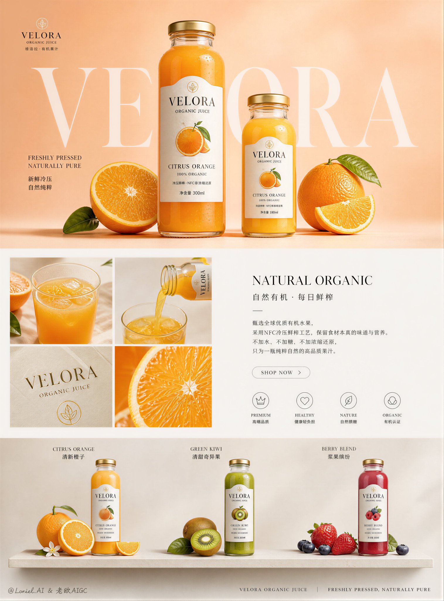
提示词
English
Create an ultra-premium e-commerce detail-page sales poster for a self-invented juice beverage brand, strictly preserving the exact original asymmetrical packaging-led layout logic, while pushing the image in the Milk Cloud Orbit direction and upgrading the whole page into a more collectible flagship sales visual. Do not change the original composition structure. Keep the same central hero packaging block, the same surrounding ingredient-image modules, the same alternating rounded-corner visual cards, the same left-right text explanation rhythm, and the same lower serving-scene storytelling flow. The final artwork must feel like a collector-edition commercial print for a luxury juice brand: hyper-real, clean, luminous, materially rich, elegantly quiet, and visually rare, with the entire page reading more like a design-award-winning brand object than an ordinary product detail page.

Brand identity:
Create a self-invented premium juice beverage brand such as “VELORA JUICE LAB”, “AUREL FRESH PRESS”, or “EMBER FRUIT RESERVE”. The hero product should be a premium bottled or boxed cold-pressed juice series that naturally fits the original central-pack composition. The brand must feel fresh, modern, organic, giftable, and internationally premium. Use a minimal official logo mark, elegant English main titles, and smaller refined Chinese subtitle lines.

Strict original structure:
This is critical. Preserve exactly:
- one strong central hero package vertically anchoring the page
- surrounding asymmetrical ingredient and texture image modules
- inserted left-right text explanation zones between image blocks
- rounded rectangular image cards in the same visual rhythm
- lower continuation of serving and ingredient storytelling
- overall reading order as one premium detail-page poster
Do not convert it into a homepage, grid collage, or alternative composition.

Central hero product block:
Place one dominant premium juice package in the center, acting as the spine of the page. It may be a luxury carton, glass bottle, or slim clear bottle with an exceptionally refined label. The packaging must feel materially expensive: crisp print detail, subtle matte or satin finish, elegant emboss feel, clean structural edges, premium cap or seal reflections, and beautiful liquid visibility if transparent. The hero pack should feel like a collectible object, almost worthy of display.

Milk Cloud Orbit material realism:
This is the main focus. Push tactile realism to the highest possible level:
- fruit flesh fibers and juicy translucency
- cut-edge wetness and fresh pulp tension
- peel pores and natural skin sheen
- liquid depth, meniscus, and inner glow inside bottle or glass
- condensation beads with believable edge tension
- packaging print sharpness, paper grain, film sheen, and embossed details
- glass reflections, wall thickness, and clean highlights
- puree, syrup, or cold-pressed liquid texture with natural viscosity
Everything must feel touchable, de-AI, and collector-grade.

Surrounding ingredient modules:
Around the central package, keep the original surrounding module logic but elevate every image into a premium material study:
- sliced citrus, berries, peach, kiwi, mango, apple, grape, or pomegranate
- bowls of puree or pressed fruit texture
- macro fruit segments, seeds, peel textures, and juice droplets
- elegant top-down ingredient arrangements on refined neutral surfaces
Every surrounding block must feel quieter, more sculptural, and more luxurious, like product-ingredient still lifes in a gallery.

Text explanation zones:
Preserve the original placement of text modules between image blocks. Use elegant English main titles such as:
- “Pure Fruit Structure”
- “Cold-Pressed Clarity”
- “Natural Ingredients”
- “Freshness in Layers”
with smaller Chinese subtitle support. Keep body copy short, refined, and airy. The text must feel beautifully typeset and secondary to the material photography.

Lower serving and usage blocks:
In the lower page area, continue the same original modular storytelling logic with serving-scene images and product usage visuals. Show the juice poured into elegant glassware, paired with sliced fruit, breakfast accents, or a chilled tabletop ritual. Keep the scenes highly controlled, premium, and product-led. These lower modules must feel like the continuation of one collectible editorial narrative.

More collectible flagship feeling:
This is critical. Make the whole detail page feel more like a collectible sales visual by:
- reducing unnecessary text density
- increasing negative space within each module
- using fewer but more precise props
- making each ingredient image feel like a luxury material study
- giving the central product stronger object-like status
- letting the page breathe like a premium poster rather than a standard e-commerce sheet
The result should feel suitable for both luxury online sales and printed brand showcase display.

Color direction:
Use a refined bright-organic palette of warm ivory, pale cream, citrus yellow, grapefruit coral, mango gold, kiwi green, berry red, and gentle leaf green accents. Preserve contrast between modules, but unify them into one mature premium brand family.

Lighting:
Use soft premium commercial lighting with bright daylight-like highlights, elegant shadow falloff, refined reflections on packaging and glass, and beautiful fruit realism. The page must feel luminous, fresh, and materially expensive without becoming noisy.

Typography and layout system:
Use minimal English main titles with smaller Chinese subtitle support. Unify all headings, body text, labels, and small callouts into one advanced flagship system with better spacing, calmer hierarchy, and more collectible editorial balance. The page must feel like a luxury brand artifact.

Rendering style:
ultra-premium juice beverage e-commerce detail page, strict original asymmetrical packaging-led layout, Milk Cloud Orbit tactile realism, collectible flagship sales visual, central hero juice package with surrounding ingredient modules, elegant English main titles with smaller Chinese subtitles, hyper-real fruit and liquid photography, award-winning editorial-commerce design, 8k, masterpiece quality

Negative prompt:
changed page structure, homepage layout, random collage composition, cheap juice ad, fake fruit texture, plastic-looking liquid, cluttered page, messy typography, generic template, low-end packaging, cartoon graphics, oversaturated colors, harsh flash lighting, noisy props
中文
为一家自创的果汁饮料品牌创作一张超高端电商详情页销售海报,严格保留原有的非对称包装主导布局逻辑,同时将图像推向“奶云轨道”(Milk Cloud Orbit)方向,并将整个页面升级为更具收藏价值的旗舰级销售视觉效果。不要改变原始的构图结构。保持相同的中心英雄产品包装块、相同的周围成分图像模块、相同的交替圆角视觉卡片、相同的左右文字解释节奏,以及相同的下方饮用场景叙事流。最终的作品必须感觉像是一个奢侈果汁品牌的收藏版商业印刷品:超真实、干净、透亮、材质丰富、优雅安静且视觉罕见,整个页面的阅读体验更像是一个获得设计奖的品牌艺术品,而非普通的商品详情页。

品牌标识:
创建一个自创的高端果汁饮料品牌,如“VELORA JUICE LAB”、“AUREL FRESH PRESS”或“EMBER FRUIT RESERVE”。核心产品应为高端瓶装或盒装冷压果汁系列,自然契合原始的中心包装构图。品牌必须感觉新鲜、现代、有机、适合作为礼物,并具有国际高端感。使用极简的官方标志、优雅的英文主标题和较小的精致中文副标题行。

严格的原始结构:
这是至关重要的。准确保留:
- 一个强有力的中心英雄包装,垂直锚定页面
- 周围非对称的成分和纹理图像模块
- 在图像块之间插入的左右文字解释区
- 具有相同视觉节奏的圆角矩形图像卡片
- 下方延续的饮用和成分叙事
- 整体阅读顺序为一个高端详情页海报
不要将其转化为首页、网格拼贴或替代构图。

中心英雄产品块:
在中心放置一个占主导地位的高端果汁包装,作为页面的脊梁。它可以是奢侈纸盒、玻璃瓶或带有极其精致标签的细长透明瓶。包装必须在材质上感觉昂贵:清晰的印刷细节、微妙的哑光或缎面触感、优雅的浮雕感、干净的结构边缘、高端瓶盖或封口反射,如果是透明的,则应有美丽的液体可见度。英雄包装应该感觉像是一个收藏品,几乎值得展示。

奶云轨道材质写实:
这是主要焦点。将触感写实推向最高水平:
- 果肉纤维和多汁的透明感
- 切边的湿润感和新鲜果肉的张力
- 果皮孔隙和自然的表皮光泽
- 瓶内或玻璃杯内液体的深度、弯月面和内部光泽
- 具有可信边缘张力的冷凝水珠
- 包装印刷的锐度、纸张纹理、薄膜光泽和浮雕细节
- 玻璃反射、壁厚和干净的高光
- 具有自然粘性的果泥、糖浆或冷压液体质感
一切都必须感觉触手可及、去AI化且达到收藏级。

周围成分模块:
在中心包装周围,保留原有的周围模块逻辑,但将每张图像提升为高端材质研究:
- 切开的柑橘、浆果、桃子、猕猴桃、芒果、苹果、葡萄或石榴
- 盛放果泥或压榨水果纹理的碗
- 宏观水果切片、种子、果皮纹理和果汁滴
- 在精致的中性表面上优雅的自上而下的成分排列
每个周围区块必须感觉更安静、更具雕塑感且更奢华,就像画廊中的产品成分静物画。

文字解释区:
保留图像块之间文字模块的原始位置。使用优雅的英文主标题,例如:
- “Pure Fruit Structure”
- “Cold-Pressed Clarity”
- “Natural Ingredients”
- “Freshness in Layers”
并配有较小的中文副标题支持。保持正文简短、精致且通透。文字必须排版精美,且次于材质摄影。

下方饮用及使用板块:
在页面下方区域,延续相同的原始模块化叙事逻辑,使用饮用场景图像和产品使用视觉效果。展示果汁倒入优雅的玻璃器皿中,搭配切片水果、早餐点缀或冰镇桌面仪式。保持场景高度受控、高端且以产品为主导。这些下方模块必须感觉像是一个可收藏的编辑叙事的延续。

更具收藏价值的旗舰感:
这是至关重要的。通过以下方式让整个详情页感觉更像是一件收藏级的销售视觉作品:
- 减少不必要的文字密度
- 增加每个模块内的负空间
- 使用更少但更精确的道具
- 让每张成分图感觉像是一场奢侈材质研究
- 赋予中心产品更强的物体感地位
- 让页面像高端海报一样呼吸,而不是标准的电商页面
结果应适用于奢侈品在线销售和印刷品牌展示。

色彩方向:
使用精致、明亮且有机的色调,包括暖象牙色、淡奶油色、柑橘黄、葡萄柚珊瑚色、芒果金、猕猴桃绿和柔和的叶绿点缀。保留模块之间的对比,但将它们统一为一个成熟的高端品牌家族。

光影:
使用柔和的高端商业照明,具有明亮的日光般高光、优雅的阴影衰减、包装和玻璃上的精致反射,以及美丽的写实水果。页面必须感觉亮丽、清新且材质昂贵,且不显杂乱。

排版和布局系统:
使用极简的英文主标题,并辅以较小的中文副标题支持。将所有标题、正文、标签和细小的标注统一为一个具有更好间距、更冷静层级和更具收藏价值编辑平衡感的高级旗舰系统。页面必须感觉像是一个奢侈品牌的手工艺品。

渲染风格:
超高端果汁饮料电商详情页,严格的原始非对称包装主导布局,奶云轨道触感写实,收藏级旗舰销售视觉,中心英雄果汁包装配周围成分模块,优雅英文主标题配较小中文副标题,超真实水果和液体摄影,屡获殊荣的商业编辑设计,8k,杰作质量

负向提示词:
改变的页面结构,首页布局,随机拼贴构图,廉价果汁广告,虚假的水果纹理,塑料感的液体,杂乱的页面,凌乱的排版,通用模板,低端包装,卡通图形,过饱和的色彩,刺眼的闪光灯照明,嘈杂的道具