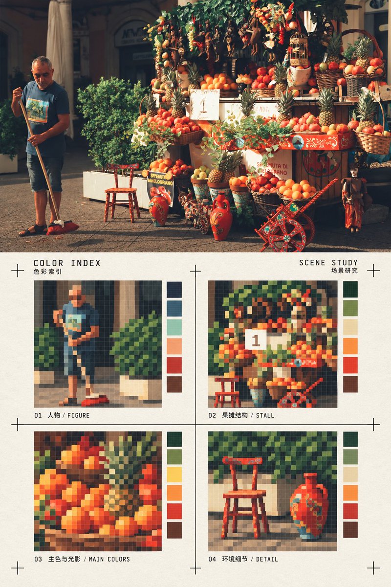
真实照片与像素色彩索引对比海报
来源: @Hamburgerai模型: ChatGPT
📸 示例图片
提示词
English
Use a single real photo as the sole source of content to create a vertical top-and-bottom comparison editorial poster. The upper half completely preserves the real photographic texture, subject identity, quantity, pose, spatial relationship, lighting, and composition of the input photo, without turning the photo into an illustration; the lower half is a stylized re-rendering area of the same photo: on warm white paper, the image is refined into four equal-sized square pixel color block indices, respectively corresponding to the most recognizable subject outline, architectural or object structure, relationship between main colors and light/shadow, and one environmental detail from the photo. Each grid uses hard-edged pixel blocks with a limited number of colors and a low-resolution grid feel, preserving traceable forms instead of random mosaics. The four grids are arranged in a 2×2 layout with ample paper space left around them; use thin black crosshair crop/registration marks to frame the index area, adding a very small amount of small bilingual titles and fields, such as "COLOR INDEX / SCENE STUDY," with restrained and clear text like print proof annotations that do not overshadow the main content. The lower half must look like a designed color index card, rather than a filter, ordinary pixelation, or repeated photo; do not add irrelevant objects or change the theme of the photo. The upper and lower areas each occupy about half, with a clear horizontal boundary; side-by-side layout is prohibited, multi-image collages are prohibited, "original/AI image" corner marks are prohibited, and watermarks and brand logos are prohibited. All colors are extracted and compressed from the input photo, and the content of the four grids changes according to the subject of the photo, applicable to any photo such as people, animals, architecture, street scenes, nature, interiors, food, and objects.
中文
使用一张真实照片作为唯一内容来源,制作一张竖版上下对比编辑海报。上半部完整保留输入照片的真实摄影质感、主体身份、数量、姿态、空间关系、光线和构图,不把照片画成插画;下半部为同一照片的风格化转绘区:在暖白纸面上,把画面提炼成四个等大的方形像素色块索引,分别对应照片中最有辨识度的主体轮廓、建筑或物体结构、主色与光影关系、一个环境细节。每格使用有限色数的硬边像素块和低分辨率网格感,保留可追溯的形体,不做随机马赛克。四格排列为2×2,周围留出充足纸面;用细黑色十字裁切/定位标记框住索引区域,加入极少量小型双语标题与字段,例如“COLOR INDEX / SCENE STUDY”,文字克制、清晰、像印刷校样标注,不喧宾夺主。下半区必须像一张经过设计的色彩索引卡,而不是滤镜、普通像素化或重复照片;不增加无关物件,不改变照片主题。上下区域约各占一半,水平边界清楚;禁止左右并排、禁止多图拼贴、禁止“原图/AI图”角标、禁止水印和品牌标志。所有颜色从输入照片提取并压缩,四格内容随照片主体变化,适用于人物、动物、建筑、街景、自然、室内、食物和物件等任何照片。