照片转高端设计感手绘记忆海报
来源: @Ziha_ai模型: ChatGPT
📸 示例图片
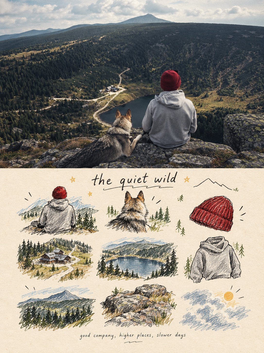
提示词
English
turn each photo I upload into a separate, high-end design poster. Do not combine multiple photos into a collage. Each photo must be processed and output individually.
1. Overall Layout and Composition
Use a 3:4 vertical aspect ratio.
Divide the canvas into two equal horizontal sections, with a strict 1:1 height ratio: the top half occupies exactly 50% of the canvas, and the bottom half occupies the remaining 50%.
2. Top Half — Original Photography
Preserve the original photograph in the upper section. Maintain the subject’s identity, structure, pose, realistic textures, natural lighting, shadows, and original color atmosphere. Apply only subtle, sophisticated color grading to achieve the aesthetic of an art magazine, independent publication, or gallery exhibition image.
You may naturally extend the environmental background to fit the composition, but never stretch, distort, or alter the subject.
3. Bottom Half — A Visual Memory Collection
Extract the most recognizable subjects, distinctive details, action cues, objects, and narrative relationships from the photograph. Reinterpret them as a visual system combining a modular 3×3 icon grid, naïve hand-drawn doodle illustrations, crayon/p colored-pencil textures, and handwritten typography.
Do not reproduce the original photograph in full detail, and do not create realistic illustrations. Instead, simplify the complex visual information into nine memorable visual elements. These may include:
The main subject
Distinctive physical or visual features
Personal belongings or objects
Plants or food
Modes of transportation
Poses or gestures
Emotional symbols
Small memorable details from the surrounding scene
Every element must be a semantic extension of the same photograph above, creating a cohesive “memory checklist” that clearly belongs to that specific image.
4. Grid System and Visual Arrangement
Use an implicit, loosely arranged 3×3 grid. The nine-cell structure should serve as an underlying compositional framework rather than a rigid, visible grid.
Slightly vary the position, scale, angle, and placement of each icon to create an organic, imperfect arrangement that feels structured but never mechanical. Aim for a natural loose grid / organic grid aesthetic.
At the top of the lower section, you may add a short handwritten title, accompanied by a few playful wavy lines, tiny stars, or decorative symbols.
At the bottom, include a very small handwritten caption, making the overall design feel like a page from a personal journal, visual diary, or curated collection sheet.
Maintain generous negative space. The layout should feel relaxed, cute, restrained, and visually balanced rather than cluttered.
5. Illustration Style and Texture
Use a Naïve Hand-Drawn Doodle Illustration style.
Keep shapes simple, slightly childlike, and intentionally imperfect.
Use subtly shaky outlines with irregular line thickness.
Allow contours to remain partially open rather than perfectly closed.
Preserve a sense of deliberate imperfection and handmade character.
Avoid overly dense coloring. Let the paper texture, white grain, and rough edges remain visible.
Combine fine black outlines with colored-pencil or crayon fills and a few selective blocks of color.
Use flat color / spot color to establish visual relationships instead of relying on realistic lighting and shading.
If grid guidelines are included, keep them extremely faint, as if lightly sketched in pencil, rather than using clean, computer-generated table lines.
Final Art Direction
The finished poster should feel like a sophisticated independent art publication blended with a playful, handmade visual diary. The upper half should preserve the beauty and authenticity of the original photograph, while the lower half transforms its most meaningful details into nine charming, hand-drawn visual memories.
The final result must be a separate 3:4 vertical poster for each uploaded photograph, with an exact 50/50 split between the original photograph and the illustrated memory collection.
中文
将我上传的每张照片转换为单独的高端设计海报。不要将多张照片合并为拼贴画。每张照片必须单独处理并输出。
1. 整体布局与构图
使用 3:4 的纵横比。将画布分为两个相等的水平部分,具有严格的 1:1 高度比:上半部分恰好占据画布的 50%,下半部分占据剩余的 50%。
2. 上半部分 — 原始摄影
在上部区域保留原始照片。保持主体的身份、结构、姿势、真实的纹理、自然的光线、阴影和原始色彩氛围。仅应用微妙而精致的调色,以达到艺术杂志、独立出版物或画廊展览图像的美学效果。你可以自然地扩展环境背景以适应构图,但绝不要拉伸、扭曲或改变主体。
3. 下半部分 — 视觉记忆收藏
从照片中提取最具辨识度的主体、独特的细节、动作暗示、物体和叙事关系。将它们重新解释为一个视觉系统,结合模块化的 3×3 图标网格、天真烂漫的手绘涂鸦插图、蜡笔/彩色铅笔纹理和手写排版。不要完全还原原始照片的细节,也不要创建写实的插图。相反,将复杂的视觉信息简化为九个令人难忘的视觉元素。这些可能包括:主要主体、独特的身体或视觉特征、个人物品或物体、植物或食物、交通工具、姿势或手势、情感符号、周围场景中微小而难忘的细节。每个元素必须是同一张上方照片的语义延伸,创建一个清晰属于该特定图像的凝聚力“记忆清单”。
4. 网格系统与视觉安排
使用隐式的、松散排列的 3×3 网格。九宫格结构应作为基础构图框架,而不是僵硬、可见的网格。略微改变每个图标的位置、比例、角度和摆放,以创造一种有机、不完美的排列感,让人感觉有结构但绝不机械。追求自然松散网格/有机网格的美学。在下半部分的最上方,你可以添加一个简短的手写标题,并配以一些俏皮的波浪线、小星星或装饰符号。在底部,加入一个非常小的手写说明,使整体设计感觉像个人日志、视觉日记或策划收藏页。保持充足的留白。布局应感觉轻松、可爱、克制且视觉平衡,而不是杂乱。
5. 插图风格与纹理
使用天真手绘涂鸦插图风格。保持形状简单,略带童趣且刻意不完美。使用线条粗细不均、略显颤抖的轮廓。允许轮廓保持部分开放,而不是完美的闭合。保留刻意的不完美感和手工特色。避免过于密集的着色。让纸张纹理、白色颗粒和粗糙边缘保持可见。结合纤细的黑色轮廓与彩色铅笔或蜡笔填充,以及少量的选定色块。使用平涂色/专色来建立视觉关系,而不是依赖写实的光影。如果包含网格引导线,请保持其极淡,如同铅笔轻描淡写,而不是使用干净的计算机生成表格线。
最终艺术指导
完成的海报应感觉像是精致的独立艺术出版物与俏皮的手工视觉日记的结合。上半部分应保留原始照片的美感和真实性,而下半部分则将其最有意义的细节转化为九个迷人的手绘视觉记忆。最终结果必须是针对每张上传的照片生成一张单独的 3:4 竖版海报,且原始照片与插图记忆收藏之间为精确的 50/50 比例。