东方文化艺术海报强主体巨型野字动势
来源: @MrLarus模型: ChatGPT
📸 示例图片
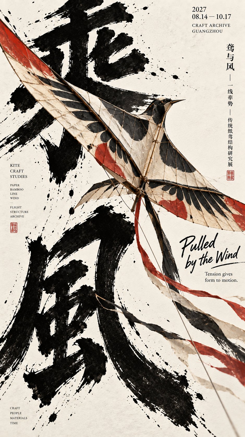
提示词
English
Make a 9:16 vertical Oriental culture and art poster, the core method is "strong subject + giant wild characters + clear momentum".

Use clean and warm ivory white art paper for the background, retaining slight paper texture. No complex backgrounds, no dirty aging, no templated layouts, let large areas of white space become part of the image.

Use two oversized black brush characters as the main visual skeleton in the image. The calligraphy should be thick, wild, and free, with obvious lifting and pressing, flying white, and realistic ink edges. The two characters should not be arranged too neatly; they can be misplaced, overlapped, echoing up and down, with some strokes directly going out of the frame.

Place a strong subject object in the center of the screen; the subject must be large enough, with a clear enough silhouette, and have real volume, material, and structure. The subject can be a paper kite, a large drum, a folding fan, a long blade, or other highly recognizable Oriental objects.

Most importantly, let the subject and the wild characters have a dynamic relationship that can be understood at a glance. Don't just place the object in front of the characters, but let the subject truly change the text: it can break the frame, impact, radiate, slant cut, pull open, intersperse, push, or let the strokes change with the direction and force of the subject.

The overall composition should have a very clear line of momentum. It can be a diagonal frame break, radial expansion, frontal impact, or a strong cutting axis. Let the audience feel the screen is "moving" at a glance, rather than a static display.

Adopt asymmetric editorial design for the layout. The central area is responsible for "strong subject + giant wild characters + momentum relationship", and small-sized exhibition information, dates, locations, and material descriptions are added to the left and right edges, giving the image both visual impact and a sense of publication for cultural exhibition posters.

Add a small amount of natural handwritten English titles, like notes added later by a designer. The English should not be too large, mainly playing a role in rhythm adjustment. A very small amount of vermilion seals can be added as embellishments, but do not pile up too many decorative elements.

The overall color scheme is controlled to warm ivory white, deep ink black, plus a main color of the subject itself. For example, the paper kite can have a small amount of cinnabar red, the big drum can use a deep red drum body, the folding fan can use off-white plus red brush marks, and the long blade is mainly cold silver gray. Colors should not be too cluttered.

The final effect should be like a high-completion Oriental exhibition poster: the subject is strong enough, the characters are wild enough, the direction is clear enough, and the visual tension is directly maximized. Suitable for poster references such as traditional crafts, Oriental culture, and exhibition visuals.

Avoid characters, ordinary product advertisements, e-commerce staged photos, Guochao illustrations, red and gold festive feelings, neon tech feelings, cheap CGI, and meaningless accumulations of ink dots.
中文
做一张 9:16 竖版东方文化艺术海报,核心方法是“强主体 + 巨型野字 + 明确动势”。

背景使用干净温暖的象牙白艺术纸,保留轻微纸张纹理。不要复杂背景,不要脏污做旧,不要模板化排版,让大面积留白成为画面的一部分。

画面里使用两个超大的黑色毛笔字作为主要视觉骨架。书法要粗重、野性、自由,带明显提按、飞白和真实墨迹边缘。两个字不要排得太工整,可以错位、压叠、上下呼应,部分笔画直接出画。

在画面中央放置一个强主体器物,主体必须足够大、轮廓足够清楚,并且有真实体积、材质和结构。主体可以是纸鸢、大鼓、折扇、长刃,或其他具有强识别度的东方器物。

最重要的是,让主体和野字发生一个一眼就能看懂的动态关系。不要只是把器物摆在字前面,而是让主体真正改变文字:可以破框、冲击、放射、斜切、拉开、穿插、推动,或者让笔画随着主体的方向和力量发生变化。

整体构图要有一条非常明确的动势线。可以是斜向破框、放射展开、正面冲击,或一条强烈的切割轴。让观众一眼就感到画面在“动”,而不是静态陈列。

版式上采用非对称编辑设计。中央区域负责“强主体 + 巨型野字 + 动势关系”,左右边缘再加入小尺寸展览信息、日期、地点和材质说明,让画面既有视觉冲击,也有文化展览海报的出版感。

加入少量自然手写英文标题,像设计师后来补上的注释。英文不要太大,主要起到节奏调节作用。可以再加入极少量朱红印章作为点缀,但不要堆太多装饰元素。

整体配色控制为暖象牙白、深墨黑,再加一个主体本身的主色。比如纸鸢可带少量朱砂红,大鼓可用深红鼓身,折扇可用米白加红刷痕,长刃则以冷银灰为主。颜色不要太杂。

最终效果要像高完成度的东方展览海报:主体够强,字够野,方向够明确,画面张力直接拉满。适合传统工艺、东方文化和展览视觉这类海报参考。

避免人物、普通产品广告、电商摆拍、国潮插画、红金节庆感、霓虹科技感、廉价 CGI,以及无意义的墨点堆积。