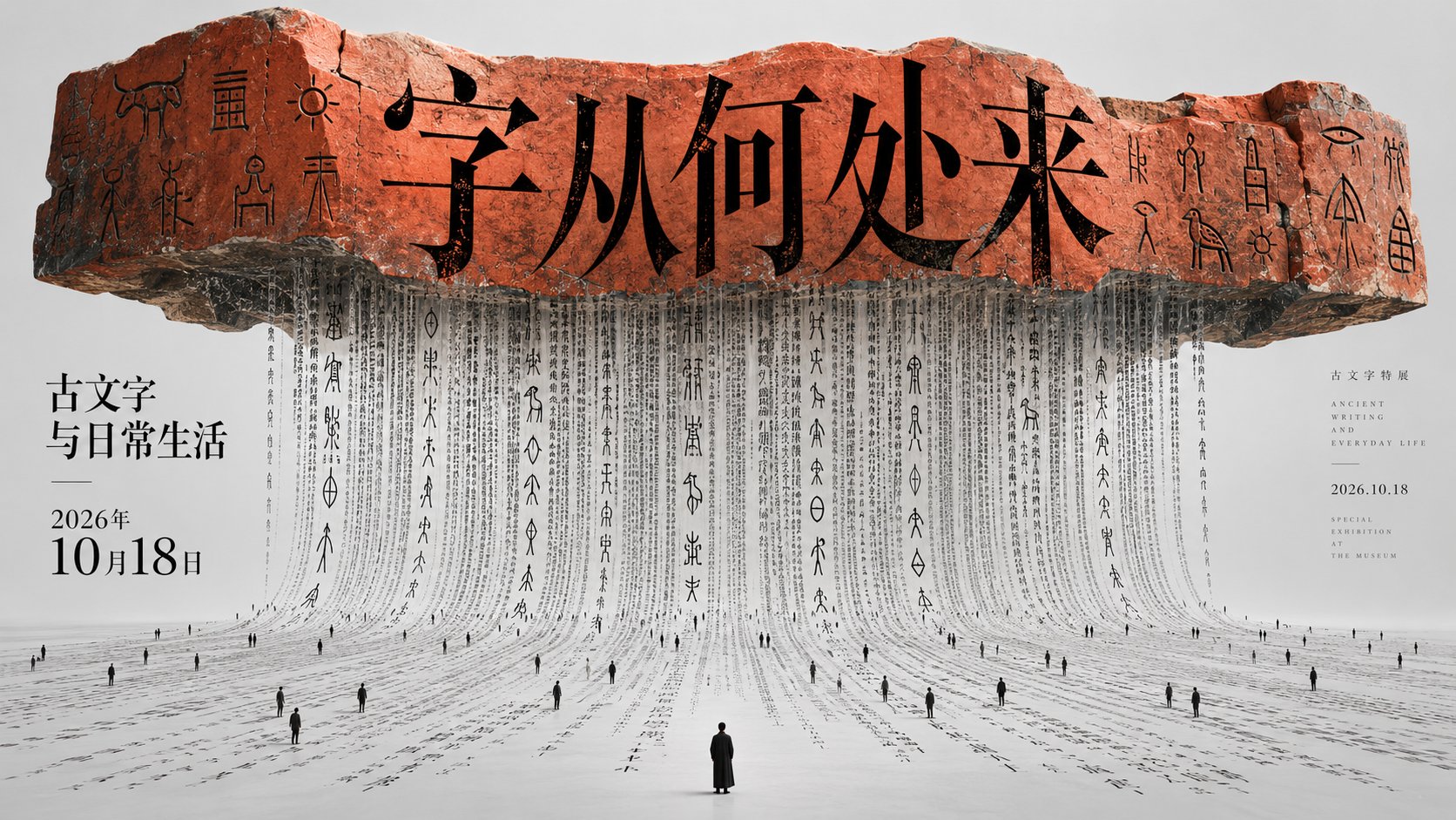
博物馆古文字展极简空间装置海报
来源: @xiaoxiaodong模型: ChatGPT
📸 示例图片
提示词
English
A huge horizontal text component suspended at the top of the image as the primary visual event, the component extends horizontally with soft undulating edges, dense text falls continuously from beneath it like a whole curtain made of characters and naturally spreads onto the lower plane, extremely small dark human figures are scattered on the text stream as scale references, forming an extreme contrast in size. Adopting a central axis stable and vertical gravity composition layout, the top retains a wide breathing area, the middle uses a horizontal heavy block to press down on the visual center, and the bottom allows fine vertical lines to extend outward, maintaining a balance of top-heavy, bottom-sparse, central focus, and bottom unfolding regardless of image size. The text layer and image layer serve as each other's figure-ground: the large text at the top is responsible for first-sight identification, the dense text stream in the center carries the main body texture and movement lines, and the tiny human figures only serve as pauses and scale markers; reading enters from the top title, follows the vertical text stream downward, and finally stops at a single larger human figure in the center below. No matter how much text there is, it follows this hierarchy; when text is insufficient, secondary small characters are added according to the theme. The title uses a slender high-contrast serif structure, narrowed counters, and thin, sharp strokes; the body text forms a continuous beat with dense vertical arrangement, tight but clear line spacing, and partial character sequences bending slightly along the curved surface. The text layer is like a final flat layer superimposed in the computer, pure black solid, sharp edges, the only element in the whole frame not affected by three-dimensional light and shadow. Whitespace adopts Gestalt figure-ground separation and negative space breathing: a large empty field at the top sets off the title, narrow ventilation gaps are reserved between the central character sequences, and the flat bottom surface surrounds scattered human figures, making the white space itself a scale and silence. The image only retains this text component provided by the theme, falling subtitles, and a few scale figures in the center, the rest is a clean, flat light gray base color without any other scenery. Adopting a composite method of photography and digital synthesis: using three-dimensional photographic lighting to shape realistic curved surfaces, shadows, depth of field, and edge reflections, using synthesis to accurately fit characters to curved surfaces and extend them to flat planes, and then covering titles and body text with sharp typesetting; overall like architectural photography combined with typography space installation. Color follows the contrast principle of low-saturation achromatic base and a single high-purity warm focal point, the overall is medium-high brightness, cool-toned, thin, restrained and quiet, the most intense color is concentrated only on the top horizontal component, the rest maintains a black-white-gray relationship; no matter what the theme is, it maintains this tendency of light and dark, thickness, cool and warm, and psychological feeling, like a thick and eye-catching spot color ink strip superimposed on a matte photographic negative. The temperament is quiet, solemn, and conceptual, with both Eastern writing order and contemporary installation feel. The theme, accurate text, use, and layout size appended at the end take priority; the top-heavy bottom-sparse skeleton, central falling text stream, extreme scale contrast, clean background, sharp computer typesetting, and single intense focus remain unchanged.

——————
Theme: Museum Ancient Text Exhibition Poster
Title: "Where Do Characters Come From"
Subtitle: "Ancient Characters and Daily Life"
Time: "October 18, 2026"
Horizontal 16:9
中文
以巨大横向文字构件悬置在画面上部为第一视觉事件,构件横向伸展,边缘有柔和起伏,密集文字从其下方连续垂落,像一整面由字组成的帘幕并自然铺到下方平面,极小的深色人形作为尺度参照散落在文字流上,形成极端的大小反差。采用中轴稳定与垂直重力构成版式,上方保留宽阔呼吸区,中部用横向重块压住视觉中心,下方让细密纵线向外延展,任何画面尺寸都维持上重下疏、中央聚焦、底部展开的平衡。文字层与图像层互为图底:顶部大字负责第一眼识别,中央细密字流承担主体质感与动线,微小人形只作停顿和尺度标记;阅读从上方标题进入,沿垂直字流向下,最后停在下方中心的单个较大人形。文字无论多少都守这个层级;文字不足时依主题补足次级小字。标题使用修长高对比衬线结构,字腔收窄、笔画纤细而锐利;正文以密集竖向排列形成连续节拍,行距紧而清楚,局部字列随曲面轻微弯折。文字层像最后在电脑里平整叠上去的一层,纯黑实心、边缘锐利,是全画面唯一不受三维光影影响的元素。留白采用格式塔的图底分离与负空间呼吸:顶部大块空场衬托标题,中部字列之间保留细窄通气缝,下方让平整底面包围散落人形,空白本身成为尺度和静默。图像只保留中央这一处由主题提供的文字构件、垂落字幕与少量尺度人物,其余是洁净平整的浅灰底色,不生出任何景物。采用摄影与数字合成的复合手法:用三维摄影式光线塑造真实弧面、阴影、景深和边缘反射,用合成把文字精确贴合曲面并延展到平面,再以锐利排字覆盖标题与正文;整体像建筑摄影结合字体排印的空间装置。色彩遵循低饱和无彩底与单一高纯度暖色焦点的对比原理,整体中高明度、偏冷、偏薄、克制而安静,最浓烈的色彩只集中在上方横向构件,其余维持黑白灰关系;无论什么主题都保持这种明暗、厚薄、冷暖倾向与心理感受,像哑光摄影底片上叠加一条厚实而醒目的专色墨带。气质沉静、庄严、观念化,兼具东方书写秩序与当代装置感。末尾追加的主题、准确文字、用途与版面尺寸优先;上重下疏的骨架、中央垂落字流、极端尺度反差、洁净底色、锐利电脑排字与单一浓烈焦点保持不变。

——————
主题:博物馆古文字展开展海报
标题:「字从何处来」
副标题:「古文字与日常生活」
时间:「2026年10月18日」
横版 16:9