现代东方编辑美学文化展览海报
来源: @MrLarus模型: ChatGPT
📸 示例图片
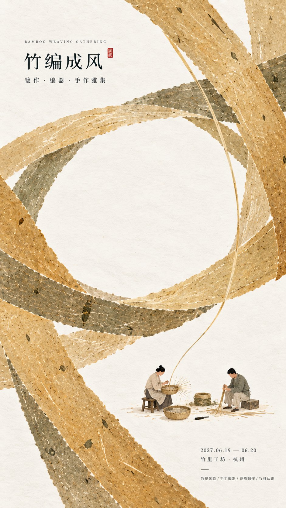
提示词
English
【Subject / Exhibition Name】{Fill in, e.g., Bamboo Weaving Craft / System of Weights and Measures / Ancient Postal Relays / Granary System}
【Main Title】{Fill in}
【Core Visual Structure】{Fill in, e.g., Circular Weaving / Balanced Horizontal Axis / Segmented Relay Paths / Staggered Granary Grids}
【Main Color Gamut】{Fill in 3–5 colors, e.g., Bamboo Yellow + Warm White + Gray-Green / Vermilion Ochre + Ink Blue + Earth Gold}
【Micro-scenes】{Fill in 1–3 real cultural behaviors, e.g., Bamboo weaving / Calibrating scales / Handover of documents / Grain storage registration}
【Cultural Elements】{Fill in a small number of necessary objects or institutional nodes}
【Exhibition Info】{Date / Location / Type, optional}
【Aspect Ratio】9:16 vertical

Design a cultural exhibition poster with modern Oriental editorial aesthetics, using "paper fiber + large color gamut + micro-scenes" as the core visual language. First, refine a structural relationship that best represents the essence of the content based on the [Subject / Exhibition Name], making the [Core Visual Structure] directly become the compositional skeleton of the entire image, rather than painting an ordinary scene first and then overlaying text. For example, one can use the interleaving of paper ribbons to represent weaving, huge horizontal axes and end blocks to represent measurement, continuous segmented color gamuts to represent information transmission, and staggered heavy blocks to represent storage and order.

Use the [Main Color Gamut] to establish 2–5 large paper-based color blocks with clear scale differences. The color blocks should have real, rich, yet clean textures of handmade paper, watercolor pulp, or mineral pigments, visible natural long and short fibers, herbal fibers, pulp particles, pigment deposits, slight indentations, large-scale natural color variations, and irregular torn paper edges. The color surfaces should remain intact, matte, and heavy, without being dirty, old, yellow-spotted, randomly mottled, heavily noisy, or having cheap vintage effects. When viewed from a distance, one should first see clear large color gamut relationships and structural actions, remaining clearly recognizable even when reduced to social media feed sizes.

The large color gamut is not background decoration but must truly carry the content logic. Based on the theme, let the paper blocks intersperse, bite, enclose, support, segment, stagger, balance, surround, or continuously transmit, allowing the audience to first feel core concepts such as "weaving, measuring, relaying, storing" without reading the text. Avoid making the image into a regular PPT grid, flowchart, or ordinary Chinese-style collage.

Embed small-scale [Micro-scenes] between the large color gamuts, with figures and props generally occupying about 3%–6% of the frame. Figures must be performing a real action, such as weaving bamboo, measuring with a ruler, handing over documents, changing horses, measuring grain, or registering granary records, rather than posing for a photo. If the theme itself includes a process, 2–3 continuous small nodes can be set to let the miniature figures bear the narrative function; if the theme is more craft-oriented, a single complete small scene is sufficient. The number of [Cultural Elements] in the scene should be restrained, keeping only the objects, tools, documents, or markings that truly explain the theme, without commercial displays or piling up traditional cultural symbols.

A very small amount of cinnabar red, warm orange, old gold, or deep ink can be used as visual nodes, such as seals, strips, lights, rulers, document stamps, etc., but they must have a real relationship with the content, with the total area usually controlled at 1%–3%. Do not randomly add seals, auspicious clouds, flying birds, landscapes, or decorative patterns for the sake of "Oriental feeling."

Typography adopts the language of modern cultural institutions, museums, archival exhibitions, or Oriental editorial design. The main title [Main Title] uses slender, upright Chinese Songti, Mingti, or modern fonts with a sense of publication, maintaining small to medium font sizes so the text does not overpower the large color gamut. Small font sizes are used for auxiliary English, dates, locations, and exhibition descriptions to form a clear hierarchy. Text is only responsible for information and does not bear the main visual impact; all content must have real meaning, not using meaningless placeholders like RANDOM, DESIGN, ART, STUDIO, etc.

The overall reading order should be: large paper color gamut and structural relationships → thematic concepts and spatial logic → miniature figure scenes and cultural behaviors → title and exhibition information. The final image should achieve strong memory points for large shapes, color gamuts, and compositions when viewed from afar, while paper fibers, figure actions, institutional nodes, and object details are only discovered upon close inspection, possessing both material texture and a sense of narrative and methodology.

Avoid: book cover vibes, ordinary traditional Chinese-style illustrations, realistic photographic backgrounds, screen-full of ancient architecture, large ancient-costume figures, huge titles, PPT-style layouts, modern infographic arrows, stacking of elements, meaningless English, commercial advertising feel, dirty/old paper, 3D CGI, glass materials, plastic feel, neon colors, logos, watermarks, numbering, and starburst decorations.
中文
【主题 / 展览名称】{填写,例如:竹编工艺 / 度量衡制度 / 古代邮驿 / 仓储体系}
【主标题】{填写}
【核心视觉结构】{填写,例如:环形编织 / 平衡横轴 / 分段驿路 / 错层仓格}
【主色域】{填写 3–5 个颜色,例如:竹黄 + 暖白 + 灰绿 / 朱赭 + 墨青 + 土金}
【微场景】{填写 1–3 个真实文化行为,例如:竹编制作 / 校验尺度 / 文书交接 / 收粮登记}
【文化元素】{填写少量必要器物或制度节点}
【展览信息】{日期 / 地点 / 类型,可选}
【画幅比例】9:16 竖版

设计一张具有现代东方编辑美学的文化展览海报,以「纸纤维 + 大色域 + 微场景」作为核心视觉语言。先根据【主题 / 展览名称】提炼一个最能代表内容本质的结构关系,让【核心视觉结构】直接成为整个画面的构图骨架,而不是先画普通场景再叠加文字。例如可以利用纸色带的交错表现编织,用巨大横轴与两端块面表现衡量,用连续分段色域表现信息传递,用错层厚重块面表现储备与秩序。

使用【主色域】建立 2–5 个具有明确尺度差异的大型纸本色块。色块应具有真实、丰富但干净的手工纸、水彩纸浆或矿物颜料质感,可见天然长短纤维、草本纤维、纸浆颗粒、颜料沉积、轻微压痕、大尺度自然色差与不规则撕纸边缘。色面保持完整、哑光、有重量,不做脏旧、黄斑、随机斑驳、强噪点或廉价复古效果。远看时应首先看到清楚的大色域关系和结构动作,即使缩小到社交媒体信息流尺寸仍然有明显识别度。

大色域不是背景装饰,而要真正承担内容逻辑。根据主题让纸块发生穿插、咬合、围合、承托、分段、错层、平衡、环绕或连续传递,让观众在不阅读文字的情况下也能先感受到“编织、衡量、接力、储备”等核心概念。避免把画面做成规则PPT网格、流程图或普通国风拼贴。

在大色域之间嵌入尺度很小的【微场景】,人物与道具总体约占画面3%–6%。人物必须正在执行一个真实动作,例如编竹、量尺、交接文书、换马、计量粮食或登记仓册,而不是站立摆拍。若主题本身包含流程,可设置2–3个彼此连续的小节点,让微型人物承担叙事功能;若主题更偏工艺,则保留一个完整小场景即可。场景中的【文化元素】数量要克制,只保留真正能够说明主题的器物、工具、文书或标记,不做商品陈列,也不要堆满传统文化符号。

可以使用极少量朱砂红、暖橙、旧金或深墨色作为视觉节点,例如印记、封条、灯火、标尺、文书盖印等,但必须与内容发生真实关系,总面积通常控制在1%–3%。不要为了“东方感”随机增加印章、祥云、飞鸟、山水或装饰花纹。

排版采用现代文化机构、博物馆、档案展览或东方编辑设计语言。主标题【主标题】使用纤细、端正的中文宋体、明朝体或具有出版感的现代字体,保持中小字号,不让文字压过大色域。辅助英文、日期、地点、展览说明使用更小字号,形成清楚层级。文字只负责信息,不承担主要视觉冲击,所有内容必须有真实意义,不使用 RANDOM、DESIGN、ART、STUDIO 等无意义占位词。

整体阅读顺序应为:大型纸色域与结构关系 → 主题概念与空间逻辑 → 微型人物场景和文化行为 → 标题与展览信息。最终画面应做到远看有强烈大形、色域和构图记忆点,近看才发现纸纤维、人物动作、制度节点和器物细节,既有材料质感,也有叙事与方法感。

避免:书籍封面既视感、普通传统古风插画、写实摄影背景、满屏古建筑、大型古装人物、巨大标题、PPT式排版、现代信息图箭头、元素堆砌、无意义英文、商业广告感、脏旧纸张、3D CGI、玻璃材质、塑料感、霓虹色、Logo、水印、编号和星芒装饰。