极简实验主义文字排版海报设计
来源: @xiaoxiaodong01模型: ChatGPT
📸 示例图片
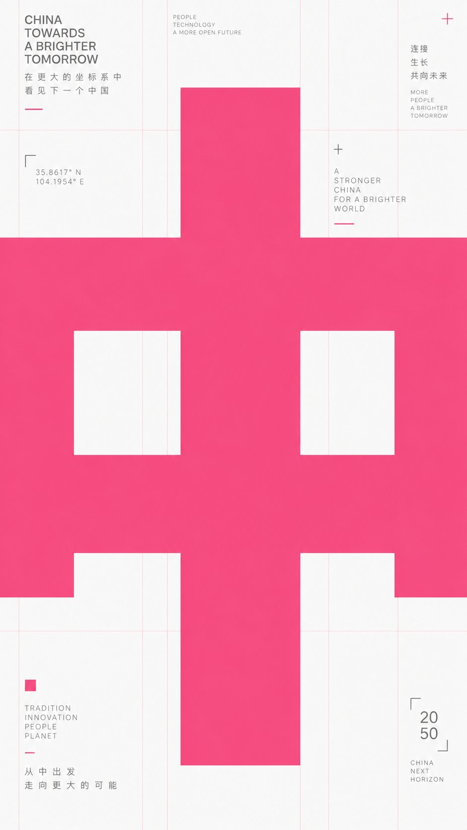
提示词
English
Based on the core concept, short phrase information, and a small amount of auxiliary explanation provided by any future theme, translate the theme into an extremely enlarged text or symbol subject: the first sight must be thick sans-serif glyphs almost filling the screen, horizontally pressed into the layout, the character body occupying the center like a structural beam, partially cropped or crossing boundaries, making reading a strong physical event first, and then reading the subtitle at its edges. Keep the background with a large area of cold white space, superimposed with extremely thin, light warm-colored composition lines, baseline lines, and vertical column lines; the lines are like the unhidden skeleton of a design draft rather than decoration. The main color uses only high-saturation orange-red to bear all the visual weight, gray is used for short explanatory text, avoid multi-colors and gradients. Information modules are sparsely attached to grid intersections and edges: small icons consist of simple geometric angles, dots, and short horizontal lines; titles are short and bolded, body text is in narrow columns of light gray, overall presenting a precise, restrained, and experimental layout teaching feel. Glyph construction requires low contrast, thick strokes, large open internal white space, flat straight endpoints, tight letter spacing, punctuation and subsidiary symbols also follow the grid rhythm; if replaced with other writing systems, maintain the same thick block volume, internal and external spatial relationships, cropping pressure, and horizontal reading momentum. Prohibit illustrated backgrounds, shadows, textured paper feel, centered cards, rounded cuteness, commercial poster lighting effects, and overfilled information. —————— Theme: Le (Happiness) Aspect Ratio: 9:16 Note: Appropriate Mid-Autumn Festival elements Font Color: Gucci Ancora Red
中文
由任意未来主题提供核心概念、短句信息和少量辅助说明,将主题转译为一个极端放大的文字或符号主体:第一眼必须是几乎撑满画面的粗重无衬线字形横向压入版面,字身像结构梁一样占据中心,局部被裁切或越界,使阅读先成为强烈的形体事件,再在其边缘读到副标题。背景保持大面积冷白留空,叠加极细、浅暖色的构图线、基准线和竖向分栏线,线条像设计稿未隐藏的骨架而非装饰。主色只用高饱和橙红承担全部视觉重量,灰色用于小段说明文字,避免多彩和渐变。信息模块稀疏地贴在网格交点和边缘:小图标由简单几何角、点、短横构成,标题短促加粗,正文窄列轻灰,整体呈现精确、克制、实验性的版式教学感。字形构造要求低对比、厚笔画、大开放内白、平直端点、紧密字距,标点和附属符号也服从网格节奏;若换成其他文字系统,保持同等的粗块量、内外空间关系、裁切压力和横向阅读动势。禁止插画化背景、阴影、纹理纸感、居中卡片、圆润可爱化、商业海报光效和过度排满信息。

——————
主题:乐
比例:9:16
注意:适当的中秋元素
字体颜色:古驰安可拉红