极简艺术海报字体排版设计指令
来源: @Hamburgerai模型: ChatGPT
📸 示例图片
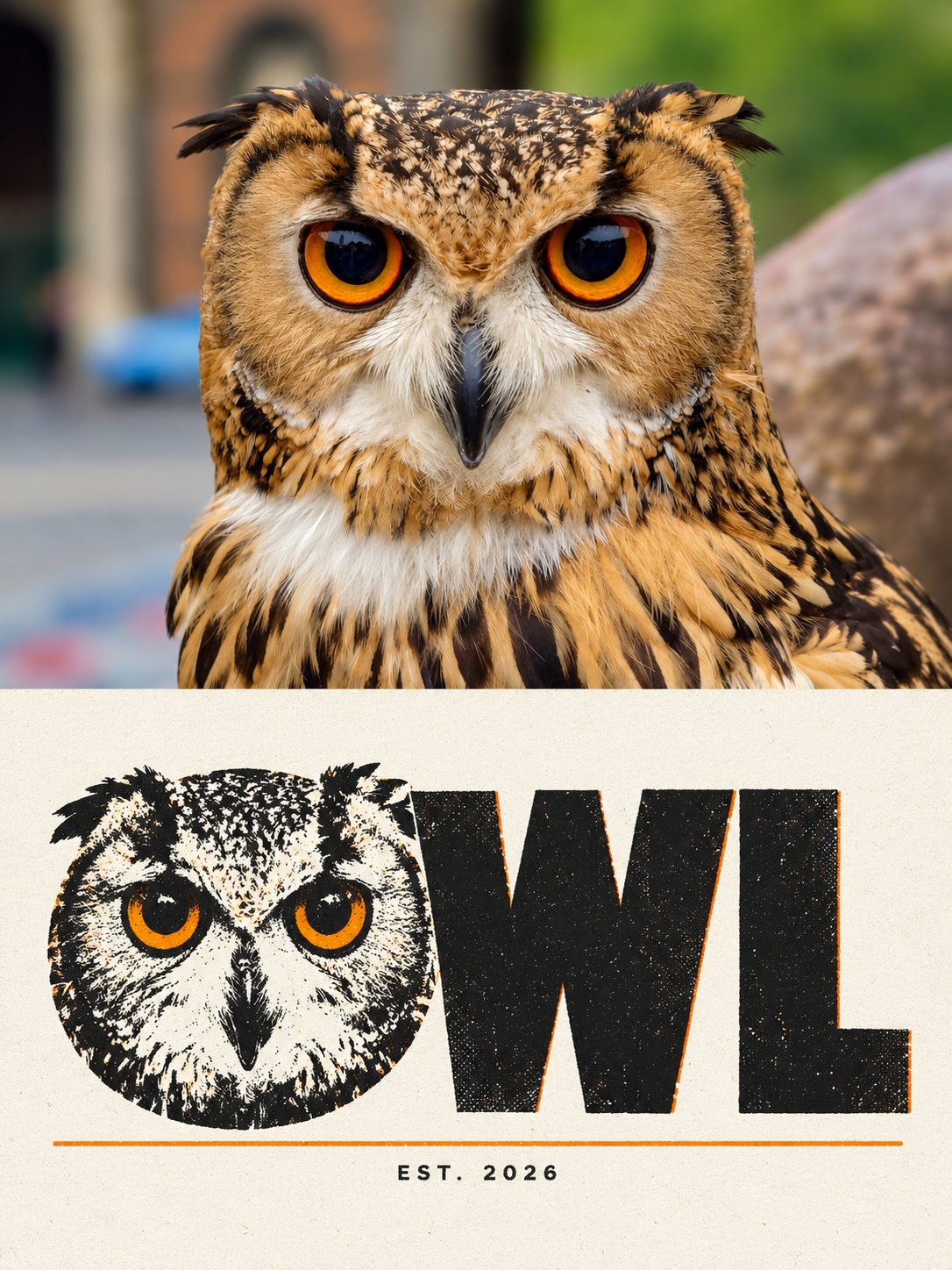
提示词
English
Please turn each photo I upload into an independent high-end design poster, no multi-image stitching, output each photo separately. Use an overall 3:4 vertical composition, with the upper and lower areas being strictly 1:1 in height, each occupying 50% of the frame.

The upper half preserves the original photo, maintaining the subject's identity, structure, posture, realistic texture, natural lighting, and original color atmosphere, with only slight high-end color grading to give it the texture of an art magazine, independent publication, or exhibition image. To fit the frame, the environmental background can be naturally extended, but the subject must not be stretched, distorted, or changed. The upper half only contains the uploaded photo itself, following the original framing, without adding any text, borders, or graphics.

The lower half extracts the most recognizable subject, outline, posture, and narrative relationship from the photo, reconstructing it into a full-bleed typographic poster: the subject's English name occupies the width of the lower half, with one of the letters replaced by the subject's most critical outline, as if the text itself grew into the subject. Do not place the graphic next to the text, and do not make it an "icon plus title".

The composition follows "one word, one replaced letter": all capital letters of the subject's English name occupy about 80% of the width of the lower half, centered and slightly lower, with thick letters and tight spacing; one most suitable letter (e.g., I can be a neck, O can be a face, M can be peaks, S can be a curved neck) is replaced by the subject's most critical outline, maintaining the original shape and readability of this letter, while the remaining letters remain regular sans-serif geometric shapes. Leave large areas of white space above and below the letters, with a thin line below the letters, and a line of extremely small text below the line.

Only use two colors: the main body of the letters uses a near-black deep charcoal color, and the replaced letter and the thin line below use one of the most prominent accent colors from the photo; the background is a very light cream white. Colors are flatly applied, no gradients.

The texture is clean screen printing: there are slight registration misalignments and tiny particles at the edges of the color blocks, and the paper surface has very fine fibers; misalignments only appear inside the letters, and the outer shape of the letters remains clear and accurate.

There are only two places for text, as follows: large text (the subject's all-caps English name, one word, no more than eight letters, choose a word where one of the letters can be replaced by the subject's outline), and small text under the thin line "EST. 2026". Other than that, no text, letters, numbers, or logos appear in the image.

The overall pursuit is a thick, eye-catching, and slightly humorous typographic design, where the graphic and text merge into one. Avoid simple icon plus text, decorative fonts, cartoonization, multiple replaced letters, commercial advertisement copy, and a template feel.
中文
请将我上传的每一张照片分别制作成一张独立的高级设计海报,不多图拼接,每张照片单独输出。整体采用3:4竖版构图,上下两个区域高度严格1:1,各占画面50%。

上半部分保留原始照片,保持主体身份、结构、姿态、真实质感、自然光影和原有色彩氛围,仅进行轻微高级调色,使其具有艺术杂志、独立出版物与展览图像质感。为适配画幅,可自然扩展环境背景,但不得拉伸、扭曲或改变主体。上半部分只放上传的照片本身,沿用原有取景,不添加任何文字、边框或图形。

下半部分提取照片中最具识别性的主体、轮廓、姿态与叙事关系,重构为一幅满幅的字体海报:主体的英文名占满下半部分的宽度,其中一个字母被主体最关键的轮廓取代,像是文字自己长出了主体。不要把图形放在文字旁边,也不要做成“图标加标题”。

构图遵循“一个词、一个被替换的字母”:主体英文名的全部大写字母占下半部分宽度的约八成,居中略偏下,字母粗壮、间距紧;其中一个最适合的字母(如 I 可当脖子、O 可当脸、M 可当双峰、S 可当弯颈)被主体最关键的轮廓取代,要保持这个字母原本的形状与可读性,其余字母保持规整的无衬线几何体。字的上方和下方留出大面积留白,字下方有一条细线,线下有一行极小的字。

配色只用两种:字母主体用近黑的深炭色,被替换的字母与下方的细线用照片里的一种最醒目的强调色;背景是极浅的奶白。颜色平涂,不用渐变。

材质是干净的丝网印:色块边缘有轻微的套印错位和细小的颗粒,纸面带极细的纤维;错位只出现在字母内部,字母的外形保持清晰准确。

文字只有两处,如下:大字(主体的全大写英文名,一个词,不超过八个字母,要选其中某个字母可以被主体轮廓替换的词),细线下的小字“EST. 2026”。除此之外画面中不出现任何文字、字母、数字或标志。

整体追求粗壮、醒目、有一点幽默的字体设计,图形与文字合为一体。避免简单图标加文字、装饰性字体、卡通化、多个替换的字母、商业广告文案和模板感。