凌晨海岸观测记录海报视觉风格
来源: @xiaoxiaodong模型: ChatGPT
📸 示例图片
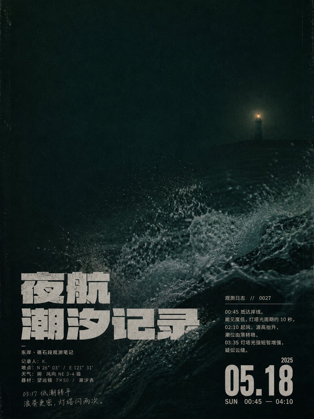
提示词
English
First establish a visual event recognizable at a glance: a large area of low light, a nearly static deep cold-colored environment occupying the main space, with a very small but bright and warm circular focal point suspended in the empty field, suppressing the whole scene with extreme scale contrast and warm-cold contrast; the lower part forms a second event with a darker horizontal base and a suddenly raised high-energy texture with a sense of grain and spray, allowing the quiet distance and the violent movement nearby to exist simultaneously. The image adopts a photographic documentary texture rather than a refined commercial texture, with dark cyan, ink blue, and blackish brown forming a narrow color gamut, the highlights being a restrained old gold, and local highlights tending towards grayish white; retain slight out-of-focus, low clarity, darkened shadows, simulated high-sensitivity noise, weak color shifts, and uneven exposure, without adding gorgeous halos, smooth gradients, or over-sharpening. The spatial organization centers on a large white space at the top and dense information at the bottom, with the horizontal horizon-style boundary pressed low, and movement textures allowed to be cropped out of bounds; all text is attached to the lower dark areas and texture boundaries, like magazine inner pages and private diaries overprinted on photos. The main title uses a heavy, compact, low-center-of-gravity sans-serif construction, with glyphs composed of thick, nearly equal-width strokes, short flat-cut endpoints, solid connections, small internal cavities, and tight letter spacing, which can be divided into two lines of staggered stacking and partially overlap with the surging texture; no matter what writing system the target text uses, it maintains its orthographic recognizability, original reading direction, and natural marking positions, achieving the same sense of oppression through literal area, stroke weight, and rhythm, without imitating a specific source alphabet. Auxiliary information uses lighter but still slightly rough sans-serif characters, with small font sizes forming two groups on the left and right: one group is a hierarchy of short notes and signatures, and the other consists of date-like numbers, short tags, thin horizontal lines, and compact body text; numbers can be significantly enlarged as navigation anchors, and the body text maintains short lines, loose line spacing, and the slight irregularity of manual typesetting. The copy content must serve the current theme and not copy any source wording, brands, or signatures; the white characters are not purely bright, but have slight grayness, edge softening, and print bleeding, making the text, noise, and photographic grain share the same old media surface. The overall temperament is restrained, lonely, with a sense of nighttime recording, letting the tension between the tiny bright spots, huge negative space, bottom movement, and editorial-style text become an irreplaceable design touch.

——————

Make it into a Late Night Coast Observation Record Poster: use deep ink green as the large-area low-light environment, gray-cyan for the lower wave foam support, and dark amber yellow for the only warm point, maintaining a narrow color gamut, low saturation, old media grain, and a color grammar of cold and dark surrounding warm and bright. A tiny lighthouse is suspended towards the upper right, the line of sight falls along the diagonal wave ridge into the bottom-left dense area, and a huge empty field is reserved in the upper left; the main title is staggered and stacked in two oversized lines on the bottom left, and the date anchor is independently placed on the bottom right, forming a strong primary-secondary relationship. The copy revolves around night sailing and tide observation, and the aspect ratio is vertical 3:4.
中文
先建立一眼可辨的视觉事件:大面积低照度、近乎静止的深冷色环境占据主体空间,一个尺寸极小却明亮温暖的圆形焦点悬置在空场中,以极端尺度反差和冷暖反差压住全局;下部由更暗的水平基底与突然抬起、带颗粒和飞沫感的高能纹理形成第二重事件,让安静的远处与近处的猛烈运动同时存在。画面采用摄影纪实质感而非精修商业质感,暗青、墨蓝、黑褐构成窄色域,亮点呈克制的旧金色,局部高光偏灰白;保留轻微失焦、低清晰度、压暗阴影、模拟高感光噪点、微弱色偏和不均匀曝光,不添加华丽光晕、顺滑渐变或过度锐化。空间组织以上部巨大留白、下部密集信息为核心,地平式横向分界压低,运动纹理允许裁切出界;所有文字贴附于下方暗部和纹理交界,像杂志内页与私人日记叠印在照片上。主标题使用粗重、紧凑、低重心的无衬线构造,字形由宽厚近等粗笔画、短促平切端点、结实连接、较小内腔和紧密字距组成,可分成两行错位堆叠,并与翻涌纹理局部交叠;无论目标文字采用何种书写系统,都保持其正字法可识别性、原阅读方向与自然标记位置,以字面面积、笔画重量和节奏实现同等压迫感,不模仿某一种来源字母。辅助信息使用较轻但仍略粗糙的无衬线字,小字号形成左右两组:一组是短注与署名式层级,另一组由日期感数字、短标签、细横线和紧凑正文组成;数字可明显放大作为导航锚点,正文保持短行、松弛行距和轻微手工排版的不齐。文案内容必须服务当前主题,不复制任何来源措辞、品牌或署名;白色字并非纯净发亮,而是带轻微灰度、边缘柔化和印刷渗化,使文字、噪点与摄影颗粒共享同一种旧媒介表面。整体气质克制、孤独、带夜间记录感,让微小亮点、巨大负空间、底部运动与编辑式文字之间的张力成为不可替代的设计手感。

——————
做成凌晨海岸观测记录海报:以深墨绿为大面积低照度环境,灰青作下部浪沫支撑,唯一暖点用暗琥珀黄,保持窄色域、低饱和、旧媒介颗粒与冷暗包围暖亮的颜色语法。微小灯塔偏右上悬置,视线沿斜向浪脊跌入左下密集区,左上保留巨大空场;主标题在底部左侧以超大两行错位堆叠,日期锚点独立置于右下,形成强烈主次。文案围绕夜航与潮汐观测,画幅为竖版 3:4。