克里姆特风日式美术馆艺术海报设计
来源: @MrLarus模型: ChatGPT
📸 示例图片
提示词
English
Exhibition Name: [Chinese Exhibition Name]
English Exhibition Name: [English Name]
Character Setting: [Adult character's appearance, hairstyle, expression, and posture]
Clothing and Action: [Dress style, fabric flow, hand movements, hands may not appear]
Main Color Palette: [Main clothing color + background color]
Decorative Patterns: [Branches, feather patterns, flowers, wheat ears, or custom patterns]
Text Color: [Deep Black / Cream White]
Exhibition Info: [Subtitle, exhibition dates, venue, opening hours]

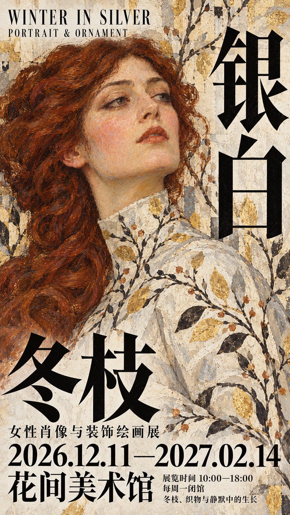
Design a 9:16 vertical art exhibition poster, blending Klimt-style decorative painting with Japanese museum editorial typography. Let the clothing and background connect through patterns, keep the oil painting volume of the character's face, and have the giant Chinese title directly participate in the composition.

Use an original adult character's half-body portrait as the main visual, heavily cropping parts of the hair, shoulders, and sleeves. The face is located in the upper half, with a left-leaning or right-leaning composition according to the character's orientation. Use shoulders, backs, shawls, or wide sleeves to form a clear large shape, establishing a diagonal, curved, or vertical movement in the image. If hands appear, ensure that the connection of fingers, wrists, and forearms is natural, the movements are simple, and they are not blocked by the title.

The face is shaped with small oil painting strokes of ochre, grayish-pink, cool gray, and dark red, with colors changing according to bone transitions, retaining base color exposure and soft/hard edges. The brushstrokes on the face and hands are finer, while hair, fabric, and background are more free. Avoid photographic skin smoothing, smooth digital gradients, and covering the entire image with the same thick impasto texture.

服饰以所填主色形成宽阔、连贯的色块,用少量衣褶交代身体与织物的体积,其余区域逐渐转为平面装饰。让所填纹样顺着肩背、衣袖、披肩弧度或衣褶方向展开,局部越过衣服轮廓,延伸进背景,使人物与环境属于同一幅绘画。

Clothing forms broad, continuous color blocks in the filled main color, using a few folds to explain the volume of the body and fabric, with other areas gradually turning into flat decoration. Let the filled patterns unfold along the curve of the shoulder/back, sleeves, shawl, or direction of folds, partially crossing the clothing outline and extending into the background, making the character and environment belong to the same painting.

Patterns have changes in priority, size, and density, avoiding equidistant repetition. Keep the area near the face and hands quiet; the sleeves, shoulders/back, and edges of the frame can be richer. Elements like plants and feathers must be converted into flat patterns, avoiding becoming handheld props or stacks of real objects.

Organize decorative details with matte gold, yellow ochre, cream white, dark bronze, or blackish-brown, retaining pigment layering, brush marks, and subtle printing grain. The gold area follows the main color tone, so that not every image becomes a full gold background. Use dark branch lines and black text for light themes, and cream white text for dark themes, while preserving the dark layers of the fabric. Avoid mirror metal, 3D relief, jewelry inlay, and glowing special effects.

Design the Chinese exhibition title as slender Songti or Mincho characters with strong thickness contrast. According to the large shape of the person and fabric, use vertical alignment along the edge, staggered horizontal and vertical, or partial horizontal spanning layouts. The text is directly overprinted on the painting and not placed in a separate title box. Protect the face, hands, and key actions; ensure the main character shapes are complete and accurate; complex Chinese characters should not be split, spliced, or deformed.

The English exhibition name is arranged at the top in a slender English font. The exhibition information is overprinted directly at the bottom, forming a three-level scale with eye-catching dates, medium-sized venue names, and compact small descriptions. The text groups share a clear alignment line and land in relatively quiet areas of the painting, without setting a separate color block bottom bar. All exhibition info remains completely within the frame, retaining safety margins.

The overall presentation is a combination of an art reproduction and mature exhibition layout. When viewed zoomed out, the face, main clothing color blocks, and giant characters are clear; when zoomed in, brushstrokes, fabric patterns, and exhibition info details are visible. Unified painting language, font temperament, and exhibition info format within the series, with variations produced through character posture, light and shadow, patterns, and fabric direction.

Only output a single full-page flat poster, using only the filled-in text. Do not add random foreign languages, fictional sponsors, serial numbers, four-pointed stars, watermarks, frames, walls, or display mockups.
中文
展览名称:【中文展名】
英文展名:【英文名称】
人物设定:【成年人物的外貌、发型、表情与姿态】
服饰与动作:【衣裙款式、衣料走向、手部动作,可不出现手】
主色调:【服饰主色+背景色】
装饰纹样:【枝条、羽纹、花卉、麦穗或自定义图案】
文字颜色:【深黑/米白】
展讯:【副标题、展览日期、场馆、开放时间】

设计一张9:16竖版艺术展览海报,融合克里姆特风格的装饰绘画与日式美术馆编辑排版。让服饰和背景通过纹样连接,人物面部保留油画体积,巨型中文标题直接参与构图。

以原创成年人物半身肖像作为主视觉,大幅裁切部分头发、肩部与衣袖。面孔位于上半部,根据人物朝向安排偏左或偏右构图。利用肩背、披肩或宽袖形成一个明确的大形,建立斜向、弧形或纵向的画面动势。若出现手部,确保手指、手腕、前臂连接自然,动作简洁,不被标题遮挡。

面部以赭石、灰粉、冷灰与暗红的小块油画笔触塑造,颜色随骨骼转折变化,保留底色露出和虚实边缘。面部与手部笔触较细,头发、衣料、背景更自由。避免摄影磨皮、光滑数字渐变,以及整张图覆盖同一种厚涂纹理。

服饰以所填主色形成宽阔、连贯的色块,用少量衣褶交代身体与织物的体积,其余区域逐渐转为平面装饰。让所填纹样顺着肩背、衣袖、披肩弧度或衣褶方向展开,局部越过衣服轮廓,延伸进背景,使人物与环境属于同一幅绘画。

纹样有主次、大小与疏密变化,避免等距重复。面孔和手部附近保持安静,袖部、肩背与画幅边缘可以更丰富。植物、羽毛等元素需转化为平面图案,避免变成手持道具或真实物件堆叠。

以哑金、黄赭、米白、暗铜或黑褐色组织装饰细节,保留颜料叠压、刷痕与细微印刷颗粒。金色面积服从主色调,不让每张都变成满版金底。浅色主题使用深色枝线与黑字,深色主题使用米白文字,并保留衣料暗部层次。避免镜面金属、立体浮雕、珠宝镶嵌和发光特效。

将中文展名设计成修长、粗细对比明显的宋体或明朝体巨字。根据人物与衣料的大形,采用沿边纵排、横竖错落或局部横跨的编排,文字直接叠印绘画,不放进独立标题框。保护面孔、手部与关键动作,主要字形完整准确,复杂汉字不拆分、不拼接、不变形。

顶部以细长英文字体排列英文展名。底部直接叠印展讯,以醒目日期、中型场馆名称、紧密小型说明构成三级尺度。文字组共享清楚的对齐线,落在相对安静的绘画区域,不设置独立色块底栏。所有展讯完整留在画幅内,保留安全边距。

整体呈现艺术作品复制图与成熟展览排版相结合的观感。缩小观看时,面孔、服饰主色块和巨字清楚;放大后可见笔触、织物纹样与展讯细节。系列中统一绘画语言、字体气质和展讯格式,通过人物姿态、明暗、纹样与衣料方向产生变化。

只输出单张满版平面海报,仅使用填写的文字。不要添加随机外文、虚构赞助商、编号、四角星芒、水印、画框、墙面或展示样机。