日系萌系Q版多色圆珠笔手绘插画
来源: @VoxcatAI模型: ChatGPT
📸 示例图片
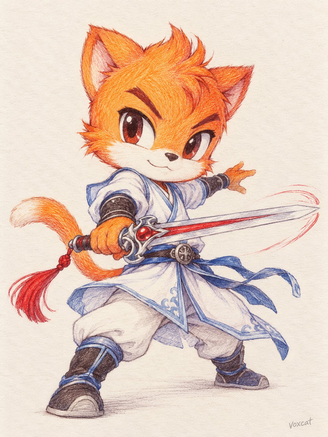
提示词
English
[Subject / Theme], Japanese moe Chibi multicolor ballpoint pen hand-drawn illustration, presented in the form of a flat-laid scanned manuscript of the original drawing on paper. Retain the core identity characteristics, original color distribution, iconic structures, and accessories of the subject, uniformly translating them into a moe Chibi style. Humanoid characters have a head-to-body ratio of approximately 1:4–1:5, with features moderately cutened while retaining original face shapes, eye shapes, and expression differences; animals, objects, or other subjects are simplified into Chibi versions based on their own structures. Postures, expressions, and compositions are autonomously designed according to the subject's identity and temperament. Line art is outlined using colored ballpoint pens, with each part using dark tones corresponding to the inherent colors for strokes; lines are fine and soft, retaining natural variations in weight and hand-drawn strokes. Coloring relies entirely on layers of dense cross-hatching, representing volume, shadows, and textures through the density, direction, and overlapping of lines; individual strokes and the varying intensity of ballpoint pen ink are clearly visible. Coloring is concentrated on a few representative colors of the subject. Dense hatching is used in dark areas, while strokes gradually decrease in highlights to reveal the paper's white, forming a hand-crafted gradient and highlights, maintaining the original color block relationships of the subject. Hair, fur, skin, fabric, metal, or other structures use hatching styles that match their own forms and textures. White and light-colored parts mainly retain the paper's white, with a small amount of light gray or corresponding light-colored fine lines to represent structure and shadows. Off-white paper fills the screen, with fine paper grains uniformly visible; the area around the subject remains pure blank paper. Frontal flat-laid scan effect, uniform lighting, orthogonal perspective, flat paper surface, clear colored strokes and paper texture, overall presenting a realistic quality of a hand-drawn original on paper.
中文
【角色 / 主题】,日系萌系 Q 版多色圆珠笔手绘插画,以纸上原画的平铺扫描稿形式呈现。

保留主体最核心的身份特征、原有配色分布、标志性结构与配饰,将其统一转译为萌系 Q 版造型。人形角色头身比约 1:4–1:5,五官适度可爱化,同时保留原有脸型、眼形与神态差异;动物、物品或其他主体依据自身结构进行 Q 版简化。姿态、表情与构图根据主体身份和气质自主设计。

线稿使用彩色圆珠笔勾勒,各部位采用对应固有色的深色调描边,线条纤细柔和,保留自然的轻重变化与手绘笔迹。上色完全依靠细密排线逐层叠加,通过排线疏密、方向和交叉叠色表现体积、阴影与材质,清楚可见独立笔触和圆珠笔油墨的浓淡变化。

配色集中于主体原有的几种代表色。深色区域排线密集,亮部逐渐减少笔触并露出纸白,形成具有手工感的渐变与高光,保留主体原有色块关系。头发、毛发、皮肤、织物、金属或其他结构分别采用符合自身形态与材质的排线。白色与浅色部分主要保留纸白,以少量浅灰或对应浅色细线表现结构和阴影。

米白纸张铺满画面,细微纸张颗粒均匀可见,主体周围保持纯净纸面留白。正面平铺扫描效果,均匀照明、正交视角、纸面平整,彩色笔迹与纸张纹理清晰,整体呈现真实纸上手绘原稿质感。