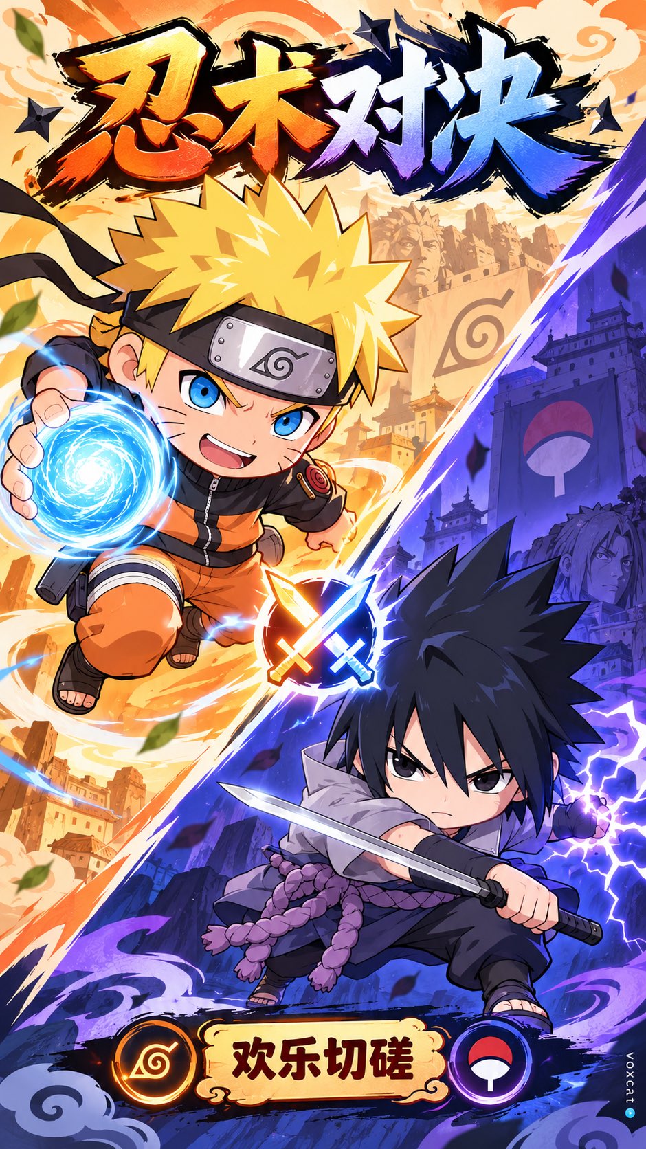
日系手游Q版对战广告插画
来源: @VoxcatAI模型: ChatGPT
📸 示例图片
提示词
English
【Work / Character A / Character B】chibi mobile game promo illustration × chibi mobile game promo art × PvP split composition × soft cel shading × flat commercial illustration × bright candy color palette × clean contour line × graphic promo layout × anime-style ad visual.

Translate [Character A] and [Character B] from [Work] into high-recognition Q-version characters. The overall style uses a modeling system of big heads and small bodies, short limbs, rounded contours, concentrated facial features, and highly refined clothing and accessory information, retaining the most core identity characteristics of each character, including hairstyle contours, main colors, iconic clothing structures, representative weapons / props / equipment / pets / professional symbols. The characters are not complex original art, but rather a completion level of lightweight commercial illustrations used for mobile game advertisements, emphasizing instant recognition and advertising information transmission efficiency.

The image adopts a PvP confrontation-style commercial advertising composition: The overall layout is vertical or near-vertical, and the screen is cut into two camp areas by a clear diagonal dividing line. The upper-left area is [Camp A color tendency, can be left blank], and the lower-right area is [Camp B color tendency, can be left blank], forming a sharp warm-cold color contrast / dual-camp contrast. The background does not feature complex scenes, but instead uses simplified large color block partitions, slight graphic patterns, faint symbolic watermarks, or minimalist geometric decorations, serving the advertising feel and character prominence.

[Character A] is located in the upper-left or upper camp of the screen, accompanied by [Character A props / weapons / partners]; [Character B] is located in the lower-right or lower camp of the screen, accompanied by [Character B props / weapons / partners]. The character actions do not need to be too intense, but rather focus on clear, readable display poses suitable for advertising covers, showing confrontation, competition, preparing to strike, camp standoff, and a sense of light competition. A glowing badge / battle icon / victory-defeat symbol can be added in the middle as a visual intersection of the two camps.

The lines use clean and stable contour lines, and the internal structure is highly simplified. The coloring uses large areas of flat coating + a small amount of soft cel shading, avoiding thick-painting textures and complex realistic light and shadow. The overall colors maintain high brightness, medium-high saturation, candy-like feel, light, young, and mobile game advertisement temperament. The focus is not on realistic space, but on character recognition, camp distinction, commercial communication efficiency, cuteness, and a relaxed competitive atmosphere.

The top of the screen reserves a space suitable for placing advertisement titles, which can display information areas like "【Theme Title / Mode Title】"; the bottom can reserve a proper amount of UI-like description areas, activity subtitles, small labels, or promotional copywriting areas. The overall effect is like a Japanese mobile game PvP mode promotion image / social media advertisement cover / game activity KV.
中文
【作品 / 角色A / 角色B】Q版日系手游广告插画 × chibi mobile game promo illustration × mobile game promo art × PvP split composition × soft cel shading × flat commercial illustration × bright candy color palette × clean contour line × graphic promo layout × anime-style ad visual。

将【作品】中的【角色A】与【角色B】统一转译为 高识别度 Q 版角色。整体采用 头大身小、四肢短小、轮廓圆润、五官集中、服装与配饰信息高度提炼 的造型体系,保留每个角色最核心的身份识别特征,包括 发型轮廓、主色、标志性服装结构、代表性武器 / 道具 / 装备 / 宠物 / 职业符号。角色不是复杂原画,而是偏 手游广告用的轻量商业插画完成度,强调一眼识别与广告信息传达效率。

画面采用 PvP 对阵式商业广告构图:
整体为竖版或接近竖版的宣传图,画面由一条 明显的斜向分割线 切成两个阵营区域。左上区域 为【阵营A配色倾向,可不填】,右下区域 为【阵营B配色倾向,可不填】,形成鲜明的 暖冷撞色 / 双阵营对照。背景不做复杂场景,而是采用 简化的大色块分区、轻微图形纹样、淡淡符号底纹或极简几何装饰,服务于广告感与角色突出效果。

【角色A】位于画面 左上或上方阵营,搭配【角色A道具 / 武器 / 伙伴】;【角色B】位于画面 右下或下方阵营,搭配【角色B道具 / 武器 / 伙伴】。角色动作不必过于剧烈,而是以 清晰、好读、适合广告封面的展示型姿态 为主,表现出 对抗、比拼、准备出手、阵营对峙、轻竞技感。中间可加入一个 发光徽章 / 对战图标 / 胜负象征符号,作为两个阵营视觉交点。

线条采用 干净稳定的轮廓线,内部结构高度简化。上色采用 大面积平涂 + 少量柔和赛璐璐阴影,避免厚涂质感与复杂真实光影。整体色彩保持 高明度、中高饱和、糖果感、轻快、年轻、手游广告气质。重点不是写实空间,而是 角色识别、阵营区分、商业传播效率、可爱感与轻松竞技氛围。

画面顶部预留适合放置广告标题的位置,可呈现类似 “【主题标题 / 模式标题】” 的信息区;底部可保留适量 UI 感说明区、活动副标题、小标签或宣传文案区域。整体效果像一张 日系手游 PvP 模式宣传图 / 社交媒体投放广告封面 / 游戏活动 KV。