蓝染风格白鹭艺术海报设计
来源: @Hamburgerai模型: ChatGPT
📸 示例图片
提示词
English
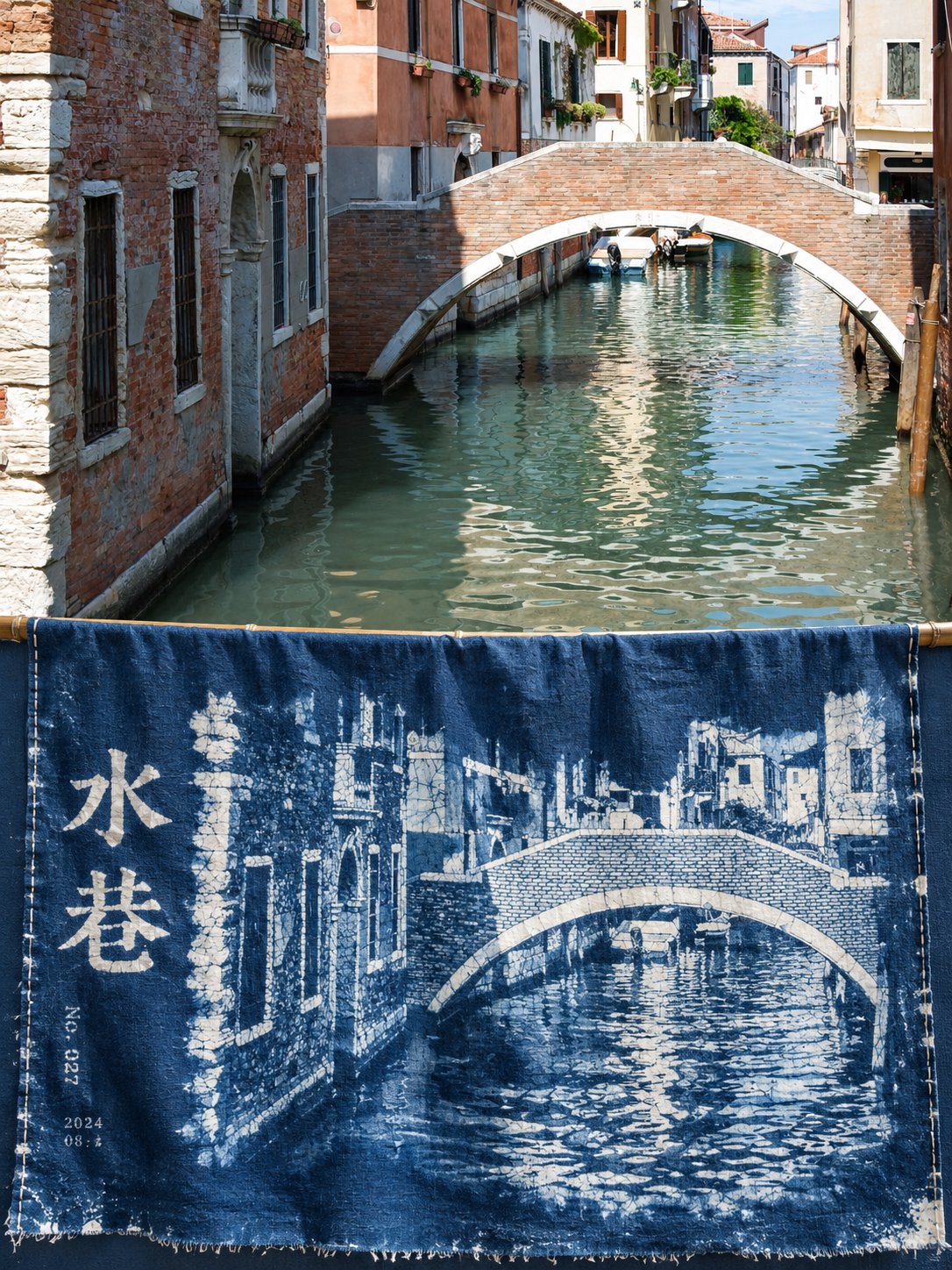
🔵 Indigo dye style, transforming egrets into indigo-dyed cloth, where the negative space looks as if it has been washed with water, looking quiet and beautiful. Please turn each photo I upload into an individual premium design poster, no multi-image stitching, each photo output separately. The overall composition uses a 3:4 vertical layout, with the upper and lower areas strictly 1:1 in height, each occupying 50% of the screen. The upper part preserves the original photo, maintaining the subject's identity, structure, posture, realistic texture, natural lighting, and original color atmosphere, with only slight premium color grading to give it the texture of an art magazine, independent publication, or exhibition image. To fit the frame, the environmental background can be naturally extended, but the subject must not be stretched, distorted, or changed. The upper part only contains the uploaded photo itself, following the original framing, without adding any text, borders, or graphics. The lower part extracts the most recognizable subject, outline, posture, and narrative relationship from the photo, reconstructing it as a handmade indigo-dyed fabric artwork: using wax-resist and tie-dye negative space methods to leave the subject on indigo-dyed cotton cloth, like a piece of blue calico hanging on a bamboo pole, undulating slightly in the wind. The composition follows "one subject, one piece of cloth, one type of negative space": the subject appears in the shape of cloth-white on a deep indigo surface, occupying about one-third to one-half of the lower part, with the rest being large areas of transition between deep indigo and light blue. The edges of the subject are formed by irregular ice cracks from wax cracking and frayed edges where the dye has seeped in, rather than drawn outlines. Choose only one most natural structure: suspended in the center, extending to one side, or from bottom to top, without using multiple compositions at the same time. The color scheme uses only one indigo color family: deep indigo, medium blue, light blue, moon white, plus the off-white of the cotton fabric itself, totaling four to five levels, distinguished by the number of immersions, moisture, and negative space, without introducing a second hue. The material must be a realistic dyed-and-woven texture: clear cotton warp and weft textures, wrinkles, and the slight drape of being supported by a bamboo pole, with dye absorbed unevenly in the fibers, featuring natural spots, water-stain edges, white ice cracks left by wax resist, and a few undyed white spots; the edge of the cloth has a short fringe and manual stitching. Soft diffused natural light shines from the side to illuminate the undulations of the cloth surface. The text appears in a dye-resist manner: a very short main title integrated into the cloth surface in white negative space lettering, like characters on blue calico, accompanied by one to two sets of extremely small auxiliary text, such as a serial number, date, or a subtle short phrase, belonging to the same dyeing process as the graphic, with slight dye bleeding at the edges, not digitally pasted text. The font refers to the square glyphs common in folk blue calico, with clear font size contrast and restrained hierarchy. The overall pursuit is quiet, cool, handmade, subtle, and possessing a sense of time. Avoid multiple colors, digital gradients, overly complex patterns, turning the subject into an illustration, large chunks of rainbow-colored tie-dye, commercial advertising copy, and a template feel.
中文
🔵蓝染风格,把白鹭转绘成蓝染布,留白的地方像是被水洗过,安静得很好看。

请将我上传的每一张照片分别制作成一张独立的高级设计海报,不多图拼接,每张照片单独输出。整体采用3:4竖版构图,上下两个区域高度严格1:1,各占画面50%。

上半部分保留原始照片,保持主体身份、结构、姿态、真实质感、自然光影和原有色彩氛围,仅进行轻微高级调色,使其具有艺术杂志、独立出版物与展览图像质感。为适配画幅,可自然扩展环境背景,但不得拉伸、扭曲或改变主体。上半部分只放上传的照片本身,沿用原有取景,不添加任何文字、边框或图形。

下半部分提取照片中最具识别性的主体、轮廓、姿态与叙事关系,重构为一幅手工蓝染布艺作品:用蜡防与绞缬留白的方法,在靛蓝染过的棉布上留出主体,像一块晾在竹竿上、被风吹得微微起伏的蓝印花布。

构图遵循“一个主体、一块布、一种留白”:主体以布白的形状出现在深靛蓝的布面上,占下半部分约三分之一到二分之一,其余是大面积的靛蓝与浅蓝过渡。主体边缘由蜡裂形成不规则的冰裂纹和染液渗入的毛边,而不是描出来的轮廓线。只选一种最自然的结构:居中悬置、偏向一侧延伸或由下而上,不同时使用多种构图。

配色只用靛蓝一个色系:深靛、中蓝、浅蓝、月白,加上棉布本色的米白,共四到五个层次,靠浸染次数、水分和留白区分,不引入第二种色相。

材质必须是真实的染织质感:清晰的棉布经纬纹理、褶皱和被竹竿撑起的轻微垂坠,染料在纤维里不均匀地吸收,有自然的色斑、水渍边、蜡防留下的白色冰裂纹和少量没染透的白点;布边有一小段毛边和手工缝线。柔和漫射的自然光从侧面照出布面的起伏。

文字用防染的方式出现:一个极短的主标题,以留白的白色字样融进布面,像蓝印花布上的字样,旁边一至两组极小的辅助文字,如编号、日期或一句含蓄的短句,与图形属于同一次染制,边缘有轻微渗染,不是后期贴上的数字文字。字体参考民间蓝印花布常见的方正字形,字号对比明显,层级保持克制。

整体追求安静、清凉、手工、含蓄、有时间感。避免多种颜色、数码渐变、过度复杂的花纹、把主体画成插画、大块彩虹色的扎染、商业广告文案和模板感。