独立唱片风格二分拼贴海报
来源: @daaihq模型: ChatGPT
📸 示例图片
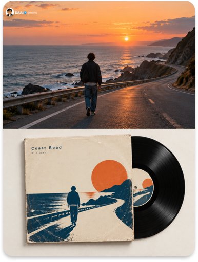
提示词
English
Please create each photo I upload into an independent high-end design poster respectively, no multi-photo stitching, each photo output separately. The overall composition uses a 3:4 vertical layout, with the top and bottom areas strictly at a 1:1 height ratio, each occupying 50% of the screen. The top and bottom blocks are stitched directly and cleanly at the midline, without thick dividers, borders, extra frames, or labels; all stylization, paper textures, and color changes occur only in the bottom half.

The top half preserves the original photo, maintaining the subject's identity, quantity, structure, posture, orientation, realistic texture, natural lighting, and original color atmosphere, with only slight high-end color grading to give it the texture of an art magazine and independent publication. To adapt to the frame, the environmental background can be naturally extended, but the subject must not be stretched, distorted, mirrored, or changed; if the uploaded image itself is an illustration, the top half is preserved as is.

The bottom half features a square vinyl record sleeve, with a vinyl record sliding out about one-third from one side of the sleeve. The front of the sleeve is a minimalist cover graphic designed for the photo above: compressing the subject and mood into 2–4 flat spot-color shapes, a line, or a silhouette, like independent record label cover designs from the 1960s–70s, restrained, bold, and with attitude.

The bottom half retains only the minimum information that makes the subject recognizable at a glance according to the theme: for people, retain the number, posture, orientation, hairstyle, and main clothing colors, without depicting facial details; for animals, retain species characteristics, patterns, and posture; for buildings, retain roof trends, main entrances, and proportions; for vehicles, retain orientation, wheels, or hull curves; for landscapes, retain a horizon line, ridge, or coastline. Delete dense vegetation, repetitive window panes, cluttered backgrounds, and advertising signs.

The center label of the record is equally simple, echoing the cover's color scheme. The corners of the sleeve have signs of use: slight whitening, circular indentations ('ring wear' left by the record inside the sleeve).

The material emphasizes real printing and cardboard: flat spot-color blocks from screen printing with slight registration deviations, the matte and fiber of thick cardboard, and the fine grooves and soft reflections of vinyl. Avoid digital flat graphics, 3D product rendering, and excessive highlights.

Composition: The sleeve and record occupy only about 50%–60% of the width of the bottom half, placed off-center, can be slightly tilted, the background is a warm white or light gray pure plane, with paper white no less than 45%.

Colors: Extract 2–3 of the most emotional colors from the top photo as spot colors, combined with the black of the vinyl and paper white, clear, full but not glaring.

Text: Write an 'Album Title' and an 'Artist Name' (fictional, extracted from the photo's mood) on the sleeve in small sans-serif or serif fonts; a corner of the back of the sleeve can reveal 3–5 lines of tiny track names; do not use real band or label names, no language restrictions.

The overall presentation is a music archive visual composed of a square sleeve, half-exposed vinyl, spot-color graphics, signs of use, and plenty of negative space. The core principle is: in every photo, there is an unreleased record. Avoid real album imitations, 3D rendering, full-page collages, digital gradients, cartoonish feel, and templated posters.
中文
请将我上传的每一张照片分别制作成一张独立的高级设计海报,不多图拼接,每张照片单独输出。整体采用 3:4 竖版构图,上下两个区域高度严格 1:1,各占画面 50%。上下两格在中线处直接、干净地拼接,不加粗分隔条、边框、额外画格或标签;所有风格化处理、纸张肌理与色彩变化都只发生在下半部分。

上半部分保留原始照片,保持主体身份、数量、结构、姿态、朝向、真实质感、自然光影与原有色彩氛围,仅进行轻微高级调色,使其具有艺术杂志与独立出版物质感。为适配画幅,可自然扩展环境背景,但不得拉伸、扭曲、镜像或改变主体;若上传的图像本身是插画,则上半部分照原样保留。

下半部分放置**一张方形黑胶唱片封套**,一张黑胶唱片从封套一侧滑出约三分之一。封套正面是为上方照片设计的**极简封面图形**:把主体与情绪压缩为 2–4 个平涂专色形状、一条线或一个剪影,像 1960–70 年代独立唱片厂牌的封面设计,克制、大胆、有态度。

下半部分按题材只保留让主体一眼可辨的最少信息:人物保留数量、姿态、朝向、发型与服装主色,不刻画五官细节;动物保留物种特征、花纹与姿态;建筑保留屋顶走势、主要入口与比例;交通工具保留朝向、车轮或船身弧线;风景保留一条地平线、山脊或岸线。删除密集植被、重复窗格、杂乱背景与广告招牌。

唱片中心标签同样简洁,与封面配色呼应。封套边角有使用痕迹:轻微磨白、圆形压痕(唱片在封套里留下的“圆环磨损”)。

材质强调真实印刷与纸板:丝网印刷的平涂色块与轻微套色偏差、厚纸板的哑光与纤维、黑胶的细密纹路与柔和反光。避免数码平面图、3D 产品渲染和过度高光。

构图:封套与唱片只占下半部分宽度约 50%–60%,偏心放置,可略微倾斜,背景为暖白或浅灰纯净平面,纸白不少于 45%。

色彩从上方照片中提取 2–3 种最有情绪的颜色作为专色,配合黑胶的黑与纸白,明确、饱满但不刺眼。

文字:在封套上以小号无衬线或衬线字体写一个“专辑名”和一个“艺人名”(虚构、从照片情绪中提炼),封套背面一角可露出 3–5 行极小的曲目名;不使用真实乐队或厂牌名称,不限制语种。

整体呈现**方形封套、半露黑胶、专色图形、使用痕迹与大量留白**构成的音乐档案视觉。核心原则是:每一张照片里,都有一张没发行的唱片。避免真实专辑仿制、3D 渲染、满版拼贴、数码渐变、卡通感和模板化海报。