高級日式文字海報提示詞
来源: @MrLarus模型: ChatGPT
📸 示例图片
提示词
English
[Theme / Project Name]: {Fill in, e.g., plant exhibition, material research, utensil exhibition, brand product}
[Main Visual Text]: {Fill in a Chinese / Japanese / English keyword suitable for enlargement}
[Core Subject / Pattern]: {Fill in, e.g., plants, utensils, products, streamlines, geometric patterns}
[Graphic-Text Interaction]: {Interspersing / Occlusion / Circumnavigating / Refraction / Embedding / Front-Back Layering}
[Main Color Tone]: {Fill in}
[Auxiliary Colors]: {Fill in 1–2}
[Brand / Exhibition Info]: {Brand name, English subtitle, date, location, keywords, etc.}
[Aspect Ratio]: 9:16

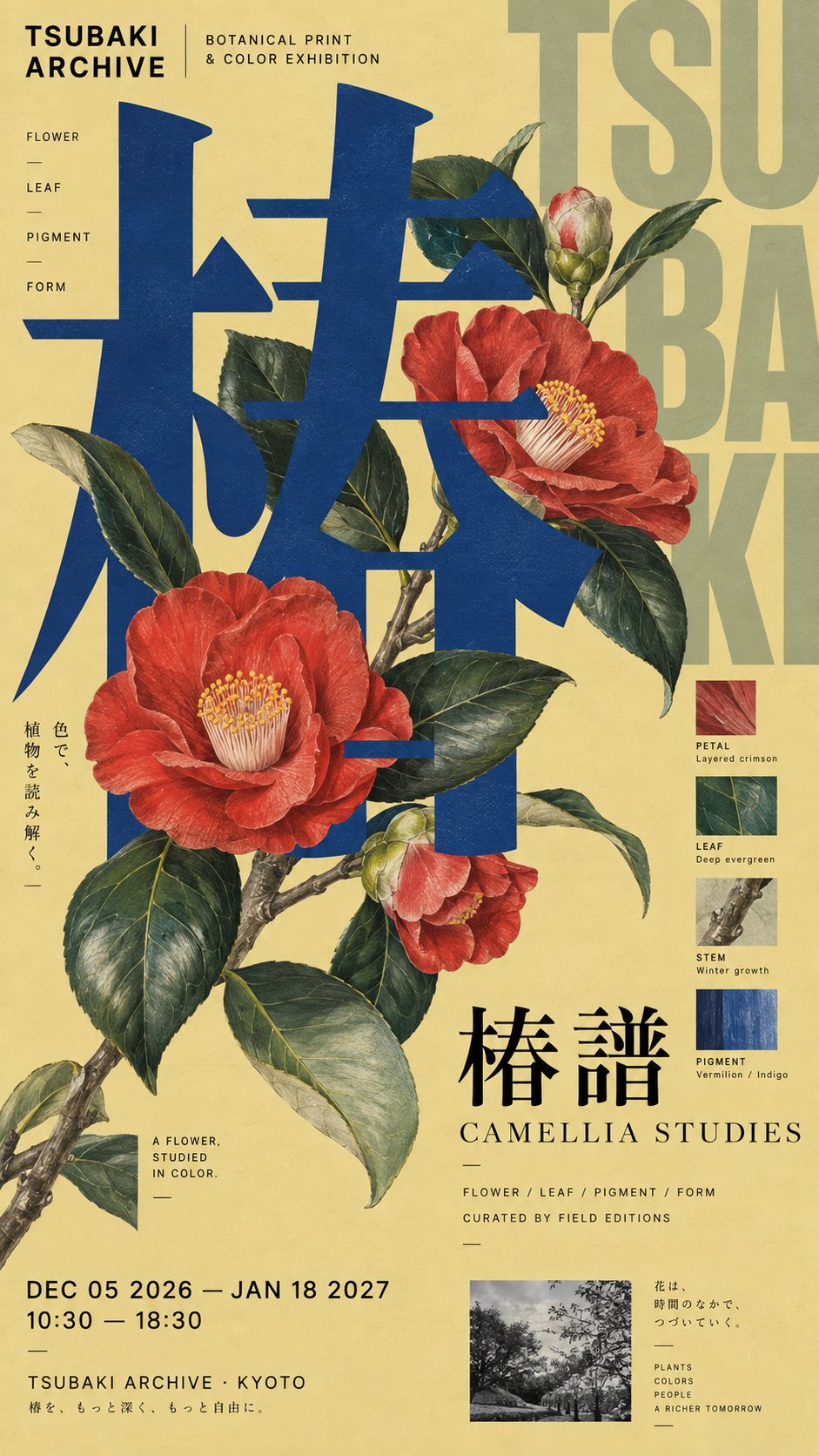
Generate a high-end Japanese typography poster. Do not adopt the ordinary layout of "subject in the middle, title on the side." Instead, first use ultra-large Typography to establish the visual skeleton of the entire image, then let the [Core Subject / Pattern] truly enter the text structure, creating a clear [Graphic-Text Interaction] with the glyphs.

The main visual text should be large enough, allowing local parts to exceed the layout, be cropped, misplaced, or pressed against the edges, making the text first become the geometric large shape of the image. The subject and text must have a real front-back relationship: some subjects are in front of the characters, some enter behind the characters or into the negative space; if using elements like streamlines, plants, liquids, or glass, they should be made to circumnavigate, occlude, refract, or undergo morphological changes because of the text structure, rather than simply covering the surface of the text.

Use a rigorous but not rigid asymmetrical editorial grid. The image can simultaneously use large characters, small characters, vertical layout, edge information, thin lines, and a few image modules, but needs to maintain a clear visual hierarchy. From a distance, first see the main text, subject, and large color blocks; at a medium distance, see the interaction between graphics and text; at a close distance, only then read the complete brand, exhibition, or product information.

Establish a real information system: the main visual text is primary information; the project name / brand name / English subtitle are secondary information; the date, location, creator, product description, research keywords, etc., are distributed as tertiary small information on the layout edges and white space areas. Do not use Lorem Ipsum or a large amount of meaningless English; small text should also look like information in real cultural posters, brand visuals, or design publications.

Control colors within 3–5 main colors, based on the [Main Color Tone], combined with [Auxiliary Colors] and a small amount of black, white, and gray. Overall use complete, clean, saturated printed color surfaces, combined with high-quality matte art paper, extremely light paper fiber, and restrained offset printing texture. Do not use obvious distressing, damage, yellow spots, strong grain, or cheap vintage filters.

The final image should have a fusion of contemporary Japanese graphic design, cultural exhibition posters, brand Editorial Design, and Typography experiments. The focus is not "arranging text beautifully," but letting text, subjects, patterns, and information truly form a unified visual system, making each poster look like a complete work rather than applying the same template.

Avoid: ordinary centered layout, complete separation of graphics and text, subject simply pressing on text, all elements on the same plane, meaningless English, random small text, UI cards, rounded corner modules, excessive minimalism causing an empty image, excessive collage causing chaos, neon gradients, cheap 3D, obvious distressing, four-pointed stars, sparkle, No.01, Vol.01, or other numbered series markings.
中文
【主题 / 项目名】:{填写,例如植物展、材料研究、器物展、品牌产品}
【主视觉文字】:{填写一个适合放大的中文 / 日文 / 英文关键词}
【核心主体 / 图案】:{填写,例如植物、器物、产品、流线、几何图案}
【图文互动方式】:{穿插 / 遮挡 / 绕行 / 折射 / 嵌入 / 前后叠层}
【主色调】:{填写}
【辅助色】:{填写 1–2 个}
【品牌 / 展览信息】:{品牌名、英文副题、日期、地点、关键词等}
【画幅比例】:9:16

生成一张高级日式文字海报。不要采用“主体放中间、标题放旁边”的普通排版,而是先用超大型 Typography 建立整个画面的视觉骨架,再让【核心主体 / 图案】真正进入文字结构,与字形产生明确的【图文互动方式】。

主视觉文字要足够巨大,允许局部超出版心、被裁切、错位或压边,使文字首先成为画面的几何大形。主体与文字必须存在真实的前后关系:部分主体位于字前,部分进入字后或负空间;如果使用流线、植物、液体、玻璃等元素,应让它们因为文字结构产生绕行、遮挡、折射或形态变化,而不是简单覆盖在文字表面。

采用严谨但不僵硬的不对称编辑网格。画面可以同时使用大字、小字、竖排、边缘信息、细线和少量图像模块,但需要保持清楚的视觉层级。远看首先看到主文字、主体和大色块;中距离看到图文之间的互动;近看才读取完整的品牌、展览或产品信息。

建立真实的信息系统:主视觉文字为一级信息,项目名 / 品牌名 / 英文副题为二级信息,日期、地点、创作者、产品说明、研究关键词等作为三级小型信息分布在版面边缘和留白区域。不要使用 Lorem Ipsum 或大量无意义英文,小字也要像真实文化海报、品牌视觉或设计刊物中的信息。

色彩控制在 3–5 个主要颜色内,以【主色调】为基础,搭配【辅助色】和少量黑白灰。整体使用完整、干净、饱满的印刷色面,结合高质量哑光艺术纸、极轻纸纤维和克制的胶版印刷质感。不要明显做旧、破损、黄斑、强颗粒或廉价复古滤镜。

最终画面要具有日本当代平面设计、文化展览海报、品牌 Editorial Design 与 Typography 实验的融合感。重点不是“字排得好看”,而是让文字、主体、图案和信息真正组成一个统一的视觉系统,使每张海报都像完整作品,而不是套用同一个模板。

避免:普通居中排版、图文完全分离、主体只是压在文字上、所有元素都在同一平面、无意义英文、随机小字、UI 卡片、圆角模块、过度极简导致画面空、过度拼贴导致混乱、霓虹渐变、廉价 3D、明显做旧、四角星芒、sparkle、No.01、Vol.01 或其他编号式系列标记。