高端半色调建筑旅行拼贴海报
来源: @Naiknelofar788模型: ChatGPT
📸 示例图片
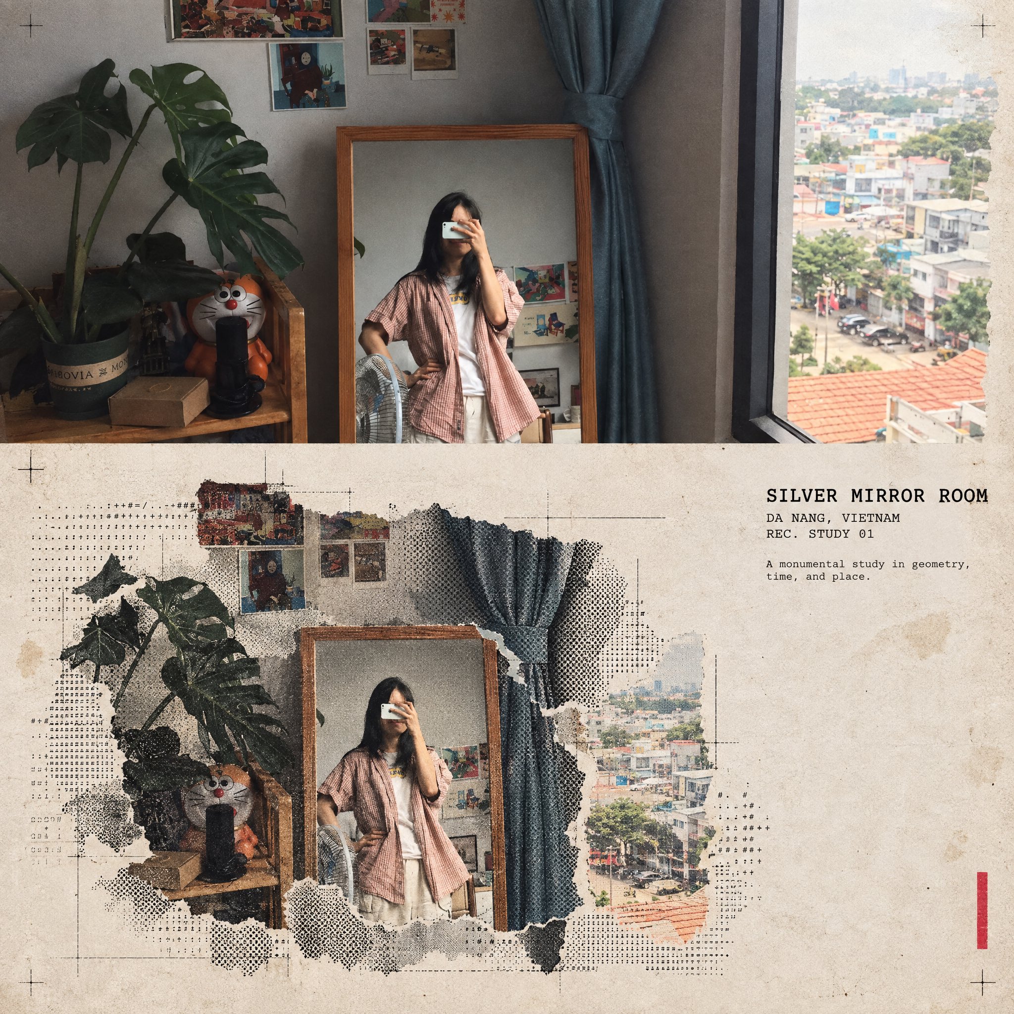
提示词
English
Turn this structure photo into a single high-end halftone architectural travel-collage poster. Output one poster per uploaded photo — never merge multiple structures or photos into one frame.

FORMAT

3:4 vertical canvas. Split into two roughly equal zones — real architectural photo on top, printed reconstruction below — divided by one clean, sharp horizontal line.

Do not stretch, warp, tilt, or unnaturally reposition the structure to force the proportions.

TOP HALF — THE REAL SHOT

Preserve the original structure faithfully: same architecture, proportions, perspective, distinctive details, surrounding elements, natural light and shadow, and original color mood.

Keep recognizable features such as:

* façade
* windows and arches
* towers or domes
* doors and structural details
* roofline
* surrounding landscape or street elements

Add only a subtle high-end color grade and the faintest film grain. Do not redesign or reinterpret the architecture.

BOTTOM HALF — THE PRINTED RECONSTRUCTION

Rebuild the same structure as an experimental printed architectural collage using:

torn photographic fragments + fixed-width ASCII character fields + photocopy halftone dots + architectural linework.

The structure must remain immediately recognizable.

* Torn-edge photographic fragments preserve the most important architectural details.
* Brick, stone, glass, metal, shadows, windows, and surrounding textures gradually dissolve outward into ASCII characters, black halftone dots, fragmented print grain, and fine architectural drafting lines.
* Use thin technical construction lines to subtly trace the structure’s geometry.
* Let selected areas break apart into paper fibers and halftone fragments, creating the feeling that the building is emerging from an archival print.
* Keep the main silhouette strong and readable.
* Texture: rough white paper-fiber edges, subtle photocopy imperfections, slight print misregistration, faded ink, old-paper stains, a few restrained crop marks, and one small red calibration bar.
* Color: warm gray old-paper background + black ink + the structure’s original muted colors + a single restrained red accent.
* Never fully desaturate the structure.

The structure should occupy roughly 60–88% of the frame width, scaled according to what reads best for the architecture.

Leave 22–38% of the paper visibly untouched and empty, creating generous negative space so the poster feels like an archival architectural specimen rather than a packed digital screen.

TYPOGRAPHY

Add one clean, readable fixed-width architectural title based on the structure:

[STRUCTURE NAME]

Below it include:

[CITY, COUNTRY]
REC. STUDY 01

Add one short observational caption related to the architecture, such as:

“A monumental study in geometry, time, and place.”

Typography should feel like an old architectural archive mixed with an underground experimental design journal.

A few loose ASCII glyphs may trace the outer silhouette or architectural edges as texture only — never use ASCII to invent windows, doors, structural details, or technical specifications.

MOOD

Early digital systems × analog photocopy × architectural archive × underground zine × modern travel editorial.

The structure should feel like it is surfacing from an old printed document — half photograph, half architectural drawing, half experimental print.

Sophisticated, minimal, tactile, intellectual, slightly mysterious, and highly collectible.

AVOID

Solid black terminal backgrounds, dense walls of code, cyberpunk neon, excessive ASCII, distorted architecture, impossible geometry, invented architectural details, fake technical specifications, random symbols with no meaning, garbled text, excessive colors, brand logos, QR codes, watermarks, author credits, or tourist-poster clichés.

Priority: Preserve the structure’s identity and architectural accuracy first. The experimental halftone/ASCII treatment should enhance the architecture, not hide it.
中文
将这张建筑照片转变为一张高端半色调建筑旅行拼贴海报。每张上传的照片输出一张海报——切勿将多个建筑或多张照片合并到一个画幅中。

格式

3:4 垂直画布。分为两个大致相等的区域——上方为真实的建筑照片,下方为打印的重建效果——由一条干净、清晰的水平线分隔。

不要为了强行适应比例而拉伸、扭曲、倾斜或不自然地重新定位建筑。

上半部分——真实拍摄

忠实地保留原始建筑:相同的建筑、比例、透视、独特的细节、周围元素、自然光影和原始色彩氛围。

保留可辨识的特征,例如:

* 立面
* 窗户和拱门
* 塔楼或穹顶
* 门和结构细节
* 屋顶线
* 周围景观或街道元素

仅添加细微的高端调色和极淡的电影颗粒感。不要重新设计或重新诠释建筑。

下半部分——打印重建

使用以下元素将相同的建筑重建为实验性的打印建筑拼贴:

撕裂的摄影碎片 + 等宽 ASCII 字符场 + 复印半色调网点 + 建筑线条。

建筑必须保持立即可辨识。

* 撕裂边缘的摄影碎片保留了最重要的建筑细节。
* 砖块、石头、玻璃、金属、阴影、窗户和周围的纹理逐渐向外溶解为 ASCII 字符、黑色半色调网点、破碎的打印纹理和精细的建筑制图线条。
* 使用细的工程施工线巧妙地勾勒建筑的几何形状。
* 让特定区域分解为纸张纤维和半色调碎片,营造出建筑正从档案印刷品中浮现的感觉。
* 保持主轮廓强有力且清晰易读。
* 纹理:粗糙的白色纸张纤维边缘、细微的复印缺陷、轻微的印刷套印不准、褪色的墨水、旧纸张污渍、少量克制的裁切标记以及一个小红色的校准条。
* 颜色:暖灰色旧纸张背景 + 黑色墨水 + 建筑原始的柔和色彩 + 单一且克制的红色点缀。
* 永远不要让建筑完全去色。

建筑应占据画幅宽度的约 60–88%,根据最适合该建筑的比例进行缩放。

留出 22–38% 的纸张明显留白,营造出宽裕的负空间,使海报感觉像是一件档案建筑标本,而不是拥挤的数字屏幕。

排版

添加一个基于该建筑的干净、易读的等宽建筑标题:

[建筑名称]

在其下方包括:

[城市, 国家]
REC. STUDY 01

添加一段与建筑相关的简短观察说明,例如:

“一场关于几何、时间和地点的丰碑式研究。”

排版应具有旧建筑档案与地下实验设计杂志相结合的感觉。

少量松散的 ASCII 字符可以仅作为纹理勾勒外部轮廓或建筑边缘——切勿使用 ASCII 来伪造窗户、门、结构细节或技术规范。

氛围

早期数字系统 × 模拟复印 × 建筑档案 × 地下杂志 × 现代旅行社论。

建筑应感觉像是从一份旧的印刷文件中浮现——一半照片,一半建筑图纸,一半实验性印刷。

精致、极简、有质感、充满理智、略带神秘且极具收藏价值。

避免

纯黑终端背景、密集的代码墙、赛博朋克霓虹灯、过多的 ASCII、扭曲的建筑、不可能的几何形状、虚构的建筑细节、虚假的技术规范、毫无意义的随机符号、乱码、过多的色彩、品牌徽标、二维码、水印、作者署名或旅游海报的陈词滥调。

优先级:首先保留建筑的身份和建筑准确性。实验性的半色调/ASCII 处理应增强建筑感,而不是掩盖它。