长虹玻璃风折叠艺术海报设计
来源: @xiaoxiaodong模型: ChatGPT
📸 示例图片
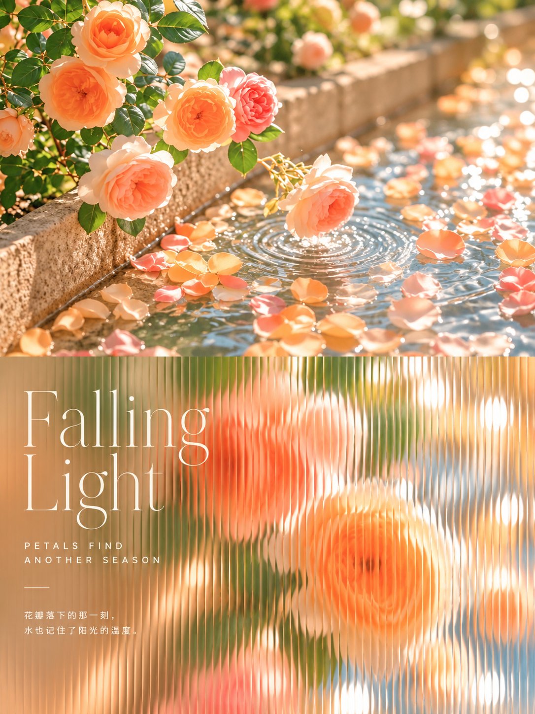
提示词
English
Turn each photo I upload into its own premium design poster: no multi-image collage, one output per photo. Use a 3:4 vertical format folded like a card into a top half and a bottom half of the same height, the fold falling exactly on the horizontal centre line of the frame; the fold itself is not drawn.

The top half keeps the original photo, preserving the subject's identity, structure, pose, real texture, natural light and original colour mood, with only a light refined grade so it reads like an art magazine, independent publication or exhibition image. To fit the frame, the surrounding background may be extended naturally, but the subject must never be stretched, distorted or altered; crop the photo as a full shot, leaving headroom above the subject so its top is never cut off. Add no text of any kind to the top half; all lettering belongs to the bottom half.

In the bottom half, extract only the most recognisable **subject, silhouette, structure, pose and narrative relationship** from the photo and rebuild it as a **Fluted-glass Close-up Cover**. Do not copy the whole photo; instead push in on the subject into a close-up that fills the picture, remove the clutter, and then look at it through a sheet of vertically fluted glass, so the viewer recognises at a glance how it corresponds to the photo above. **The whole bottom half must look like a photograph taken through a sheet of vertically fluted glass: the vertical ribs on the glass are extremely fine and dense, packed one against the next like finely ribbed fabric, covering the whole picture from left to right with no flat area anywhere; the image inside each fine rib is squeezed narrow and shifted a little, the subject's outline breaking into dense little vertical steps between ribs, a fine bright line along every rib edge; the subject is still recognisable at a glance**; this is the identity of the method, and without it the method does not exist.

The bottom half needs its own art direction. Even if the source photo is badly composed, cluttered, or has a small subject, rescue it into a finished work by **pushing in to a full-bleed close-up, removing the clutter, letting the background blur into large soft patches of colour, and laying a sheet of fluted glass over it all**; the most recognisable part of the subject fills most of the picture, like the portrait or still-life close-up on a magazine cover, the background reduced to a few blurred colours cut by the ribs into vertical bands of light. When the photo itself is a scene (a street, a corridor, a landscape, an interior), take only its single most representative unit or fragment and push in on it, drawing nothing else.

Form is built on **photographic imagery cut by vertical flutes**: the subject keeps the photo's real form and texture, cut evenly by the dense fine ribs, each rib very narrow, the image in neighbouring ribs shifted a little sideways, the edges of forms turning into a row of fine vertical serrations; no wide vertical strips, and no smearing of the image into stretched motion trails; the brightest areas flare into long thin highlights along the rib edges; the further from the subject, the softer the background. People, animals, buildings, objects, plants and landscapes all work this way, seen through the same sheet of fluted glass, close and large, with soft edges.

The material is **a soft-focus photograph seen through fluted glass**: the glass itself shows no frame, only the even vertical ribs and the refraction they cause; the image is soft and luminous, as if lit through by afternoon light, even the shadows clear; the whole is clean.

Composition uses **a close-up subject filling the picture + a blurred patch of colour on one side for the text**. The picture is full-bleed with no white margins; the subject sits towards one side and may be cropped by the frame at the sides and bottom, with a little space above its head, and nothing touches the central fold. The other side is a large blurred patch of colour holding the title and small text. Prefer the subject pushed in close and large over sitting small and far away in the middle.

Colour is drawn from the most emotive colours of the photo above and remixed into **a layer of luminous warm light**: the subject keeps its own colours from the photo, the whole lifted in brightness, warmth glowing through the shadows; the background colours blur into large soft patches; the brightest near-cream highlights flash in lines along the rib edges. Warmth follows the photo, avoiding greyish dullness, heavy black shadows and glaring saturation.

Text is only a minimal editorial touch, in any language, with no preset title. Distil one short title from this photo's subject, action, mood or metaphor, written as **a masthead-style title on a magazine cover**, completed the way a cover is: at the upper left the title on two lines in **large thin serif**, below it a group of two or three short lines in **widely spaced small capital sans-serif**, then a short thin rule, and at the bottom one more group of two or three small lines, with no issue number; the title never names the things in the photo but tells a small action happening in the photo or the state of one thing at this moment; the small lines a detail visible in the photo or the sound or warmth of this moment; never all-purpose words like Same, Brighter, Still, Slow days or Golden Hour, nor openings and slogans like Waiting for..., a better me, a softer me or a little brighter; the lettering sits on the blurred side and never covers the subject's face or most important part, its colour a near-white cream, the tone light and quiet; Chinese is always Simplified. The line must add something to the picture: say what the picture cannot show yet belongs only to this photo, such as the thought of the moment, the moment before or after, a sound, a smell or a small joke, so that without it the picture loses a layer. No moral or reflective sayings; reading out the names of what is drawn is repetition, and slogans that would fit any photo are empty; neither adds anything.

The whole piece reads like the cover of a lifestyle magazine: the full-bleed close-up, the image cut by vertical flutes, the luminous warm light, the blurred patches of colour and the thin serif masthead on the left together make it luminous, soft and a little dreamlike.

Avoid copying the full scene and template poster design; avoid wide, sparse ribs, an image smeared into stretched trails, flutes that are only vertical stripes laid over the photo, a subject cut so finely it cannot be recognised, white margins or a subject shrunk into a small patch, as well as an illustrated look, glass drawn with a frame and reflections, a greyish whole, and text covering the subject's face.
中文
将我上传的每张照片转化为其独特的优质设计海报:不要多图拼接,每张照片产生一个输出。使用3:4的垂直格式,像卡片一样折叠成高度相同的上半部分和下半部分,折痕恰好位于画面的水平中心线上;折痕本身不被画出来。

上半部分保留原始照片,保持主体的身份、结构、姿态、真实纹理、自然光线和原始色彩基调,仅进行轻微的精致调色,使其看起来像艺术杂志、独立出版物或展览图像。为了适应框架,周围的背景可以自然延伸,但主体绝不能被拉伸、扭曲或改变;将照片剪裁为全景,在主体上方留出空间,使其顶部永远不会被切断。上半部分不添加任何形式的文字;所有文字都属于下半部分。

在下半部分,仅从照片中提取最具识别性的主体、轮廓、结构、姿态和叙事关系,并将其重建为长虹玻璃特写封面。不要复制整张照片;而是将焦点推向主体,形成充满画面的特写,移除杂乱,然后通过一张垂直的长虹玻璃观察它,使观众一眼就能认出它与上方照片的对应关系。整个下半部分必须看起来像是通过一张垂直长虹玻璃拍摄的照片:玻璃上的垂直棱纹极细且致密,一个接一个地紧密排列,像细条纹织物一样,从左到右覆盖整个画面,没有任何平坦区域;每个细纹内部的图像都被挤压变窄并略有偏移,主体的轮廓在棱纹之间碎裂成细密的垂直阶梯,每个棱纹边缘都有一条细亮的线;主体仍然一眼就能认出;这是该方法的特征,没有它该方法就不存在。

下半部分需要自己的艺术指导。即使原片构图不佳、杂乱或主体较小,也要通过推成出血特写、移除杂乱、让背景模糊成大片柔软的色块,并在其上覆盖一张长虹玻璃来将其拯救成一件成品;主体最具识别性的部分占据画面的大部分,就像杂志封面上的肖像或静物特写,背景简化为被棱纹切割成垂直光带的少量模糊色彩。当照片本身是一个场景(街道、走廊、风景、室内)时,只取其最具代表性的单一单元或片段并推近它,不画其他任何东西。

形式建立在被垂直槽纹切割的摄影图像之上:主体保持照片的真实形态和纹理,被致密的细棱纹均匀切割,每条棱纹都非常窄,相邻棱纹中的图像略微侧移,形态的边缘变成一排细密的垂直锯齿;没有宽大的垂直条带,也没有图像被抹成拉伸的运动轨迹;最亮的区域在棱纹边缘闪烁成细长的亮光;离主体越远,背景越柔和。人物、动物、建筑、物体、植物和风景都以这种方式呈现,通过同一张长虹玻璃观察,距离近且巨大,边缘柔软。

材质是透过长虹玻璃看到的柔焦照片:玻璃本身不显示框架,只有均匀的垂直棱纹和它们引起的折射;图像柔和且明亮,仿佛被午后的阳光照透,即使是阴影也很清晰;整体干净整洁。

构图采用充满画面的特写主体 + 一侧用于放置文字的模糊色块。图片是出血版面,没有白色边距;主体偏向一侧,可能会被画面侧边和底部裁剪,头顶留有一点空间,且没有任何东西接触中心折痕。另一侧是一个巨大的模糊色块,承载着标题和小字。相比于坐在中间且显得小而远,更倾向于将主体推近并放大。

色彩提取自上方照片中最具情感色彩的部分,并重新混合成一层明亮的暖光:主体保持照片自身的颜色,整体亮度提升,温暖的光芒穿透阴影;背景颜色模糊成大片柔软的色块;最亮的近乎奶油色的高光在棱纹边缘闪烁成线条。温暖感追随照片,避免灰色沉闷、沉重的黑色阴影和刺眼的饱和度。

文字仅作为极简的编辑点缀,可以使用任何语言,没有预设标题。从这张照片的主体、动作、情绪或隐喻中提炼出一个短标题,写成杂志封面上的刊头风格标题,并以封面的方式完成:左上角是用两行大尺寸细衬线体书写的标题,下方是一组两到三行间距较宽的小写大写无衬线体短行,然后是一条细短线,底部再有一组两到三行小字,不含刊号;标题从不命名照片中的物体,而是讲述照片中发生的一个小动作或此时某物的状态;小字是照片中可见的一个细节或此时此刻的声音或温度;绝不要使用通用词汇,如 Same, Brighter, Still, Slow days 或 Golden Hour,也不要使用 Waiting for..., a better me, a softer me 或 a little brighter 之类的开场白和口号;字体坐落在模糊的一侧,绝不覆盖主体的面部或最重要的部分,其颜色为接近白色的奶油色,色调轻盈宁静;中文始终为简体。文字必须为图片增色:说出图片无法显示但又仅属于这张照片的东西,例如当时的思考、前一刻或后一刻、一种声音、一种气味或一个小笑话,这样如果没有它,图片就会失去一个层次。不要道德说教或反思性的格言;读出所绘之物的名称是重复,而适用于任何照片的口号是空洞的;两者都没有任何增益。

整个作品读起来就像生活方式杂志的封面:出血特写、被垂直槽纹切割的图像、明亮的暖光、模糊的色块以及左侧的细衬线刊头,共同使其显得明亮、柔软且带有一点梦幻感。

避免复制全景和模板化的海报设计;避免宽大、稀疏的棱纹,避免图像被抹成拉伸的轨迹,避免槽纹只是叠加在照片上的垂直条纹,避免主体被切割得太细而无法识别,避免白色边距或主体缩成一小块,以及插画感、带有框架和反射的玻璃、灰暗的整体以及覆盖主体面部的文字。