三段式社论海报视觉设计
来源: @MrLarus模型: ChatGPT
📸 示例图片
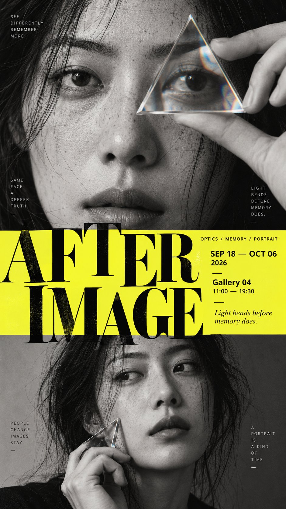
提示词
English
[POSTER THEME]: {fill in the theme}
[MAIN TITLE]: {fill in the title}
[TOP SECTION]: {portrait / object archive / typography / image}
[MIDDLE SECTION]: {information band / typography / image / transition}
[BOTTOM SECTION]: {landscape / hero object / second portrait / typography}
[COLOR PALETTE]: {fill in the palette}
[VISUAL STYLE]: {editorial / museum / photography exhibition / cultural poster}
[ASPECT RATIO]: 9:16

Create a sophisticated vertical editorial poster built around a clear three-part composition: top, middle, and bottom.

Each section must have a distinct visual role, but the final poster should feel like one continuous design rather than three stacked rectangular panels.

Use strong differences in scale, image density, typography, and negative space to establish hierarchy.

The top section should create the first visual anchor through a bold image, oversized typography, or a strong subject.

The middle section should act as the structural hinge of the composition. It can use a title, information field, narrow panoramic image, color band, or typography layer to connect the upper and lower sections.

The bottom section should provide a second visual weight or spatial conclusion through a landscape, object, secondary portrait, or oversized type.

Avoid rigid card-like boundaries. Let selected elements cross between sections through masking, overlap, irregular silhouettes, transparency, atmospheric transitions, foreground/background relationships, or typography extending beyond its original area.

Typography must actively participate in the composition rather than simply sit on top of the image. Allow large letterforms to be cropped by the page, partially hidden behind subjects, overlap imagery, or interact with negative space.

Use a strong editorial hierarchy:
one dominant title,
one clear secondary information layer,
and small meaningful metadata such as dates, venue, category, or curatorial text.

Small text should feel like real exhibition or editorial information, not decorative filler.

Keep some areas intentionally quiet. Do not fill every empty space.

The first read should communicate the main visual structure immediately.
The second read should reveal the interaction between type and imagery.
The third read should reveal the smaller information and details.

Maintain a refined contemporary poster aesthetic with strong typography, deliberate cropping, controlled information density, clean print texture, and professional editorial spacing.
中文
[海报主题]:{填写主题}
[主标题]:{填写标题}
[顶部区域]:{人像 / 物品存档 / 排版 / 图像}
[中间区域]:{信息带 / 排版 / 图像 / 过渡}
[底部区域]:{风景 / 主体对象 / 第二人像 / 排版}
[配色方案]:{填写配色}
[视觉风格]:{社论 / 博物馆 / 摄影展 / 文化海报}
[纵横比]:9:16

创建一个精致的垂直社论海报,围绕清晰的三部分构图构建:顶部、中间和底部。

每个部分必须具有独特的视觉角色,但最终的海报应该感觉像是一个连续的设计,而不是三个堆叠的矩形面板。

使用比例、图像密度、排版和负空间的强烈差异来建立层级。

顶部区域应通过大胆的图像、超大排版或强烈的主体创造第一个视觉锚点。

中间区域应作为构图的结构衔接点。它可以使用标题、信息字段、窄全景图像、色带或排版层来连接上下部分。

底部区域应通过风景、物体、次要人像或超大字体提供第二个视觉重量或空间结论。

避免僵化的卡片式边界。让选定的元素通过遮罩、重叠、不规则轮廓、透明度、大气过渡、前景/背景关系或超出其原始区域的排版在各部分之间穿插。

排版必须积极参与构图,而不仅仅是置于图像之上。允许大字母被页面裁剪、部分隐藏在主体之后、与图像重叠或与负空间互动。

使用强烈的社论层级:
一个主导标题,
一个清晰的次要信息层,
以及小的有意义的元数据,如日期、地点、类别或策划文本。

小文本应该感觉像真实的展览或社论信息,而不是装饰性的填充物。

有意保持某些区域的安静。不要填满每一个空白空间。

第一眼阅读应立即传达主要的视觉结构。
第二眼阅读应揭示排版与图像之间的互动。
第三眼阅读应揭示较小的信息和细节。

保持精致的现代海报美学,具有强烈的排版、刻意的裁剪、受控的信息密度、干净的印刷纹理和专业的社论间距。