东亚当代艺术实验海报压角构图设计
来源: @MrLarus模型: ChatGPT
📸 示例图片
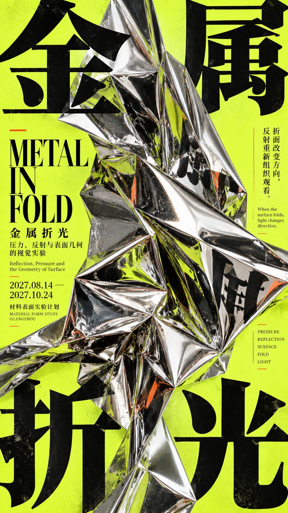
提示词
English
[Subject]
[Four-character Chinese Title]
[Key Visual Material] Metal / Stone / Mirror / Ice / Other hard materials
[Physical Change] Folding / Pressing down / Cracking / Refraction / Deformation
[Main Background Color]
[Main Font Color]
[Accent Color]
[English Title]
[Aspect Ratio] 9:16

Generate an experimental vertical poster with the temperament of East Asian Contemporary Exhibition Poster, Japanese Experimental Graphic Design, Editorial Art Direction, and Corner-Pressure Composition. The core uses "corner-pressure composition": split the [Four-character Chinese Title] into four huge Chinese characters, forcefully pressing into the center of the frame from the top left, top right, bottom left, and bottom right. The four characters should not be of equal size, equidistant, or form a four-grid grid, but should establish obvious inward pressure through different font sizes, cropping, bleed amounts, and the depth of entry into the center.

Set a [Key Visual Material] with sufficient volume in the center of the frame, and truly change the layout through [Physical Change]. The point is not to "place the object in the middle of the four characters," but to let the material truly relate to the Typography: mirrors can reflect, split, and reorganize character shapes; heavy objects can press down the paper surface, causing text to follow the surface with real perspective changes; cracked materials can change the direction of text reflection through fragments; transparent ice can obstruct, refract, and pass through part of the strokes. Each work chooses only one strongest physical mechanism; do not stack a large number of special effects simultaneously.

The main body must have highly realistic material details, such as the facets and reflections of mirrored metal, the weight and grain of stone, the thickness and refraction of glass or ice, paper depressions and folds, crack edges, and contact shadows. Physical relationships must be reasonable and understandable, letting the audience clearly see that "real materials are changing fonts and layouts," rather than post-digital distortion, random glitch, or ordinary 3D decoration.

Typography is divided into three levels: huge Chinese characters in the four corners are responsible for the first visual; the [English Title] and Chinese work name are responsible for the second level; dates, locations, short sentences, material keywords, and a small amount of instructions are responsible for the third level. Use obvious font size contrast, asymmetrical alignment, partial vertical Chinese, compact English, and ultra-fine dividing lines to establish a mature sense of editorial design. Information density is kept medium-high, but do not fill the screen evenly; it can be denser near the main body, while another part retains clean negative space.

Overall color is controlled at 3–4 main levels. [Main Background Color] forms a large area of strong color gamut, [Main Font Color] establishes a stable structure, [Key Visual Material] is responsible for real physical texture, and [Accent Color] is used only for a small number of short lines, date nodes, or editorial marks. Very light paper texture, offset grain, and screen printing texture can be added, but do not heavily age, stain, or use punk collage.

The final reading order should be: first see the strong large shape formed by the four huge corner characters and the central hard main body; second, discover that the material has truly changed the Typography; third, observe reflections, pressure, cracks, refraction, or surface deformation; finally, read the English title and small amount of exhibition information. In the thumbnail state, there must be a clear focus and strong stop-scroll impact, and after zooming in, there are real material and precise typography details.

Avoid: mechanical four-grids, four characters being completely equal in size, subject being too small, fonts and materials being separated from each other, ordinary product advertisements, random digital distortion, RGB glitch, tech HUD, complex parameters, Logos, QR codes, numbering, four-pointed stars, and copyright marks.
中文
【主题】
【四字中文标题】
【主视觉材质】金属 / 石材 / 镜面 / 冰体 / 其他硬质材料
【物理变化】折叠 / 下压 / 破裂 / 折射 / 形变
【背景主色】
【字体主色】
【强调色】
【英文标题】
【画面比例】9:16

生成一张具有 **East Asian Contemporary Exhibition Poster、Japanese Experimental Graphic Design、Editorial Art Direction、Corner-Pressure Composition** 气质的实验性竖版海报。核心使用“压角构图”:将【四字中文标题】拆成四个巨大汉字,从左上、右上、左下、右下向画面中心强势压入。四字不要等大、等距或形成四宫格,而是通过不同字号、裁切、出血量和进入中央的深度建立明显的向内压力。

画面中央设置一个体量足够大的【主视觉材质】,并通过【物理变化】真实改变版面。重点不是“把物体放在四个字中间”,而是让材质真正与 Typography 发生关系:镜面可以反射、切分并重组字形;重物可以压低纸面,让文字跟随表面产生真实透视变化;破裂材质可以通过裂片改变文字反射方向;透明冰体可以遮挡、折射并穿过部分笔画。每张作品只选择一种最强的物理机制,不要同时堆叠大量特效。

主体必须具有高度真实的材质细节,例如镜面金属的折面与倒影、石材的重量和颗粒、玻璃或冰的厚度与折射、纸面的凹陷褶皱、裂纹边缘和接触阴影。物理关系必须合理可理解,让观众明确看到“真实材料正在改变字体和版面”,而不是后期数字扭曲、随机 glitch 或普通 3D 装饰。

Typography 分为三个层级:四角巨大中文字负责第一视觉;【英文标题】和中文作品名负责第二层;日期、地点、短句、材料关键词和少量说明负责第三层。使用明显的字号反差、不对称对齐、局部竖排中文、紧凑英文和极细分隔线建立成熟的编辑设计感。信息密度保持中高,但不要平均填满画面,主体附近可以更密,另一部分保留干净负空间。

整体色彩控制在 3–4 个主要层级。【背景主色】形成大面积强色域,【字体主色】建立稳定结构,【主视觉材质】负责真实物理质感,【强调色】只用于少量短线、日期节点或编辑标记。可以加入极轻纸张纹理、胶印颗粒和丝网印刷质感,但不要严重做旧、污渍或朋克拼贴。

最终阅读顺序应为:第一眼看到四角巨字与中央硬质主体形成的强烈大形;第二眼发现材质真的改变了 Typography;第三眼观察反射、压力、裂纹、折射或表面形变;最后阅读英文标题和少量展览信息。缩略图状态下必须有清晰焦点和强烈 Stop-scroll 冲击,放大后又有真实材质和精密排版细节。

避免:机械四宫格、四字完全等大、主体过小、字体和材质彼此分离、普通产品广告、随机数字扭曲、RGB glitch、科技 HUD、复杂参数、Logo、二维码、编号、四角星芒和版权标识。