旧物修补材料品牌视觉风格板
来源: @xiaoxiaodong模型: ChatGPT
📸 示例图片
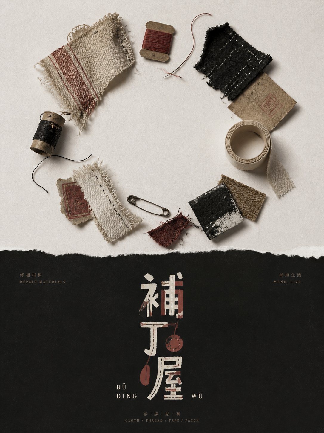
提示词
English
Generate a brand visual style board around any theme object, establishing a strong brightness partition between the upper and lower parts overall: the upper part is a clean high-brightness blank field, placing real objects or material samples related to the theme, using an overhead display and a slightly staggered diagonal intersection relationship, letting long strips, round heads, tips, or curved silhouettes form extractable symbolic clues; objects retain manual traces, worn edges, polished dark parts, partial cracks or coating peeling, shadows are soft and ground-hugging, the blank area is larger than the physical object occupation, making coarse materials appear quiet and scrutinized. The lower part transitions into a low-brightness matte black information field, the top only puts a small amount of explanatory text with extremely small letter spacing, the left and right corners form a slight symmetry, the central axis puts a short Chinese name and a small English transcription, maintaining white space to suppress information density. The main logo is extracted from the contours of the objects in the upper part, not directly copying the objects, but transforming the long handles, round ends, notches, missing corners, and joints of the theme into loose handwritten letters and primitive graphics, the letter sizes are uneven, the baseline jumps, the spacing is loose, and local glyphs are replaced by object-shaped silhouettes, like hand-cut paper pieces or thick paint stickers on a black background. Color matching is theme-adaptive: high-brightness background colors and low-brightness background colors undertake large-area structures, the logo uses a small amount of low-saturation theme colors and warm white to form brightness skip points, and the colored version and the light version maintain the same glyph skeleton when juxtaposed. Avoid exquisite vectors, commercial gloss, and neat grids; must retain the relationship of crudeness, hand-making, material wear, and the mutual deformation of graphics and text.

——————
Establish a visual style board for an old object repair material brand: the upper high-brightness empty field displays patch cloth, needles and thread, tape, and worn corners, using a gathering composition close to a circle, leaving a piece of quiet white space in the middle; using brick red as the only low-saturation accent color, warm white, matte black, and grayish-brown undertake the main body, the material remains coarse and lusterless. The logo is placed on the central axis of the lower black field, the title is in a narrow and long vertical arrangement, the English transcription is split into two segments close to the glyph outline, and the information hierarchy shrinks step by step from the title to tiny annotations; the aspect ratio is vertical 3:4.
中文
围绕任意主题对象生成品牌视觉风格板,整体先建立上下强明度分区:上部是干净高明度空白场,放置主题相关的真实物件或材质样本,采用俯视陈列和轻微错位的斜向交叉关系,让长条、圆头、尖端或弯曲轮廓形成可被提炼的符号线索;物件保留手工痕迹、磨损边、暗部擦亮、局部裂纹或涂层剥落,阴影柔软贴地,空白面积大于实物占用,使粗粝材质显得安静而被审视。下部转入低明度哑黑信息场,顶部只放少量极小字距的说明文字,左右边角形成轻微对称,中轴放简短中文名与小号英文转写,保持留白压住信息密度。主要标志从上部物件的轮廓中提炼,不直接复制物件,而把主题的长柄、圆端、凹口、缺角、连接处转化为松散手写字母和幼拙图形,字母大小不齐、基线跳动、间距松散,局部字形被器物状剪影替代,像手剪纸片或厚涂颜料贴在黑底上。配色按主题自适应:高明度底色与低明度底色承担大面积结构,标志使用少量低饱和主题色与暖白色形成明暗跳点,彩色版和浅色版并置时保持同一字形骨架。避免精致矢量、商业光泽和整齐网格,必须保留朴拙、手作、材料磨耗、图形与文字互相变形的关系。

——————
为旧物修补材料品牌建立视觉风格板:上部高明度空场陈列补丁布、针线、胶带和磨损边角,采用近似圆环的聚拢构图,中间留出一块安静空白;以砖红作为唯一低饱和强调色,暖白、哑黑与灰褐承担主体,材质依旧粗粝而无光泽。标志置于下部黑场中轴,标题做窄长竖向排列,英文转写拆成两段贴近字形轮廓,信息层级从标题到微小注释逐级收缩;画幅为竖版 3:4。