品牌Logo概念探索设计稿生成
来源: @MrLarus模型: ChatGPT
📸 示例图片
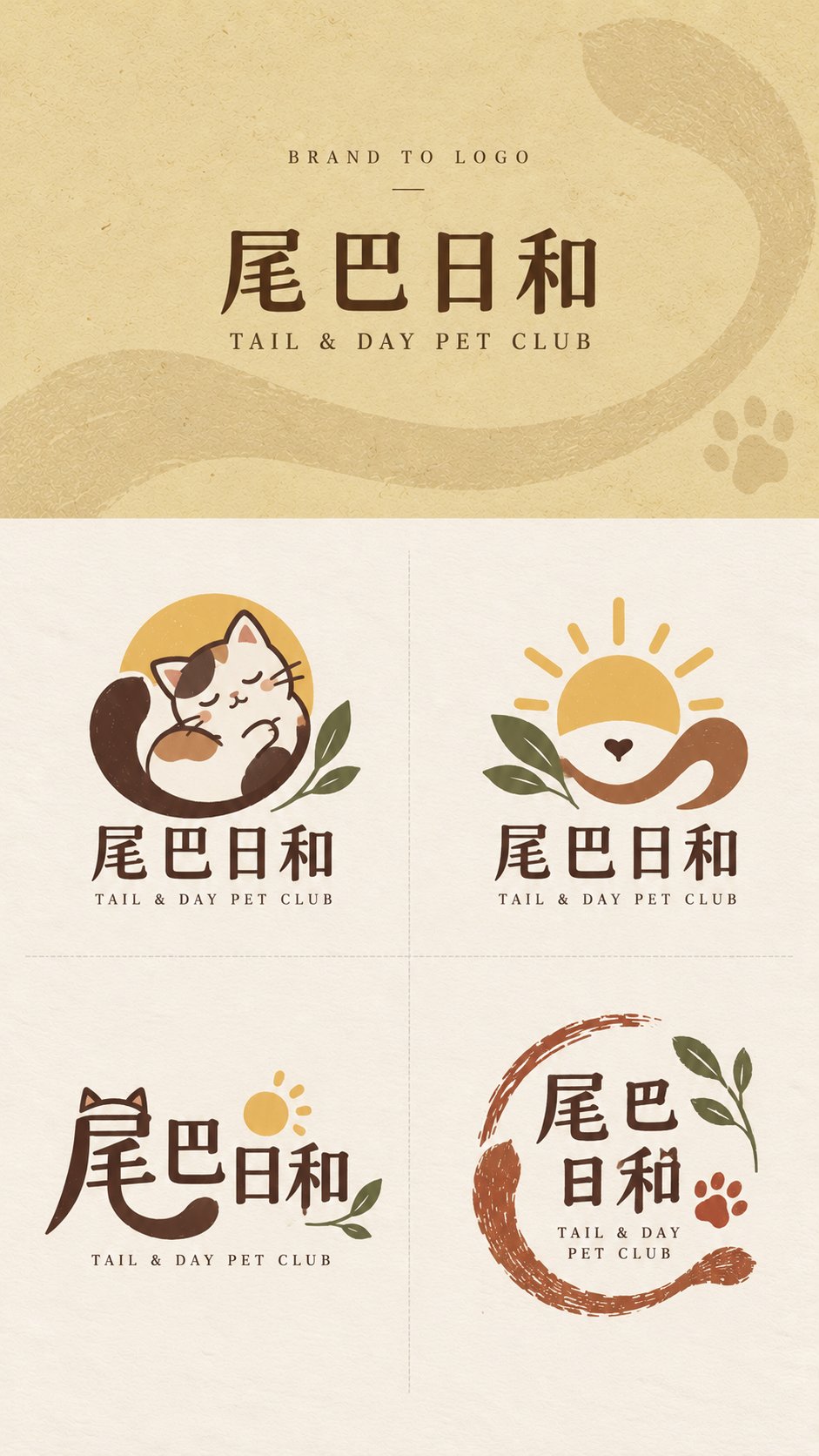
提示词
English
【Brand Name】: {e.g., Tail & Day}
【English Name】: {e.g., TAIL & DAY PET CLUB}
【Brand Type】: {e.g., Pet lifestyle brand / Flower shop / Catering / Bookstore}
【Brand Keywords】: {e.g., Warm, natural, friendly, handmade feel}
【Core Visual Imagery】: {e.g., Tail, sun, pet companionship}
【Main Color Suggestions】: {e.g., Cream yellow, dark brown, brick red, sage green}
【Top Background Color】: {Fill in according to brand temperament}
【Aspect Ratio】: 9:16

Please generate a complete "Brand to Logo" brand logo concept exploration design draft for the above brand. The core is not simply generating four similar logos, but proposing four truly different visual design routes around the same brand name, industry attributes, and core concepts.

The final image is fixed at a 9:16 vertical version. The top brand input area strictly occupies 30% of the entire image height, and the bottom logo display area strictly occupies 70%. This ratio cannot be changed regardless of the length of the brand name; when the name is long, reduce the font size instead of expanding the top area. The bottom 70% is then strictly divided into 2×2 four equal-sized areas, using only very light and thin dashed lines for separation, without drawing peripheral borders.

【Top Branding Area】

The top is only an introductory area for the original brand information, not a main visual poster. Use [Top Background Color], and add extremely slight paper, washi, wrapping paper, screen printing grain, or low-contrast dark patterns related to the brand to only increase texture without forming complex illustrations.

The top only retains three layers of information:

BRAND TO LOGO

【Brand Name】

【English Name】

The brand name should use a normal, clear, modern printed font, without being pre-logoized, handwritten, or graphically deformed. Do not add slogans, brand descriptions, large amounts of small English text, serial numbers, stamps, auxiliary icons, or complex light and shadow, so that the visual focus naturally falls on the four logo schemes below.

【Bottom Logo Display Area】

The bottom uniformly uses a Warm Ivory warm off-white paper background, retaining only slight natural paper grain. All four logos need to be developed around the [Brand Type], [Brand Keywords], and [Core Visual Imagery], keeping the brand core consistent, but the design methods must be significantly different.

Each logo should be a complete set of brand identity that can be realistically used for stores, packaging, labels, social avatars, business cards, or peripheral products, rather than a full illustration, poster, or decorative image.

Control each scheme within 1–3 primary colors, prioritizing the [Main Color Suggestions]. Avoid high-saturation variegated colors, complex gradients, 3D, metal relief, glass texture, and commercial mockups.

【Mascot | Mascot Type】

Design a highly generalized character or anthropomorphic subject from the brand name, industry, or core imagery. The character needs to have a clear large outline and strong memory points, but do not make it into a complex anime character or a full scene illustration.

Let the character itself relate to the brand concept, for example, holding a product, hiding behind an object, or merging with core plants or animals. Pair it with the complete [Brand Name] wordmark and a smaller [English Name], making it overall friendly, story-oriented, and suitable for social media dissemination.

【Emblem | Imagery Emblem Type】

Do not rely on a full character; instead, extract the 2–3 most important elements from the [Core Visual Imagery] and combine them into a concentrated, balanced brand emblem that is easy to recognize when scaled down.

Prioritize using negative space, surrounding, vertical stacking, partial enclosure, or graphic isomorphism to let different elements truly fuse into one logo rather than simply placing several small icons side by side. Pair it with the brand wordmark to form a complete and stable logo system.

【Type-led | Creative Typography Type】

Take the [Brand Name] itself as the core design object. Analyze the strokes, structures, radicals, negative spaces, and letter outlines with the most visual potential in Chinese characters or English letters, and let the core imagery of the brand grow naturally from within the text.

Omissions, shared strokes, extensions, cutting, partial replacement, negative space reconstruction, or glyph fusion can be performed, but basic legibility must be maintained.

Do not simply stick an extra icon next to a regular font. The focus is to make "the text itself the logo," forming a more modern, clever, and professional graphic design scheme.

【Stamp | Open Handmade Mark Type】

Design a logo with the temperament of a hand-carved, printmaking, shop stamp, or packaging mark, but do not use a regular complete square box, and do not stuff all content into a closed ellipse.

Use incomplete boundaries, open arcs, natural strokes, brand core graphics, or text to jointly form a loose visual scope. Elements can be slightly misaligned, and the edges allow for a small amount of natural ink deficiency and uneven hand-printing to give the overall design a sense of breath.

The Stamp must maintain clear primary-secondary relationships and sufficient white space. Do not become stiff, dense, or difficult to use practically in pursuit of a "stamp feel."

The four types must share the same brand worldview, core imagery, and basic color palette, but they cannot simply be the same logo in four drawing styles or four layouts.

Do not add serial numbers such as A/B/C/D. Do not add slogans, explanatory sentences, or extra information at the bottom. Do not generate packaging mockups, real store scenes, or full illustrations.

The final image should look like a mature, clean, professionally differentiated logo exploration sheet with real brand design value.
中文
【品牌名称】:{例如:尾巴日和}
【英文名称】:{例如:TAIL & DAY PET CLUB}
【品牌类型】:{例如:宠物生活方式品牌 / 花店 / 餐饮 / 书店}
【品牌关键词】:{例如:温暖、自然、亲切、手作感}
【核心视觉意象】:{例如:尾巴、太阳、宠物陪伴}
【主色建议】:{例如:奶油黄、深棕、砖红、鼠尾草绿}
【顶部背景色】:{根据品牌气质填写}
【画幅比例】:9:16

请为以上品牌生成一张完整的「Brand to Logo」品牌 Logo 概念探索设计稿。核心不是简单生成四个相似 Logo,而是围绕同一个品牌名称、行业属性和核心概念,提出四条真正不同的视觉设计路线。

最终画面固定为 9:16 竖版。顶部品牌输入区严格占整个画面高度的 30%,底部 Logo 展示区严格占 70%,无论品牌名称长短都不能改变这个比例;名字较长时缩小字号,不扩大顶部区域。底部 70% 再严格划分为 2×2 四个等大区域,只使用非常浅、非常细的虚线分隔,不绘制外围边框。

【顶部品牌区】

顶部只是品牌原始信息的引入区,不是主视觉海报。使用【顶部背景色】,加入极轻微的纸张、和纸、包装纸、丝网印刷颗粒或与品牌相关的低对比暗纹,只增加质感,不形成复杂插画。

顶部只保留三层信息:

BRAND TO LOGO

【品牌名称】

【英文名称】

品牌名称使用正常、清晰、现代的印刷字体,不提前进行 Logo 化、手写化或图形变形。不要加入口号、品牌说明、大量小英文、编号、印章、辅助图标或复杂光影,让视觉重点自然落到下方四个 Logo 方案。

【底部 Logo 展示区】

底部统一使用 Warm Ivory 暖米白纸张背景,只保留轻微天然纸纹。四个 Logo 都需要围绕【品牌类型】【品牌关键词】【核心视觉意象】展开,保持品牌核心一致,但设计方法必须明显不同。

每个 Logo 都应该是一套完整、可以真实用于门店、包装、标签、社交头像、名片或周边商品的品牌标识,而不是完整插画、海报或装饰图。

每个方案控制在 1–3 个主要颜色以内,优先使用【主色建议】。避免高饱和杂色、复杂渐变、3D、金属浮雕、玻璃质感和商业 mockup。

【Mascot|吉祥物型】

从品牌名称、行业或核心意象中设计一个高度概括的角色或拟人化主体。角色需要拥有清楚的大轮廓和强记忆点,但不要做成复杂动漫人物或完整场景插画。

让角色本身与品牌概念发生关系,例如抱着产品、隐藏在物体后面、与核心植物或动物融合。搭配完整的【品牌名称】字标和较小的【英文名称】,整体亲和、有故事感、适合社交传播。

【Emblem|意象徽章型】

不依赖完整人物,而是从【核心视觉意象】中提炼 2–3 个最重要的元素,组合成一个集中、平衡、容易缩小识别的品牌徽章。

优先使用负空间、环绕、上下叠合、局部包围或图形共形,让不同元素真正融合成一个标志,而不是简单把几个小图标并排放在一起。搭配品牌字标,形成完整稳定的 Logo 系统。

【Type-led|字形创意型】

以【品牌名称】本身作为核心设计对象。分析中文字或英文字母中最有视觉潜力的笔画、结构、偏旁、负空间和字母轮廓,让品牌的核心意象从文字内部自然生长出来。

可以进行省笔、共享笔画、延长、切割、局部替换、负空间重构或字形融合,但必须保留基本识别度。

不要在普通字体旁边额外贴一个图标。重点是让“文字本身就是 Logo”,形成更现代、更聪明、更具有专业平面设计感的方案。

【Stamp|开放式手作印记型】

设计一款具有手刻、版画、店章或包装印记气质的 Logo,但不要使用规整完整的方框,也不要把所有内容塞进封闭椭圆。

使用不完整边界、开放弧线、自然笔触、品牌核心图形或文字共同形成松散的视觉范围。元素可以轻微错位,边缘允许少量自然缺墨和手工印刷不均,让整体具有呼吸感。

Stamp 必须保持清楚的主次关系和充分留白。不要因为追求“印章感”而变得死板、密集或难以实际使用。

四款必须共享同一个品牌世界观、核心意象和基础配色,但不能只是同一个 Logo 换四种画风或四种排版。

不要加入 A/B/C/D 等编号。底部不要添加口号、解释句或多余信息。不要生成包装 mockup、真实门店场景或完整插画。

最终画面要像一张成熟、干净、有方法差异、有真实品牌设计价值的专业 Logo Exploration Sheet。