秋季旅行手帐拼贴水彩插画
来源: @Goodmanprotocol模型: ChatGPT
📸 示例图片
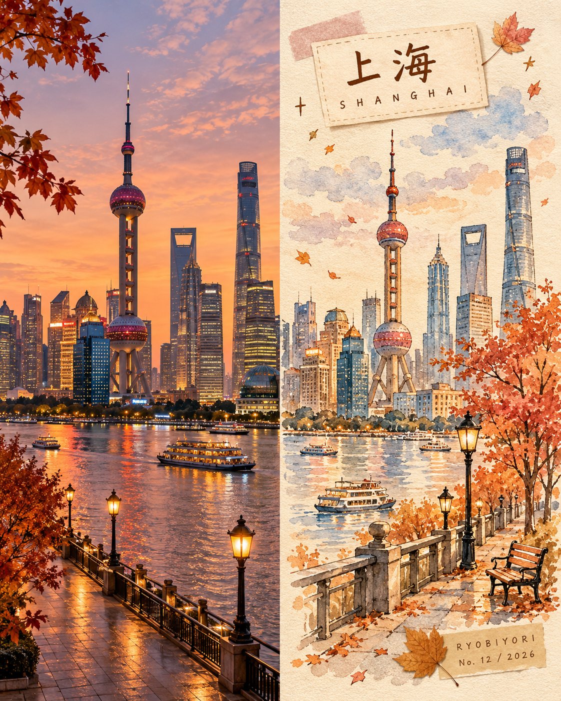
提示词
English
Create a premium 4:5 vertical autumn travel-journal artwork for [COUNTRY / CITY / LOCATION / SUBJECT].

TEXT-TO-IMAGE ONLY — generate every element from the written destination or subject alone. Do not request, upload, use, or depend on any reference image, existing photograph, or source image.

MASTER STYLE LOCK:
Hand-painted autumn watercolor on warm ivory paper, minimalist travel-editorial illustration, transparent watercolor washes mixed with soft gouache, delicate imperfect ink outlines, visible paper grain, natural pigment blooms, soft edges, muted autumn colors, generous negative space, warm nostalgic atmosphere, premium handcrafted art-book aesthetic.

COMPOSITION:
Divide the vertical canvas into two equal halves using a precise 50/50 left-right split.

LEFT HALF — REALISTIC DESTINATION:
Generate an original, natural-looking photograph-style scene of [COUNTRY / CITY / LOCATION / SUBJECT]. Automatically determine its recognizable architecture, scenery, atmosphere, and natural lighting. Preserve realistic textures, authentic colors, and believable perspective. Keep this entire half clean, with no text, labels, illustrations, borders, or decorative elements.

RIGHT HALF — AUTUMN WATERCOLOR JOURNAL:
Reimagine the same destination as a delicate, handmade autumn watercolor illustration. Use simplified rounded architecture, warm glowing windows, a small tree with dusty rose, apricot, and amber foliage, a few drifting leaves, and subtle watercolor clouds. Include only a few meaningful local details, keeping the composition airy and uncluttered.

COLOR PALETTE:
Caramel brown, dusty rose, apricot orange, creamy yellow, muted maple red, warm ivory, and faint lavender-grey shadows. Use soft, low-saturation afternoon light. No neon colors or harsh black.

HANDMADE DETAILS:
Add one or two narrow kraft-brown or dusty-pink washi tape strips, a small pressed autumn leaf, and a few delicate hand-drawn stars or arrows. Integrate these details naturally without overcrowding the illustration.

DESTINATION LABEL:
Place a small cream-colored paper label near the upper-left corner of the RIGHT HALF.

Main title: [LOCATION NAME]
Subtitle: [ENGLISH LOCATION NAME]

Use rounded, handwritten Japanese-inspired lettering for the main title and smaller, widely spaced handwritten English lettering for the subtitle. Keep spelling accurate and typography legible.

SIGNATURE LABEL:
Near the bottom-right corner of the RIGHT HALF, add a small kraft-paper label with exactly this text:

RYOBIYORI
No. [NUMBER] / [YEAR]

Use subtle, fine dark-brown lettering.

STRICT LAYOUT RULES:
All text, labels, washi tape, and decorative elements must remain entirely within the right half. The left half must contain only the original generated realistic destination scene. Never reproduce or modify an existing photograph.

PAPER & FINISH:
Warm ivory watercolor-paper texture, delicate fibers, subtle grain, organic pigment edges, and a carefully assembled travel-journal feeling.

FINAL AESTHETIC:
Realistic destination imagery × autumn watercolor illustration × handmade travel journal × nostalgic seasonal palette × premium editorial design.

AVOID:
Reference-image requests, image-editing instructions, existing-photo preservation, unequal panel widths, text crossing the center divider, excessive decoration, oversaturated colors, glossy digital painting, 3D rendering, misspelled text, extra logos, watermarks, and interface elements.

OUTPUT:
4:5 vertical portrait, exact 50/50 left-right composition, realistic generated destination scene on the left, watercolor travel-journal illustration on the right, ultra-high definition.
中文
为 [国家 / 城市 / 地点 / 主题] 创作一个优质的 4:5 垂直秋季旅行手帐艺术品。

仅限文本转图像 —— 仅根据书面的目的地或主题生成每个元素。不要请求、上传、使用或依赖任何参考图像、现有照片或来源图像。

大师风格锁定:
暖象牙色纸上的手绘秋季水彩,极简旅行社论插画,透明水彩洗涤色调混合柔和的水粉,精致不完美的墨水轮廓,可见的纸张纹理,自然颜料晕染,柔和边缘,柔和的秋色,大量的留白,温暖怀旧的氛围,优质手工艺术书美学。

构图:
使用精确的 50/50 左右分割将垂直画布分成相等的两半。

左半部分 —— 真实的目的地:
生成一张 [国家 / 城市 / 地点 / 主题] 的原创、自然的摄影风格场景。自动确定其具有辨识度的建筑、风景、氛围和自然光线。保持真实的纹理、真实的色彩和可信的透视。保持整个这一半简洁,没有文字、标签、插图、边框或装饰元素。

右半部分 —— 秋季水彩手帐:
将同一目的地重新构思为精致、手工制作的秋季水彩插画。使用简化的圆形建筑、温暖的发光窗户、一棵带着灰粉色、杏色和琥珀色叶子的小树、几片漂浮的落叶以及微妙的水彩云。仅包含几个有意义的当地细节,保持构图轻盈且不凌乱。

调色板:
焦糖棕、灰粉色、杏橘色、奶油黄、柔和的枫叶红、暖象牙色以及浅淡的薰衣草灰阴影。使用柔和、低饱和度的午后光线。不要霓虹色或刺眼的黑色。

手工细节:
添加一两张窄窄的牛皮棕色或灰粉色和纸胶带条、一片小小的压制秋叶以及几颗精致的手绘星星或箭头。自然地融入这些细节,不要让插画显得过于拥挤。

目的地标签:
在右半部分的左上角附近放置一个小奶油色纸标签。

主标题:[地点名称]
副标题:[英文地点名称]

主标题使用圆润的日语风格手写字体,副标题使用较小、间距较宽的英文手写字体。确保拼写准确,排版清晰易读。

签名标签:
在右半部分的右下角附近,添加一个小的牛皮纸标签,上面确切写着以下文本:

RYOBIYORI
No. [数字] / [年份]

使用微妙、精细的深褐色字体。

严格的布局规则:
所有文本、标签、和纸胶带和装饰元素必须完全保留在右半部分。左半部分必须仅包含原始生成的真实目的地场景。切勿复制或修改现有的照片。

纸张与饰面:
暖象牙色水彩纸纹理,精细纤维,微妙颗粒,有机颜料边缘,以及精心组装的旅行手帐感。

最终美学:
真实的地点图像 × 秋季水彩插画 × 手工旅行手帐 × 怀旧季节性色调 × 优质社论设计。

避免:
参考图像请求、图像编辑指令、保留现有照片、面板宽度不相等、文字跨越中心分隔线、过度装饰、过度饱和的颜色、油亮的数字绘画、3D 渲染、拼写错误的文本、额外的标志、水印和界面元素。

输出:
4:5 垂直人像,精确的 50/50 左右构图,左侧为生成的真实目的地场景,右侧为水彩旅行手帐插画,超高清。