精品咖啡品牌秋季限定商业广告海报设计
来源: @Adam38363368936模型: ChatGPT
📸 示例图片
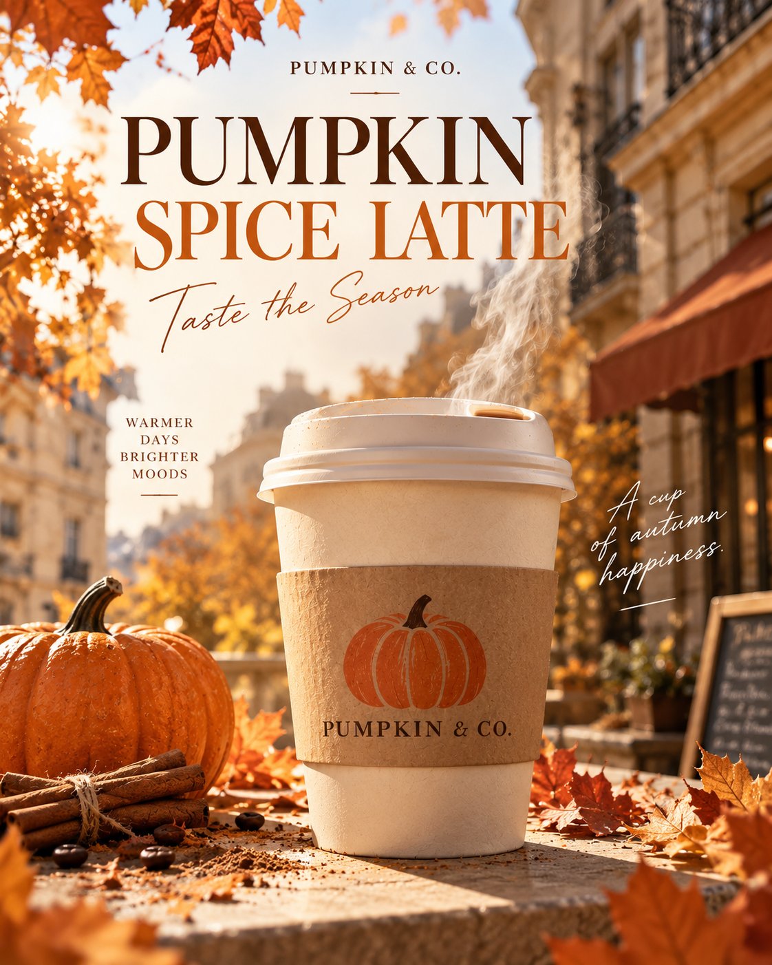
提示词
English
Generate a high-quality boutique coffee brand autumn limited product poster designed by a professional commercial advertising agency, 4:5 vertical version, high definition.

Design Style: Modern Western boutique coffee brand visual, Editorial Advertising Design, blending high-end magazine layout, realistic product photography, and autumn lifestyle aesthetics.

【Overall Composition】

Adopts a complete commercial graphic poster design with clear font hierarchy, image-text layout, visual flow, and exquisite white space.

Main colors: Pumpkin Orange #C96932, Cream White #F5E9D5, Deep Coffee Brown #35251C.

The image uses a three-stage layout: top title area, middle product visual area, and bottom information area.

The background is warm cream beige, combined with autumn afternoon sunlight, soft blurred shadows of European-style cafe buildings, and a few orange-red maple leaves. The image is clean and not cluttered with decorations.

【Top Typography】

A small brand logo is placed in the upper left corner:
A simple orange pumpkin line icon
PUMPKIN & CO.

A small capsule-shaped tag is used in the upper right corner:
AUTUMN EDITION
2026

An extra-large, high-end retro serif font in deep coffee brown is used in the upper left-middle position, arranged in two lines:

FALL IN
LOVE.

The title uses a fashion magazine serif font with distinct thick and thin contrasts, exquisite letters, and tight leading, creating a strong visual impact.

A small subtitle is added below the main title:
YOUR SEASONAL COFFEE RITUAL

【Central Product Main Visual】

A real take-away hot pumpkin latte is placed on a light beige stone tabletop.

The paper cup is cream-white, with a real kraft paper cup sleeve wrapped around the middle, clearly printed with an orange pumpkin pattern and the brand name PUMPKIN & CO.

The cup uses a fully closed low white plastic take-away hot drink lid with a realistic drinking hole, raised edges, and plastic texture.

The lid strictly maintains a realistic hot drink lid structure, without any cream peaks, ice cream, milk foam buildup, or exposed coffee liquid.

A wisp of soft, translucent white steam naturally rises from the drinking hole, light and delicate.

Using real commercial product photography texture, the cup serves as the visual center, with prominent volume, normal proportions, and a sharp, clear product.

Beside the cup are a small orange pumpkin, two cinnamon sticks, and a few naturally scattered autumn leaves. Decorative elements remain restrained.

Warm sunlight from the top left illuminates the paper cup, forming realistic and unified natural shadows on the tabletop.

【Bottom Commercial Information】

An exquisite information layout area is set at the bottom of the image, using a clear grid layout.

A larger modern sans-serif font is used on the left:

PUMPKIN
SPICE LATTE

Small text is used below:
WARM SPICES · SMOOTH ESPRESSO
THE TASTE OF FALL

An exquisite pumpkin orange circular seal is placed in the bottom right corner, with the following clearly written inside:

LIMITED
EDITION

The brand slogan is arranged below the horizontal separator line at the bottom:

SIP THE SEASON.

【Design Requirements】

A complete commercial poster design must be presented, and the title, subtitle, brand name, product name, slogan, and limited edition labels on the poster must actually be generated in the image.

The typography has a professional design sense, with clear font size hierarchy, the title has a significant visual impact, and the product and text do not block each other.

Use professional font combinations: high-contrast retro serif fonts paired with clean modern sans-serif fonts.

Maintain a unified brand visual identity system, with exquisite and rhythmic layout and reasonable white space.

All English must be spelled correctly, text edges must be clear, avoiding garbled characters, typos, or repeated words.

The image has both the product texture of real photography and the commercial completeness of high-end graphic design.

Avoid ordinary mobile phone photos, product photography lacking text, overly complex decorations, exaggerated CGI, cream topping, ice cream shapes, fake plastic textures, and light/shadow errors.

Final effect is a high-end commercial advertising poster that can be used for coffee brand autumn marketing activities, social media promotion, and store displays.
中文
生成一张专业商业广告公司设计的精品咖啡品牌秋季限定产品海报,4:5 竖版,高清。

设计风格:现代欧美精品咖啡品牌视觉,Editorial Advertising Design,融合高级杂志排版、真实产品摄影与秋季生活方式美学。

【整体构图】

采用完整的商业平面海报设计,具有明确的字体层级、图文布局、视觉动线和精致留白。

主色调:南瓜橙 #C96932、奶油白 #F5E9D5、深咖啡棕 #35251C。

画面采用上方标题区、中间产品视觉区、下方信息区的三段式布局。

背景是温暖的奶油米色,结合秋日下午阳光、柔和的欧式咖啡馆建筑虚影和少量橙红色枫叶。画面简洁,不堆砌装饰。

【顶部排版】

左上角放置小号品牌标识:
一个简洁的橙色南瓜线条图标
PUMPKIN & CO.

右上角使用小型胶囊形标签:
AUTUMN EDITION
2026

画面上方偏左位置使用超大号、高级复古衬线字体,深咖啡棕色,分两行排版:

FALL IN
LOVE.

标题采用具有明显粗细对比的时尚杂志衬线字体,字母精致,行距紧凑,产生强烈的视觉冲击。

主标题下方增加小号副标题:
YOUR SEASONAL COFFEE RITUAL

【中心产品主视觉】

一杯真实的南瓜拿铁外带热咖啡放置在浅米色石材桌面上。

纸杯米白色,杯身中间环绕真实的牛皮纸杯套,杯套上清晰印有橙色南瓜图案和品牌名称 PUMPKIN & CO.

杯子使用完整闭合的低矮白色塑料外带热饮杯盖,具有真实饮口、凸起边缘和塑料纹理。

杯盖严格保持真实热饮杯盖结构,不出现任何奶油尖顶、冰淇淋、奶泡堆积或裸露咖啡液体。

一缕柔和半透明的白色热气从饮口自然升起,轻盈、细腻。

采用真实商业产品摄影质感,杯子作为视觉中心,体积突出,比例正常,产品清晰锐利。

杯子旁点缀一个小型橙色南瓜、两根肉桂棒和少量自然散落的秋叶。装饰元素保持克制。

左上方温暖阳光照亮纸杯,在桌面形成真实、统一的自然阴影。

【底部商业信息】

在画面底部设置精致的信息排版区,采用清晰的网格布局。

左侧使用较大的现代无衬线字体:

PUMPKIN
SPICE LATTE

下方使用小号文字:
WARM SPICES · SMOOTH ESPRESSO
THE TASTE OF FALL

右下角放置一个精致的南瓜橙色圆形印章,内部清晰写着:

LIMITED
EDITION

底部横向分隔线下方安排品牌广告语:

SIP THE SEASON.

【设计要求】

必须呈现完整的商业海报设计,海报上的标题、副标题、品牌名称、产品名称、广告语和限定标签都要实际生成在画面中。

排版具有专业设计感,字体大小层级鲜明,标题具有明显视觉冲击,产品与文字互不遮挡。

使用专业字体组合:高对比复古衬线字体搭配简洁现代无衬线字体。

保持统一的品牌视觉识别系统,版式精致、有节奏感,留白合理。

所有英文必须正确拼写,文字边缘清晰,避免乱码、错字、重复文字。

画面既有真实摄影的产品质感,又有高级平面设计的商业完成度。

避免普通手机照片、缺少文字的产品摄影、过度复杂的装饰、夸张 CGI、奶油堆顶、冰淇淋形状、假塑料质感、光影错误。

最终效果是一张可以用于咖啡品牌秋季营销活动、社交媒体推广、门店展示的高级商业广告海报。