七十年代风格现代角色联名包装重绘
来源: @DeepBlueX0模型: ChatGPT
📸 示例图片
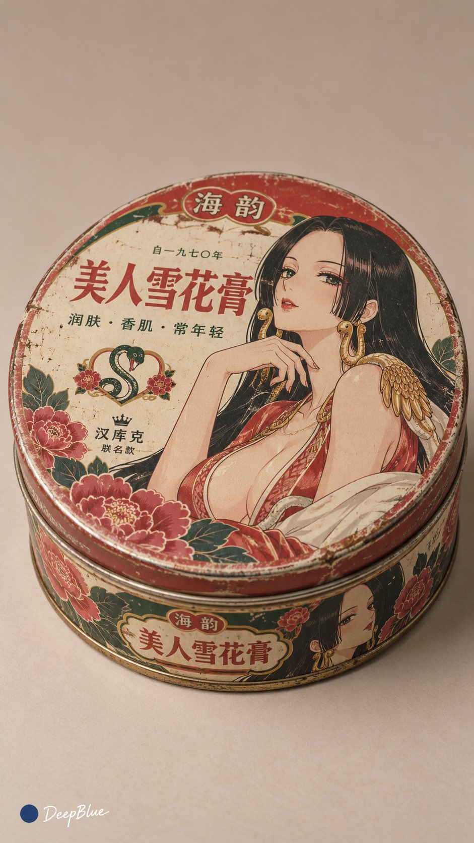
提示词
English
Generate a 9:16 vertical image, output one by one, do not create a collage. For each image, independently select one type of 1970s product packaging; then independently select one modern anime or game adult character with high visual recognition, and perform a cross-era collaborative packaging redesign. Retain the core identifying elements of the character, such as hairstyle, clothing silhouette, representative colors, props, and temperament, but translate the whole into 1970s Chinese commercial packaging language to create a unique "familiar yet strange" feeling, as if this collaborative product truly existed in that era.

The overall style adopts 1970s commercial graphic design and early modern commercial art styles, with rounded fonts, hand-drawn promotional illustrations, wavy color bands, simple badges, decorative borders, limited spot color printing, and warm retro color palettes. Do not use modern poster-style visuals; instead, make the character part of the main packaging visual, with character movements, props, skill symbols, and symbolic elements naturally integrated into the main image, background patterns, and decorative motifs. The packaging must revolve around the product's use and the character's attributes, with original designs for fictional brand names, product names, collaboration text, slogans, and side descriptions, ensuring the text is concise, legible, and carries the atmosphere of the era.

Select reasonable box types, materials, and structures based on the category, accurately representing cardboard thickness, fold lines, creases, tin box curls, metal seams, printing ink texture, and slight age-related wear. Adopt a collectible still-life photography method, with a single complete package placed on a simple neutral background, clearly displaying the front and one side from a three-quarters perspective, emphasizing the sense of a real object, graphic design completeness, and collection value. Each image should independently vary the product category, character temperament, color scheme, illustration method, layout structure, and packaging details, avoiding repetitive templates.
中文
生成一张9:16竖版图片,逐张输出,不制作拼图。每张独立抽取一种70年代商品包装;再独立抽取一位具有鲜明视觉识别度的现代动漫或游戏成年角色,进行跨时代联名包装重设计。保留角色的核心识别元素,如发型、服饰轮廓、代表色、道具与气质,但整体统一转译为1970年代中国商业包装语言,营造“熟悉却陌生”的独特感觉,仿佛那个年代真实存在过这款联名商品。

整体采用1970年代商业平面设计与近代商业美术风格,圆润字体、手绘宣传插画、波浪色带、简洁徽章、装饰边框、有限套色印刷与温暖复古配色。不要使用现代海报式画面,而是让角色成为包装主视觉的一部分,角色动作、道具、技能符号与象征元素自然融入主图、底纹与装饰图案中。包装需围绕商品用途与角色属性,原创设计虚构品牌名、产品名、联名字样、宣传语与侧面说明,保证文字简洁、易读、带年代气息。

根据品类选择合理盒型、材质与结构,准确表现纸板厚度、折线、压痕、铁盒卷边、金属接缝、印刷油墨质感与轻微年代磨损。采用收藏品静物摄影方式,单件完整包装置于简洁中性背景,以三分之四视角清楚展示正面与一个侧面,强调真实物件感、平面设计完成度与收藏价值。每张独立变化商品品类、角色气质、配色方案、插画方式、版式结构与包装细节,避免重复套版。